We're proud to provide User Experience services.

Hide additional information on this project
Show additional information on this project Expand
Automating essential fundraising and donation tools

Team Leadership

Last Call Media has enjoyed a long ongoing history working with The Society of St. Vincent de Paul that started back in 2014 and continues to this day. Originally brought in to tackle improving the online donation experience at stvincentdepaul.net, our work has expanded greatly from there over the years as we’ve served as a business, creative, and technical partner to the St Vincent de Paul team.

How we did it

The Society of St. Vincent de Paul (SVdP) is a non-profit organization dedicated to serving the poor and providing others with the opportunity to serve. The digital experience SVdP offers to their community of supporters is an important part of achieving their mission. Last Call Media has been handling the ongoing feature development, the necessary support, and regular maintenance of the SVdP sites for the past several years.

Online donations made easy

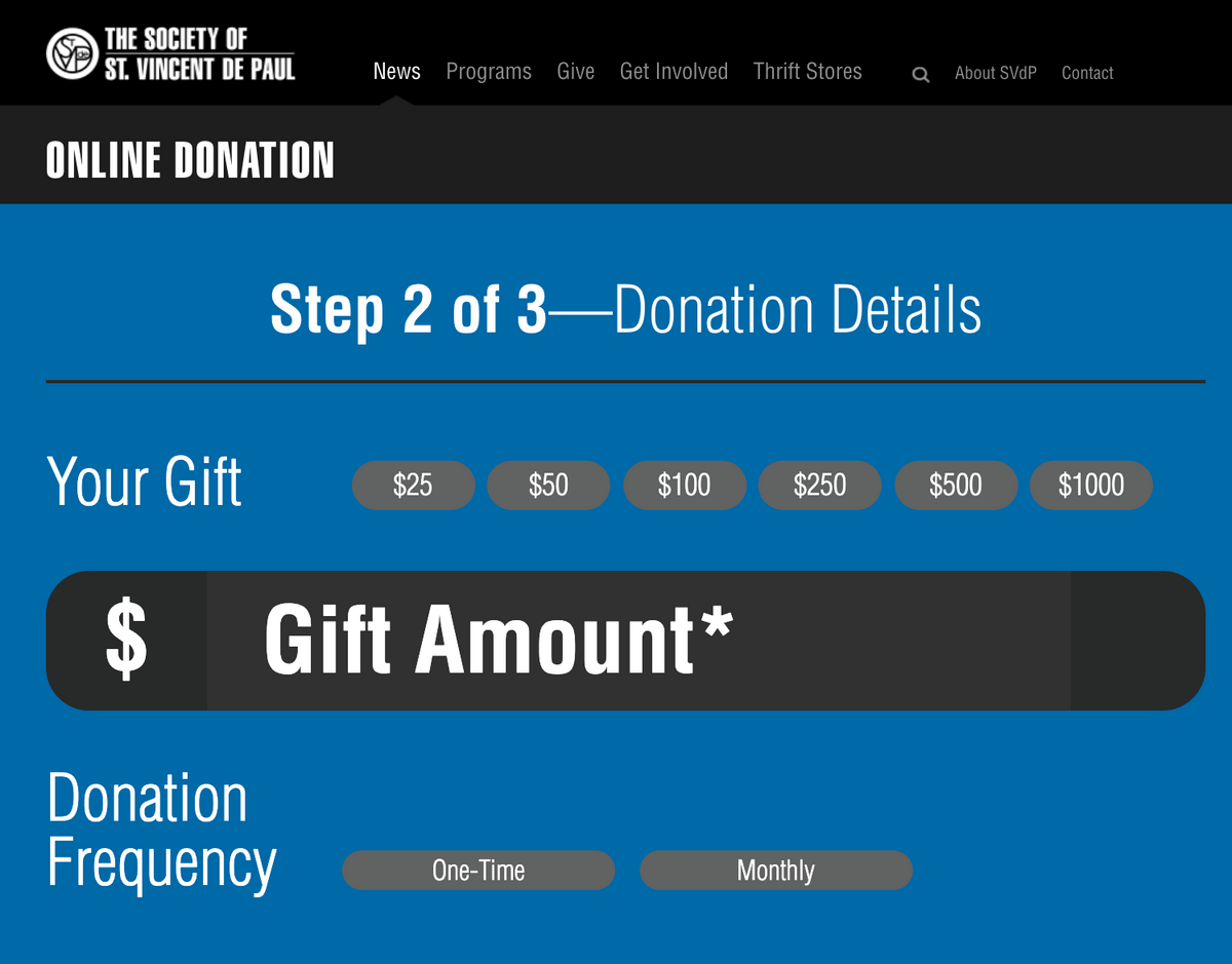
Any time the SVdP team initiates a new campaign, whether fundraising for Thanksgiving, COVID-19 relief or homelessness prevention, a new web form needs to be created on stvincentdepaul.net

Last Call Media worked with SVdP to create an elaborate system for the site that relies heavily on a combination of web forms, Salesforce and Braintree. The web forms are integrated into the Drupal 7 site, Salesforce serves as the source of truth for creating and managing new contacts, while Braintree is used for processing online payments. Once we completed building the system, we began the process of rolling out functionality to enable SVdP to launch targeted giving campaign pages on their own. 

The new functionality enables the SVdP to independently handle any new campaign and helps the team keep track of all the different data points  while making the online experience of the supporters quick and simple.

svdp-donation

A streamlined process for scheduling pickups 

In addition to web forms for financial donations, SVdP faces an additional layer of complexity when scheduling pickups of donated goods like furniture and clothing. 

Previously, SVdP used a system of phone calls, taken at their call center, which were then recorded in Salesforce. These were then manually screened and assigned to driver routes each day. Because there is a limit to the number of pickups SVdP could perform in one day, there would often be situations where a person’s pickup had to be rescheduled because it was accidentally added to an already-full route.

Last Call Media worked with SVdP to streamline that process. We used Checkfront to automate the booking process, presenting a customized version of the booking interface within an iframe on SVdP’s Drupal site, connecting it to their existing Salesforce account, and cutting out the need for people to call into SVdP to schedule a donation pickup. We were even able to add a unique custom receipt URL, so after completing the booking process users are directed to a Drupal webform where they have the option of donating to SVdP to support their free pickup service.

The new process greatly decreased the amount of time the SVdP team needs to spend on each of these donations. Now they are able to schedule more pickups per zip code area per day and have confidence in the system they need to rely on every day.

Automated transaction reports  

When we started working with SVdP, their finance team needed to run several reports manually and cross-reference the data in order to begin the process of analyzing transaction reports. 

One of our projects together, as part of our ongoing support and maintenance relationship, was to improve the sites reporting capabilities by aggregating transaction data from their formerly separated eCommerce sites into one exportable master transaction report. 

Last Call Media turned a lengthy manual process into an automated one that makes a .csv available within a few clicks.

Last Call has been involved in improving the site’s essential fundraising and donation tools to make giving easier for users and also provide SVdP staff with powerful reporting and analytics data they can use for future campaigns. We’re proud to keep helping SVdP improve how they use technology to deliver services to their community, recruit and manage volunteers, and encourage donations. We remain excited by our involvement with such a charitable organization and we value the high level of trust and open communication that drives our relationship.

If you’re in Central or Northern Arizona, go to stvincentdepaul.net and be part making a difference with The Society of St. Vincent de Paul.

Hide additional information on this project
Show additional information on this project Expand
Blackboard’s shift to a solution-driven digital experience

Team Leadership
  • Art Director
    Colin Panetta

Blackboard is the largest education technology company in the world, serving nearly 100 million users in every region of the globe. Their comprehensive suite of products and services power institutions looking to teach, engage their community and provide a dynamic educational experience to students. 

Blackboard is an innovative, fast-moving organization, and their digital marketing tools needed to support that. To drive their next phase of growth, Blackboard engaged Last Call Media to build a global marketing platform on Drupal 8. The ability to iterate quickly, launch new marketing campaigns, and spin up sites in new regions is crucial for the Blackboard team. Ultimately moving faster means a better chance of competing against an increasing number of competitors. 

Last Call Media set out to help Blackboard test and implement a bold new approach to digital marketing, and as a result, transformed the way Blackboard.com reached and engaged educators.

How we did it

Surfacing Blackboard’s value proposition in the main navigation

The largest opportunity with the new global marketing platform was shifting how Blackboard connected with its prospective customers.

Originally, a prospective customer’s journey would begin with selecting their industry to dive deeper into a plethora of information about the different products and services. This experience was informative, but it didn’t make it clear that Blackboard’s competitive edge is not in any one individual product but rather in the interconnectedness of their various products, and how they come together to build a dynamic educational ecosystem, regardless of a customer’s industry. We worked with Blackboard to transition from an industry-focused navigation, originally:

To journeys that surface Blackboard’s value streams first: Teaching & Learning, Community Engagement, and Consulting Services. 

Given the importance of Blackboard.com as a marketing tool to drive revenue, we knew we needed to test our efforts in order to identify any usability issues before the site went live. To do this, we conducted in-person user testing at Blackboard’s annual user convention, BbWorld. We gained valuable insight that informed the final structure of the site navigation. Having positive and constructive real-world user feedback was essential in gaining stakeholder buy-in on this new approach. 

Now, Blackboard.com with its revised primary navigation helps connect prospective customers to the different ways Blackboard provides value to its customers. 

Empowering global marketers through a consistent UX 

Prior to the new platform, one of the major challenges Blackboard’s marketers had with the former Tridion content management system was efficiency. In the past, every page needed to be built manually by Blackboard’s internal web team. Marketers used to submit a form to the web team. Often faced with a backlog several weeks long, the web team created it from scratch as soon as possible. A draft page would be created, sent back to the marketer, and any edits would be returned in a document. This could take several days at best to release a new page or changes to an existing page. 

Blackboard marketers can now add and edit content easily while remaining on brand and demonstrating Blackboard’s impact around the globe.

After understanding this process, the different types of content needed and ways that content can be presented to support the new user journeys, we delivered a collection of over a dozen flexible components. Now marketers worldwide are able to create and edit pages on their own, reducing time to market and costs, and the web team is able to focus on other higher value-creating activities. 

Powered by a modern CMS, Drupal 8  

Blackboard needed an enterprise-grade CMS that was capable of scaling to meet their increasing marketing needs while also remaining easy for their content authors to manage. Drupal was a great choice for Blackboard as it enabled them to respond and make content and code-level changes quickly, including introducing new functionality.

The next iteration of the Blackboard brand, supported by a pattern library

The new platform provided an opportunity to rethink how Blackboard uses space and colors so their digital properties are more consistent in look, feel, and structure to their products. 

Blackboard started using color more sparingly and with greater purpose, and the new platform better utilizes white space and reserves color to truly highlight the content Blackboard wants to bring front and center. Subtle variations in the “Call-to-Action” button styles were added to make it clearer to the site visitor what the next step is. With the new platform, Blackboard has removed many of the bright yellow buttons and softened their approach and introduced a few more “friendlier” color options to their web palette. The outcome here is that Blackboard.com, the flagship marketing platform looks and feels consistent with Blackboard’s products and services. 

A globally consistent brand experience with localized messaging   

As a global company, Blackboard’s marketing team needs to be able to quickly position their products and services to customers in those markets directly, in their language. Further, Blackboard’s marketing and content strategy varies per market and therefore often by language. Simply translating pages into different languages was not sufficient given it’s often the case that not all products and services are available in all markets, and even when they are they are often positioned differently. A product may be marketed differently in Spain and in Germany while also not being available in Australia, for example, which means we needed a different approach to translation that supported localization. Blackboard’s new Drupal 8 site had to not only provide content in different languages but also content specific to each visitor’s geographic location. 

To support this, we built a Global Site feature in the new Blackboard.com that allows the Blackboard marketing team to spin up and manage new sites in different languages quickly without the need to engage development. At launch, this included close to two dozen sites in around 14 different languages.

We extended Drupal 8 core’s translate functionality to support the variations in language between American English and Queen’s English and Latin American and Castilian Spanish while maintaining flexibility so that content could also be localized for different regions. 

Blackboard’s requirements were complex and caused us to rethink our typical multilingual strategy. Instead of creating a site that supports content in multiple languages, we built a localization platform that takes into account available product offerings as well as language and regional nuance - creating a platform for an organization that is not only multilingual but truly global.

A commitment to web accessibility 

Blackboard and Last Call Media share a commitment to ensuring what we create is fully accessible to all audiences, regardless of ability. To that end, we had accessibility needs in mind from the very beginning. Our cross-functional approach to product development meant that we were able to validate early on that our work would meet WCAG 2.1 minimums, and by engaging users of assistive technology to assist with testing as development progressed, we knew that the release would also be truly usable on day one. 

Our initial objective was to help Blackboard respond faster to changing customer demands worldwide by improving the content authoring experience for their marketing team, empowering their internal development teams to sustain and iterate on the platform for the long haul, and reducing operating costs. 

With input from Blackboard’s customers and employees, we led the delivery of an improved user experience for Blackboard’s community, created a platform to showcase their products and services, and helped Blackboard tell the story of how they continue to positively impact learners, educators, and institutions around the globe.

The relaunched Blackboard.com saw a decreased bounce rate on the homepage, more users finding their destination quickly, and a dramatic increase in traffic to the free trial page. The new flexible, modern, engagement platform for Blackboard is more a customer-focused digital experience and supports their current and future marketing objectives. It has helped Blackboard thrive in a constantly changing and increasingly competitive edtech environment.

Hide additional information on this project
Show additional information on this project Expand
Enabling continuous improvement by listening to constituents.

Processes
  • Agile/Scrum
Team Leadership
  • Art Director
    Colin Panetta

Feedback is of the utmost importance to the Commonwealth.

The highest priority of the Commonwealth of Massachusetts is serving its constituents as best it can. Essential to that is feedback—hearing directly from constituents about what they’re looking for, how they expect to find it, and where any improvements in that journey can be made.

We partnered with the Commonwealth to design a component for Mass.gov that would gather useful feedback from constituents, and another component that would display that feedback to all 600+ of the site’s content authors in a way that maximizes their ability to make improvements.

Watch Collecting and using feedback on Mass.gov, a session about this project presented by Colin Panetta of Last Call Media and Joe Galluccio of Massachusetts Digital Services at Design 4 Drupal below, or scroll down for our written case study about it.

Getting feedback from constituents to site authors.

Discovery

The success of Mass.gov hinges on getting the right feedback from constituents to site authors. Our first step in overhauling the way Mass.gov collects feedback was to define what we needed to know about each page in order to improve it, so we could design the feedback component around that. It consisted of the following:

  • Whether or not users found what they were looking for, and what that was.
  • Contextualize the above by knowing how satisfied users are with the page, and what they came to the site to do.
  • Very detailed feedback that could only be provided through their user panel, a list of nearly 500 constituents who have volunteered to test new features for the site.

With our broad goals defined, we wanted to make sure the feedback component was working on a more granular level as well. We conducted a series of interviews with site authors asking how to best reach their users, and gained some valuable insight. Here’s what they told us:

  • Too much information in the feedback form would scare users away.
  • Feedback was being submitted with the expectation of a response, and organizations wanted to be able to respond.
  • But, not all organizations would be able to respond, so a variety of contact options needed to be available to them.

Strategy

We combined what we learned above with our best practices to make a set of requirements that we used to define a strategy. It was immediately obvious that this feedback component needed to do a lot! And like site authors told us, if we showed that to users all at once, we might scare them away.

A sketched figure in an unsure pose stands in front of a tall stack of blocks, each labeled with a step in the feedback process.
Too many steps at once can be daunting.

So to maximize the amount of responses we’d get, we decided to lower the effort for submission by presenting these options one at a time, starting with the step that takes the least amount of commitment, and increasing with each step. So users can submit a little bit of feedback, and then opt into submitting a little more, and then keep going.

Blocks of increasins size are lined up to form steps. Each block is labeled with a step in the feedback process. A sketched figure climbs the steps.
A step by step approach can make large workflows more palatable to users.

Designing the feedback form

With a clear strategy in place, we designed the following component.

Feedback box asking users is they found what they are looking for. After question is yes/ no radio button and submit button.

On first load, the component is very simple — it’s only asking users if they found what they were looking for.

Once users have made a selection, the component expands with fields asking them what they were looking for.

Feedback form asking users if they found what they were looking for, with a larger text field below asking them what they were looking for and a radio button asking if they'd like a response, followed by a submit button.

Site authors have the option of including an alert here that tells users this form is not for urgent assistance, and directs them to a better place where they can do that.

In the above example, the organization who is responsible for this page is able to respond directly to feedback. So if users say they would like a response, a form opens up for them to enter their contact information. If the organization was not able to respond directly to feedback, a brief explanation of why would appear there instead.

 After submitting, users are thanked for their feedback. 

Website component thanking users for their feedback, offering them a link to contact the RMV, and asking if they would like to take a survey.

Seen above, organizations are given the option to link to their contact page. This is commonly used if the organization is unable to respond directly to feedback.

Users are then given the option to take a short survey, where they can provide more detailed feedback.

Survey asking for more detailed feedback from users.

After submitting the survey, users are given the opportunity to join the Mass.gov user panel. This is the largest commitment available for providing feedback, so it’s at the very end!

Component thanking users for submitting their survey, and giving them a button to press if they would like to join the user panel.

So that’s how feedback is collected on the site. But what happens to it after that?

Displaying feedback to site authors

Feedback submitted through the site can be viewed per node, i.e. a site author can go to a specific page through the backend of the site and view all the feedback submitted for that page. But a lot of feedback can be submitted for a single page, and on top of that, site authors are often responsible for multiple or even many pages. Combing through all that feedback can be a prohibitively daunting task, or simply not possible.

To help with this, we designed the “Content that needs attention” panel for site authors.

Website component titles "Content that needs attention," with description area explaining component to users, and a table displaying a list of content.

The “Content that needs attention” panel appears on the welcome page on the backend of the site, making it one of the first things site authors see after logging in. It displays the page titles of their 10 pages with the lowest scores from users, sorted by page views. By showing site authors their content that’s seen by the most people first, we’re helping them prioritize what to work on next.

We’re giving site authors additional information about the content right in the component, helping them make decisions at a glance. In addition to the aforementioned page titles, scores, and page views, we’re showing them the content type (since some titles can be very similar on this site), the date they last revised it (in case that helps them know how badly this content needs attention), and something a little surprising… a “Snooze” button!

We put a snooze button in because once site authors make an improvement to content, it’s no longer helpful for them to see it here. So, the way it works is that they make an improvement to content, then hit “Snooze,” and it’ll disappear from this list for one month. At the end of that month, one of two things will have happened: 1) the content will have improved enough to no longer appear on this list, or 2) the content needs more improvement, and will appear back on this list.

This feedback component collects around 30,000 pieces of feedback in a single month. Issues reported by users include missing or hard to find content, mistakes, or issues with the service itself. That feedback is used by Mass.gov’s 600+ site authors to continuously improve the delivery of their vital services to the constituents of Massachusetts.

Hide additional information on this project
Show additional information on this project Expand
Engaging and retaining the next generation of experiential learners.

Team Leadership
  • Art Director
    Colin Panetta

Wentworth Institute of Technology is a technical design and engineering university in Boston, Massachusetts. Wentworth is continuously investing in creating transformational educational experiences for its students and embracing a culture of innovation and creativity. 

The goals of the institute translate directly into the digital experience they need to provide to visitors of wit.edu, their current and prospective students, as well as faculty and staff. Last Call Media has been a close partner of Wentworth for years, helping them accomplish important milestones and solve challenging problems: to create an inspiring and meaningful user experience, develop a seamless process for hundreds of content authors, and finally, tackle inefficient development processes.

How we did it

Design to turn a vision into reality

We began by really thinking outside the box of what a college website “should” be. The institute was looking to showcase their commitment to innovation, diversity and inclusion, as well as exceptional educational experiences. Last Call Media collaborated with the Wentworth team to create their new branding direction and to turn this vision into reality. The Last Call Media design team created a fresh, vibrant new look for wit.edu to capture the attention and excitement of the school’s two key audiences: prospective students and their parents.

After translating existing static graphic designs into UX/UI prototypes with an eye towards accessibility, we introduced the Wentworth team to a new and improved method of designing and site-building by utilizing a design system, so that the site could be built in a systematic way as opposed to every page being conceived of and built individually. This way of building the Wentworth site would set us up to create a great-looking site while having an efficient development phase, and playing to Drupal’s strengths, flexibility and customizability.

WIT-homepage

A consistent, sitewide visual language

To avoid the need to uniquely design and theme every element on every page, Last Call Media created a maximally efficient workflow for Wentworth. We created a consistent sitewide visual language that becomes more intuitive the more users interact with the site.

We implemented a design system-based strategy for the redesign, defining a number of styles and components that would be reusable throughout the site. It included:

  • 40 styles (for things like colors and text styles),
  • 50 elements (which can range in scope from things like buttons to entire sections of pages),
  • 10 fully-responsive page designs—many of these involving multiple design iterations.

Authoring experience for hundreds of content creators

Within an organization like a college or university with often hundreds of content authors, it’s key to remember that site and content changes will often be coming from multiple people throughout the school, who all have varying levels of experience and comfort working within a CMS. This was absolutely the case for Wentworth, and so we varied the flexibility of each content type based on who would be building them. Content types that would be handled by the more experienced members of Wentworth’s web and marketing teams were allowed maximum flexibility—they can essentially put any component on any page they want, in any order they want. Content types that would be used by a wide array of authors with inconsistent levels of technical expertise offered a more structured layout, in order to minimize complexity and maintain the integrity of the website’s information architecture and UX/UI.

The impact of continuous delivery and maintenance

Over the years, we’ve worked with Wentworth to implement industry best practices in terms of programmatic coding, database architecture, and staged deployment and automated testing workflows. Our first engagement with Wentworth involved completing a large set of outstanding updates, setting up Single-Sign-On with Shibboleth, configuring Apache Solr with multicore for development along with boosted “more like this” search results, and other search enhancements.

Our Core Services team was also able to complete Wentworth’s site migration to Pantheon on a tight timeline of less than a week, prior to the school’s Thanksgiving holiday in 2017. This has led to significant cost savings for the school, and provided a clearer path to empowering their small internal development team; the workflows on the new platform were easier for Wentworth to manage, and they benefited greatly from the multidev environment feature.

Our work with the Institute has spanned everything from regular core and module updates, migrating their site to a new hosting platform, to refactoring user groups, URL structures, to accessibility updates and SEO best practice improvements. We maintain a close working relationship with Wentworth in order to continue offering advice and guidance on how to make the most of Drupal

Through a refreshed online presence, the new wit.edu represents Wentworth’s commitment to creating transformational educational experiences for students, and a culture of innovation and creativity. Wentworth is now able to provide site visitors with a more accurate picture of what Wentworth is really about to help them decide whether they can see themselves or their child succeeding at Wentworth. 

Last Call Media is proud to have been Wentworth’s partner in improving user experience, creating a seamless process for making content changes for hundreds of content authors, and modernizing development processes.

Hide additional information on this project
Show additional information on this project Expand
Helping patients learn more about their options for medical professionals.

Processes
  • Continuous Delivery
Team Leadership

Helping patients identify and connect with a medical professional best suited for their needs.

A key component of the web presence for Columbia Medical School is their faculty profiles. In keeping with their tripartite mission of teaching, research, and clinical work, the University displays two distinctly different types of profiles. Department web site profiles focus on the individual’s scholarly work and administrative positions. The ColumbiaDoctors website displays information about the physician’s clinical work including specialties, practice locations, and insurance. It is also just as important for new medical professionals to store and access their profile information in one place as it is for the departments and practices they are a part of. 

Maintaining a complex system with many data feeds and manual verification of information was becoming a burden for the University’s support staff, and the complexity of the process to create or update a profile was vexing to faculty and their support staff. Columbia University Medical Center looked to LCM to help them find a new solution. There was a preference for moving to an existing solution available in the marketplace rather than building a new custom solution. 

We embarked on an intensive information gathering phase, to better understand the existing technology, data inputs and outputs, and nature of the support queue. Through preparing user stories, we worked with the University to identify stakeholders groups, and we conducted detailed interviews with individuals in each group to understand their pain points within the existing system.

Finally, we conducted extensive research to identify potential solutions. We identified a number of peer institutions and investigated the faculty and physician profiles, and - to the extent possible - the technologies and workflows employed to create them. We contacted a number of vendors to gather more detailed information and winnowed the list of candidates to those that presented the best possible fit. We summarized our findings recommendations in our final meeting with the team.

By working closely with the team and developing a strong rapport with them, as well as the stakeholders, we were able to gain a clear understanding of their goals and deliver actionable recommendations 
 

By working closely with the team and developing a strong rapport with them, as well as the stakeholders, we were able to gain a clear understanding of their goals and deliver actionable recommendations to support CUMC’s business goals. 

Hide additional information on this project
Show additional information on this project Expand
Learning Page Redesign.

Processes
  • Agile/Kanban
  • Agile/Scrum
Team Leadership
  • Senior Producer
    Kelly Albrecht

Working with the International Land Coalition gave us another opportunity to use our agile design process, generating ideas and a few unique solutions.

ILC has a lot of work going on around the world and we wanted to give users a way to explore the content on the site about each specific project that’s going on and the members involved.

Our approach was to focus in on the exploration aspects. What would give users the best sense of context of these global projects? How do we give attention to the members involved? What’s the best experience for sorting through the variety of project categories, subcategories and locations? And how do we present all this information without overwhelming the user?

How We Did It.

Building a relationship at the start

It was crucial we let ILC know that this is a journey we’ll both overcome together and they have our full support, as well as expertise with regards to questions or insight. They had many different goals for the project, but with the specifics undefined, we worked with them to help figure out the details and create a fully-realized vision.

The project’s dynamic was healthy constant dialogue between our creative team and everyone on the ILC team. We listened to their insights, we heard the things we needed to consider and the parameters we should work within. As things progressed, we started checking off the points on everyone’s checklists in order to be confident about the direction we were going.

First problem: Tools for finding relevant content

As mentioned before, ILC has many internal organizational projects. We needed an experience that helped users easily find content relevant to them. We mocked up a few ideas for a filter mechanism then iterated, each time pointing out the pros and cons then making changes specific to the drawbacks. This was our solution:

Image of ILC Filter
Image of ILC Learning Page Filter

The thought process behind it was pretty straight forward. Present a lot of options and information without overwhelming the user, make it accessible while browsing and allow some filter terms to tell their own story on hover. It took a few tries to get here, but we believe it accomplishes those goals.

Second problem: The Map

I mentioned context earlier, during the project we decided a map did a great job of showing the global reach of ILC.  We utilized the core framework of an existing map on their website but completely redesigned the visuals and added a little more functionality. On first load, we show users the globe with a few markers showing the number of their members. Users from there have the ability to zero into an area or region of interest, finding which member(s) are doing work and what the projects going on in those areas are. Here’s the break down:

Image of ILC Learning Page map

Our work was well received by the ILC board and our solutions for giving their site users the best sense of context of resource content from all over the globe was deployed on time and budget. Site users are now experiencing new ways to learn about ILC members through new ways of exploring a variety of categories and locations.

Hide additional information on this project
Show additional information on this project Expand
Let’s make moves!

Team Leadership
  • Art Director
    Molly Taaffe

This summer, Last Call Media teamed up with Blackboard to build a new customer-facing site, using a component-based design system that could afford content editors novel flexibility while still reaping the benefits of a content management system. 

In building out Blackboard.com in Drupal 8 this summer, we found a fresh opportunity to position Blackboard as a user-friendly, customer-focused, and modern brand — the big idea was to introduce subtle elements of motion design into the theme in order to create a more engaging user experience. 

So, once we’d built out the new site architecture, components, and theme, we shifted our focus to visual refinement; our goal was not only to guide users through their experience through the use of animation, hover effects, and motion design, but also to delight visitors in subtle, unexpected ways by thoughtfully introducing some of these elements into the theme.

Goals

The main goal of this effort was to liven up the site and encourage users to interact with elements on the page. As an unintended consequence of implementing a highly flexible component-based theme — in which pieces of content could be mixed and matched in basically unlimited ways on any given page — the overall look and feel had come out very clean and organized, but at the same time more boxy and “dull” than we’d anticipated! Alongside this, there was also the challenge of giving the theme an institutional, educational feel that still felt friendly and helpful instead of overly corporate and austere. 

Process

The first step in the process of adding microinteractions was to make sure the interactions were unified in their intent. For example, a rise on hover means the item is clickable, and if implemented on something that doesn’t click, would confuse the user.

Hover is a near universal sign for “this is clickable”, so we utilised a hover effect with shadow for the menu. For buttons, we opted to change from a simple color fade on hover, to a left to right swipe to change the color. This is more engaging than a simple color change, but it isn’t distracting from what the call to action is asking the user to do. It also matches the movement exhibited in the menu when items are hovered over. This addition of motion design to the menu helps users better understand where they are in a detailed navigation, and have a stronger understanding of the menu and product hierarchies.

menu interaction example

Some other elements of movement added, purely for aesthetics and to engage the user, were a hover effect where the background shapes move behind a product shot when moused over. This added interest to otherwise somewhat repetitive images of computers, and hopefully caused the user to take a second look. Another was a fade and slide in of images, from the side the image is on. This creates a very welcoming feeling as you scroll down the page. In addition, we added a video background to the banner area of the homepage, tinted Blackboard blue so as not to distract from the text and call to action button over it.

pause video example

In order to maintain our accessibility standards we had to think about users that may not be comfortable with the video at the top of the homepage, so we included a pause button to stop it from playing.

pause video example

Results

The team at Blackboard is happy with the results of this effort, and it brings a really fresh engaging experience to the site. We would love to do another round of user testing (link to solution story about that) to see how or why these additions add to the site for users.

Microinteractions are a great way to engage the user, and add a wow factor to your site. However, we believe that handling these specifically and thoughtfully is the only way to achieve an effect that really makes sense to the user, rather than just a decoration. This means that every movement and reaction should be consistent and rational, with a meaning and result that are predictable to the user after a short period of interaction. We look forward to bringing what we learned here to anything we work on to add another level of sophistication.

Hide additional information on this project
Show additional information on this project Expand
Localization means more than multilingual.

Processes
  • Agile/Kanban
Team Leadership

Blackboard is a global education technology company whose product offerings differ in various parts of the world, and in different languages. In order to provide relevant information for site visitors in different markets Blackboard’s new Drupal 8 site had to not only provide content in different languages, but also content specific to each visitor’s geographic location. It also needed to be faster and cheaper for Blackboard to spin up sites of varying complexity in new markets. 

Goals

The goal of localization for Blackboard’s corporate site was to provide site visitors from around the world with content specific to their region in their region’s language. This means that in addition to displaying content in different languages, we also needed to be able to incorporate regional and dialect-specific (think “color” vs “colour”) versions of content. Also, since not all product offerings are available in every region we needed region-specific navigation as well (to avoid linking to irrelevant content for some users). All of this variation needed to exist between each regional site while allowing some content types to be shared across each region, such as dynamic “resources”, “case studies” and partner content.

Implementation

Location Detection: Not only did we need to provide the ability to display regional content, we also wanted users to be aware of it. In order to do this, we use Acquia’s GeoIP service in order to determine where the user is visiting from. If their country doesn’t match the regional content that they are viewing, we present a modal dialog to show them that we have a section of the site that may be better suited for them. Once they either follow the link or indicate that they are happy where they are we set a cookie so that they don’t continually see the alert. If they leave the section that they have selected, we again alert them but provide the option to stay where they have navigated to.

Regional Sections: In order to provide the regional sections of the site we relied heavily on the “group” module. Each region is a “group” entity, with its own content. We have several “group-level” fields that allow us to define things like language, navigation menus that will appear in each section for each group, region-specific 4xx error pages, and the alias that serves as the beginning of the alias for each page belonging to the group.

Each page node is a part of exactly one group. There may be pages in different groups with similar titles and content, but this model allowed us to have content in the same language and still handle regional colloquialisms, dialects, etc. While the distinct page nodes were distinct for each region, we still had to recognize that there were some types of content had to be reused across regional sections, because creating new educational resource nodes with identical content for each region would not be sustainable. Those content types are allowed to belong to multiple groups. Content listings are built in a way so that they only display content that belongs to the regional section that is currently being viewed.

Multilingual: Possibly the most obvious part of localization is enabling content to be displayed in multiple languages. Drupal’s standard multilingual functionality doesn’t really play nicely with a content model that supports multiple versions (product pages can vary between markets) of content in the same language (think spelling differences between American and British English). In order to accommodate the model Blackboard required, we decided to use Drupal’s language modules, but to leave content translation out of the equation. Instead, we would create different nodes for each language that content was to be displayed in. From the administrative side this approach caused us to lose the “translate” operation for nodes, but in turn gave us a huge amount of flexibility. We were still able to create a site that supports content being entered in 10+ languages (including RTL languages like Arabic), and accommodate localized nuance for each region as well.


Blackboard’s requirements were complex, and caused us to rethink our typical multilingual strategy. Instead of creating a site that supports content in multiple languages, the approach that was taken here grants the internal team at Blackboard to create their new regional sections on their site, taking into account available product offerings as well as language and regional nuance - creating a platform for a site that is not only multilingual, but truly global.
 

Hide additional information on this project
Show additional information on this project Expand
Migrating from Workbench Moderation to Content Moderation.

Team Leadership

When the Commonwealth of Massachusetts first built their Drupal 8 site, they started in Workbench Moderation that allowed their authors to write content and put it into various moderation states such as “draft” or “needs review”. With over 600 content authors on the platform, this is a vital piece to help ensure content on the platforms meets their requirements. At the time of build, Workbench Moderation was in core and Content Moderation had not reached a stable release yet. Drupal 8 introduced Content Moderation in core and as part of our ongoing engagement with Mass.gov, we were asked to help with the heavy lifting associated with the upgrade in an effort to keep their site supported and up-to-date. The Commonwealth found this to be a greater challenge than expected and relied on LCM to facilitate the right migration path.

Our first step in initiating the migration was to investigate what we were dealing with. At the time, mass.gov had around 600,000 revisions with a moderation state that needed to be migrated from Workbench Moderation to Content Moderation. We started off by digging into Content Moderation’s code to fully understand the complexities and layers of the switch. We found the systems to be very different and with no pre-designed migration path, we deduced that we needed to create a handmade migration path from scratch, outside of a standard Drupal 8 migration. Once the initial configuration of this path was set up, the process was just to keep building the migration through trial and error and figuring out the fastest plan of action.

We knew that switching from Workbench Moderation to the new core module, Content Moderation meant the mass.gov site and its authors would benefit. For a government site, security is always a concern and therefore a top priority. When working with a core module, it is actively supported for security and for any updates that core has as opposed to still running on a contributed module. 

After we felt sound on the coding portion of the switch, we wanted to make sure we were in alignment about expected workflows, transitions, non-transitions, and revision states. We started with around 20 transitions in Workbench Moderation that we were able to consolidate to 5 transitions in Content Moderation for a more optimized workflow. 

We also worked on rebuilding some views such as the “all content view” and mass.gov’s specific dashboard called, “MyContent Block”, which contains all the content the logged in author is watching. 

After a successful switch, mass.gov users are leveraging Content Moderation to moderate content. We are implementing a patch to Content Moderation for the view for “filter by moderation state”. This filter was missing some indices that would cause MySQL to incorrectly do a full table scan instead of an indexed scan of content that caused a lot of performance issues. We ended up writing a patch to include the missing indices that would bring down the query load time on the “MyContent Block” view from 15,000 milliseconds to 200 milliseconds. We plan for this patch to be made available for other sites experiencing the same issue with a lot of content like Mass.gov does.

Overall, the goal was to make the switch as seamless as possible and create little to no changes to the content authoring experience. On the module itself, content authors did get some smaller UI changes such as the submission process with dropdowns for moderation states. When it came to deployment, authors trying to make changes during this window would have experienced downtime but we were strategic enough to initiate migration on Memorial Day weekend and experienced no content loss.

When we started the migration path, the expected migration time was 15-20 hours. When we executed deployment, we got the time down to 4 hours through our optimization efforts. The migration was incredibly successful on deployment and we experienced no issues!