We're proud to provide Research services.

Hide additional information on this project
Show additional information on this project Expand
Branding and design for site and event collateral.

Processes
  • Continuous Delivery
Team Leadership
  • Art Director
    Colin Panetta

Last Call Media makes it a priority to give back to the Drupal community, so we were excited when the nice folks at Baltimore Drupal Camp reached out to us for branding and design.

Getting alignment

For the discovery phase, we had some in-depth conversations with the team at Baltimore Drupal Camp about design trends on the web, and which ones we wanted to explore for this project. We decided that the designs should express both the historic and the punk sensibilities of Fells Point, the neighborhood the event was to take place in, while also paying homage to Frederick Douglass, as the venue was the great Frederick Douglass-Isaac Myers Maritime Park.

Drupal Boh logo

Baltimore Drupal Camp had in previous years done a few mash-ups of the Drupal and National Bohemian logos in previous years (the National Bohemian logo being the unofficial logo of Baltimore), and we were excited to try our hand at it. We produced a clean, durable logo that was used in all our subsequent material and that the Baltimore Drupal Camp also adopted for use across their social media platforms. Baltimore’s own Not Mr. Boh even gave it a shout-out on Twitter.

The Drupal and National Bohemian logos combining into the Drupal Boh logo

Illustrations

In order to capture the historic and punk aspects of Fells Point that we discussed during discovery, we produced a series of gritty, vibrantly colored illustrations for use as visual assets on the site.

Illustration of a raven holding a feather in its mouth

Illustration of Fells Point

Illustration of a historic shipSite Design

Taking both the direction we established in discovery and the assets we generated, we produced a design deliverable for the Baltimore Drupal Camp website. Because the site would change so much as the event got closer (and “Submit Your Session” became “Schedule”, among other changes) we needed to deliver a wide-ranging design that would account for multiple versions of the site.

Designs for the Baltimore Drupal Camp site

Portion of Baltimore Drupal Camp site design that includes Frederick Douglass
We included this powerful quote from the great Frederick Douglass in the site design.

We worked with the team at Baltimore Drupal Camp while we created the designs and formatted them for handoff, enjoying a productive information exchange about tools and process while we were at it.

There aren’t enough words of thanks for Colin and Last Call Media. Amazing site design, fabulous t-shirts, awesome stickers! You are Drupal!

Liz Lipinski, Baltimore Drupal Camp

Event Material

We were thrilled to see the aesthetic and assets we generated for this project in use on event collateral on the day of the camp itself. Congrats to the Baltimore Drupal Camp on a successful 2016!

Baltimore Drupal Camp stickers with Drupal Boh icon

Baltimore Drupal Camp shirts with historic ship drawing

Room at Baltimore Drupal Camp with sign

Birds of Feather sign at Baltimore Drupal camp with raven illustration

Hide additional information on this project
Show additional information on this project Expand
Looking before we leap.

Team Leadership
  • Art Director
    Colin Panetta

After working with Blackboard—the largest education technology and services company in the world—on restructuring and retheming their corporate site Blackboard.com, we knew we needed to test our efforts in order to iron out any problems before the site went live. Normally we may conduct remote moderated user testing for this (watching users navigate the site over a video call to gauge how well it works for them), but Blackboard’s annual user convention, BbWorld, provided a perfect opportunity to conduct this testing in person.

Goals

We wrote a list of goals for our user testing that included learning about user behavior, whether the site was intuitive to navigate, whether free trials were easy to find, and what users thought about the new design. We worked with the team at Blackboard to define these goals and to ensure we were all on the same page about what we would hope to learn from these interviews. We then constructed our interview questions around meeting these goals, asking users to complete tasks that would ultimately give us the necessary insights for the next phase of work.

Testing setup

On-site at BbWorld, we used Formstack to conduct our user interviews. This gave us an adaptable setup that enabled Blackboard staff to conduct testing right alongside us, even though many of them had never done so before. Speaking directly to users about the site gave Blackboard staff a higher level of empathy with their users than if they had just read a report, giving them deeper insight into how users viewed the site. We also made screen recordings of our interviews, for later reference.

The BbWorld attendees we interviewed consisted of institution technologists, instructors, academic leaders, corporate partners (resellers, ed tech vendors), and trainers, mostly in higher education, as opposed to K-12, government, or business. Most were influencers or decision-makers when it comes to purchasing education software for their institution—a valuable perspective to be sure! In the end, we facilitated almost 70 total interviews over just a couple of days! 

There were a number of initiatives in place to encourage people to test the site. These included push notifications from the BbWorld app, a $15 Starbucks gift card that was given at the end of the testing, and an event-wide “passport” attendees could only complete by visiting our table. Most of the people we spoke to came to us for one of these reasons.

Original Blackboard.com site with dark interface and many links
The old Blackboard.com

Learning about the old site

The majority of people we spoke to at BbWorld said they had used Blackboard.com before. We were particularly interested to hear from these experienced users, so we could establish a baseline experience using the old site, to later compare their experience using new site. Measuring these experiences against each other would tell us whether or not the restructure and retheme was an improvement. For example, if someone used the site for gathering specific information about Blackboard, did the new site make it easier or harder for them to do that?

Here’s what that baseline experience looked like:

  • Half of the people we spoke to said the current Blackboard.com was easy to use, with a quarter each saying it was hard or neutral.
  • Most common uses for the site included navigating to Blackboard’s Community site, reviewing the Higher Education section for language on products, or seeking help or support.
  • Finding things or navigating the site were listed as the most common difficulty, although some thought it worked well!
  • Opinions about the navigation were mostly negative.
  • Testers felt that site was clean, but some thought it presented too much information.
  • Most people said they access the site by typing the url in their address bar. (A sure sign of an experienced user!)
  • Almost universally, people accessed the site from a desktop computer.
Redesigned Blackboard.com site with brighter interface and consolidated links
The rethemed Blackboard.com

Learning about the new site

Moderated user testing is often the first time people outside of your team sees your product. While this can be daunting, it’s important to be open to constructive criticism big and small—after all, that’s the point of user testing! So while we were prepared (as always) for negative feedback, the overall response to the new Blackboard.com was extremely positive. Whew!

While we walked into testing thinking that, visually, the new theme was more of a small facelift than a full redesign, people were enthusiastic about the design of the new site. Before we could even ask about the design, many people immediately stated that they thought it was a big improvement, using words like “clean,” “modern,” and “professional” to describe it.

Many people also liked the new navigation structure. Comments about it included “All the overwhelming links are gone. Now I can digest what the navigation is offering. It’s highlighting the important information,” and “Navigation is simplified and to the point. More intuitive and easy to navigate, it will take a shorter time to get to what I want.”

Despite having a high level of familiarity with Blackboard, two thirds of the people we spoke to said that they learned something new about Blackboard during their brief time on the new site. Blackboard is working to let the public know that they’re more than just an LMS, so we were happy to hear the site is now aiding in that. Blackboard’s recruiting, safety, and social media management services were among the things people most commonly cited having learned about. 

After performing a few tasks on the new site, half of the people we spoke to said the new site was easier to use than the old site, with a quarter each saying it was harder or the same.

But of course there was still room for improvement. Things that people thought could be improved included:

  • Many people thought the site wasn’t doing a good job of explaining who Blackboard is and what they do.
  • While the new navigation worked well for many people, some expressed confusion over the specifics of what it was presenting. Specifically, they were unsure what was a product and what was a service, and confused about the word “community” being used in two different places to indicate different things.
  • Users would often miss the button for free trials, sometimes not seeing it at all until we pointed it out.

Results

The thing that gives our partners the most pause when pulling the trigger on user testing is that you don’t always know what the results will be ahead of time. How can you justify dedicating time and resources to something when you don’t know what you’re going to get? But that’s the point of testing—to find out things you don’t know. We’ve never walked away from testing without valuable insights that went on to inform the rest of the project, and our Blackboard testing was no exception.

One small but impactful result was that we changed the color of the free trial CTA. We made this pivot quickly in the middle of testing, which enabled us to gauge the impact immediately. People started noticing the button more, and thus the issue was resolved immediately — no muss no fuss! It was gratifying to have something so small make an immediate positive impact and we all laughed at how long we chatted about that button color prior to testing! Post-launch, this CTA is used six times more than it was before the redesign, and the page it links to is now the third most viewed on the site, leading more users to this essential content.

Following user testing we did an extensive redesign of the homepage, and the feedback we received stating the site should tell users who Blackboard is and what they do was our guiding light. The new Blackboard homepage is a top to bottom narrative that tells the story of Blackboard starting with a broad overview, then moves into some specifics, and then shows what Blackboard does in action. Post-launch, Blackboard has seen a decrease in the bounce rate of their homepage, meaning more users are engaging with it.

What we learned in user testing also informed the new site navigation. The site structure had been massively rearranged, shifting from being market-based to value-based. The feedback we received about certain parts of the navigation being unclear helped refine the language used. Post-launch, more Blackboard users have been getting to their destination in 0-2 clicks, meaning they’re using the new navigation to find what they’re looking for faster.

The insight that user testing provides can come in the form of reassurance. Since people were enthusiastic about the new site being easy-to-use, we could move forward with the confidence that there were no big missing pieces. Furthermore, since the new theme was so well received, we realized the visual changes provided a larger impact, shifting our perception of it from being a “facelift” to something closer to a redesign.

Blackboard.com subsequently relaunched and, with the help of the insights we gained in user testing, is seeing a decreased bounce rate on the homepage, more users finding their destination quickly, and a dramatic increase in traffic to the free trial page, meaning teachers and students worldwide have better access to some of the best digital learning tools on the market.

Hide additional information on this project
Show additional information on this project Expand
Exploration and research.

Team Leadership
  • Senior Producer
    Kelly Albrecht
  • Senior Architect
    Colin Panetta

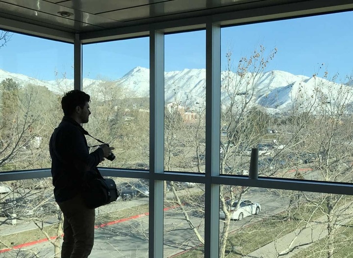
As part of a comprehensive interior remodeling, the Utah Museum of Fine Arts partnered with Last Call to carry their visual, communication, and wayfinding efforts through to the digital experiences offered by the museum.

We worked with the UMFA Marketing and Communications team to understand the personas of their visitors and to strategize the messaging and functionality needed to design and build a digital experience that could anticipate and provide needed information to the right visitor at the right time. This included identifying and prioritizing the most valuable calls to action desired by, and of, a visitor; building in strategy to persuade the visitor appropriately, directly, and contextually, to complete the goals that are mutually and wholly beneficial to the experience.

Last Call’s Creative team brought their expertise in Strategy, User Experieince, and Design to research, audit, and produce content structure and governance, functionality prototypes, and design deliverables. These deliverables were used in a two-day immersion visit, which culminated in a day of alignment with stakeholders, senior management, and the Marketing and Communications team. This exploration, research, and resulting strategy and design direction will act as the foundation informing the design and development of UMFA’s new digital experience, to launch in time for their annual membership drive and the reopening of their museum.

Kudos continue to roll in about the website… We just loving using it too.

Mindy Wilson, Marketing & Communications Director
Hide additional information on this project
Show additional information on this project Expand
The new RMA.edu.

Processes
  • Agile/Scrum
Team Leadership
  • Senior Architect
    Tom Fleming
  • Senior Development
    Tom Fleming

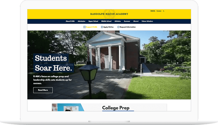
Randolph-Macon Academy desired a responsive digital experience that incorporated a consistent, compelling design focused on furthering the school’s mission, and that could easily be modified by appropriate staff with the proper permissions.

How we did it

We were able to deliver modern visual stylings and multimedia capabilities that loaded quickly and performed optimally, while incorporating best practices for analytics, social media integration, and search engine optimization.

Three layered screens show the landing page and secondary pages of the Randolph-Macon Academy website.

In addition to informing prospective students and their families about the school, the site met the needs of other important stakeholders such as current parents, current students, alumni, faculty, and staff— each of whom had their own needs from the site. The site also housed faculty and staff human resource forms and information, serving as an intranet behind the scenes.

Hide additional information on this project
Show additional information on this project Expand
National Census of Writing.

Processes
  • Agile/Scrum
Team Leadership

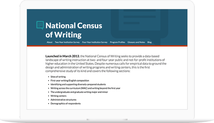
In the midst of sorting massive amounts of data for the National Census of Writing, Jill Gladstein of the Swarthmore College English Department called on Last Call Media to create a usable web data explorer for use by the general public and qualified researchers alike. Survey data was collected from respondents from over 900 higher education institutions. Census questions gathered data about curricular, administrative, and support structures of writing programs in the United States from March 2013 to October 2014.
How we did it

Census data is extremely important for the Higher Ed community, but the information is only as good as it is accessible. Working closely with the Swarthmore staff, LCM pinpointed what information was the most critical and sought after by administrators and researchers viewing the data. Graphs were designed to optimally visualize survey question responses and search functionality created to easily explore by survey question, institution type and related filters.

Tablet showing graphs from the National Census of Writing website.

The first iteration of the site launched in time for Swarthmore to unveil its functionality at the Council of Writing Program Administrators 2015 Conference to great praise. The site, in addition to the program’s work, has gone on to be featured in Inside Higher Ed being utilized by the general public, researchers and higher education institutions all over the country and is 508 compliant.

The Census is being utilized in ways we never expected.

Jill Gladstein, Swarthmore College English Department
Hide additional information on this project
Show additional information on this project Expand
A Drupal 7 Multi-site Migration to Acquia

Processes
  • Continuous Delivery
Team Leadership

LCM had the deep level of expertise needed to assist USM with a complex migration to Acquia

In preparation for an upgrade from Drupal 6 to Drupal 7, USM was faced with the need to migrate four Drupal sites based on five codebases from an onsite installation to a hosted environment with Acquia. USM was seeking an experienced group of Drupal architects to work hand-in-hand with their iTech team to determine the necessary functional and configuration changes needed to accomplish the migration. USM had a particular interest in leveraging Acquia’s search capabilities.

The University reached out to Last Call Media to drive the high-level technical planning and heavy lifting of a migration to the Acquia Cloud. The University needed a team with platform migration experience to come in and bridge the gap between Acquia and the University’s internal iTech team to ensure that the launch went smoothly. 

Aside from our experience and planning skills, there were several mission critical pieces of the overall infrastructure that needed to be changed to fit within Acquia’s ecosystem. One of these was the site search. USM had previously used a combination of several open source tools to feed data from several different sources into the site’s search engine. While this solution worked well, it was being cut in favor of Acquia Search, powered by Apache Solr. The University brought us in to build a search platform that would be capable of indexing the content of all of the Drupal sites, and searching either independently (within each site’s own content silo), or across the board. Working closely with the iTech team, we planned and executed the search feature within the new infrastructure, including the configuration of environment specific search, so the University team could iterate and test the site search in the development and staging environments before rolling new features to production. 

The final piece of the puzzle was to bring the site’s performance and security up to Acquia’s standards. We worked hard to make the vast majority of the content cacheable by Acquia’s edge layer, and brought iTech and Acquia representatives together to find resolutions for all of the issues surfaced by Acquia’s Insight reporting. At the end of this process, we performed a successful load test across all 4 sites, effectively proving the sites were ready for launch.

As launch day grew closer, we began to focus on the final details. With iTech’s help, we formulated a simple and clear launch checklist that would keep everyone on the same page when it mattered the most. When the final cutover was finished, we had almost no post-launch issues to address.

The work was completed on a timeline that allowed USM to minimize risk by switching to the new site while the University was on break. USM achieved their goal of a smooth migration to Drupal 7 on the Acquia hosting platform with no down time. 

Hide additional information on this project
Show additional information on this project Expand
Implementing A Digital Media Strategy With Measurable Results

Processes
  • Continuous Delivery
Team Leadership

Challenged to increase enrollment and retention, the University of Southern Mississippi looked to their existing ongoing relationship with Last Call Media for ways to implement a digital media strategy with measurable results. Last Call Media focused on building a new digital platform for the University that focused on increasing engagement with the University’s primary audiences: prospective and current students by implementing fresh designs with improved pathways and navigation. 

We already knew that USM.edu was an aging Drupal 6 site that was slow and difficult to update under the hood, but furthermore, site admins had little to no visibility into the performance of the platform, coupled with limited functionality and almost no reporting tools. Beyond Drupal 6 quickly becoming end-of-life from a development standpoint, USM agreed that from the marketing ROI perspective, it was time to move to Drupal 8. 

Due to Last Call Media’s long-standing working relationship with the University of Southern Mississippi, we were able to break ground quickly. The marketing and IT teams on USM and LCM agreed to work iteratively by first focusing efforts on launching a pilot site on Drupal 8 and prioritizing additional departments and colleges after the initial launch. This allowed the LCM team to formulate a focused yet creative digital strategy that would get into the hands of the USM audiences faster and allow for user feedback to inform future, more complex, development and content needs. Additionally, USM was able to communicate directly with the Acquia Certified Drupal 8 developers and architecture consultants at LCM, to provide expertise on best practices and development techniques. This direct line of communication with our certified team gave USM confidence in their ability to develop the new Drupal 8 platform alongside us. Some Acquia technologies we used on USM.edu are Acquia Cloud, Acquia Cloud Shield, Acquia Cloud Edge, Acquia Search, and Acquia Ready. The Acquia platform allowed USM to maintain a homogenous interface to their new Drupal 8 product and the workflow tools have allowed internal and external developers to collaborate in building new features and has made the quality assurance and release process consistent and seamless.

Since the relaunch of USM.edu on Drupal 8, feedback on campus has been overwhelmingly positive. The community was engaged and involved along the way, so it was a huge moment on campus when the site went live. 

There have even been some tangible technical results that the school benefited from almost immediately. One of the key results the site achieved was a sub-second page load for the homepage, despite using a video in the hero region. To accomplish this, we worked with the USM development team to obsessively reduce and minify front end assets, prefer CSS over images for presentational styling, and to lazy-load large assets not required for the initial pageview. Throughout the process, we tested using a front-end performance benchmarking tool (Phantomas) to keep us on track and efficient.
 

Though the LCM and USM teams were optimistic and bases were seemingly covered, the immediate success or failure of the site, however, rested on its ability to stay up during the initial launch. The University expected up to 85,000 visitors in a day due to our marketing efforts. To meet this goal, we developed and executed a load testing plan, giving the University the confidence and success they expected on launch day. Since its launch, the new USM.edu has been a huge victory and the University continues to see benefits from more in-depth reporting via Acquia, to site admin efficiency, all on a stable and supported Drupal 8 platform. 

Hide additional information on this project
Show additional information on this project Expand
Helping patients learn more about their options for medical professionals.
Processes
  • Continuous Delivery
Team Leadership

Helping patients identify and connect with a medical professional best suited for their needs.

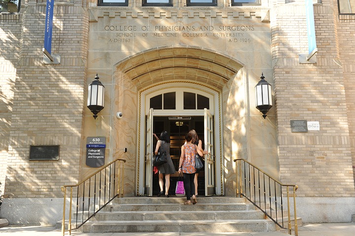
A key component of the web presence for Columbia Medical School is their faculty profiles. In keeping with their tripartite mission of teaching, research, and clinical work, the University displays two distinctly different types of profiles. Department web site profiles focus on the individual’s scholarly work and administrative positions. The ColumbiaDoctors website displays information about the physician’s clinical work including specialties, practice locations, and insurance. It is also just as important for new medical professionals to store and access their profile information in one place as it is for the departments and practices they are a part of. 

Maintaining a complex system with many data feeds and manual verification of information was becoming a burden for the University’s support staff, and the complexity of the process to create or update a profile was vexing to faculty and their support staff. Columbia University Medical Center looked to LCM to help them find a new solution. There was a preference for moving to an existing solution available in the marketplace rather than building a new custom solution. 

We embarked on an intensive information gathering phase, to better understand the existing technology, data inputs and outputs, and nature of the support queue. Through preparing user stories, we worked with the University to identify stakeholders groups, and we conducted detailed interviews with individuals in each group to understand their pain points within the existing system.

Finally, we conducted extensive research to identify potential solutions. We identified a number of peer institutions and investigated the faculty and physician profiles, and - to the extent possible - the technologies and workflows employed to create them. We contacted a number of vendors to gather more detailed information and winnowed the list of candidates to those that presented the best possible fit. We summarized our findings recommendations in our final meeting with the team.

By working closely with the team and developing a strong rapport with them, as well as the stakeholders, we were able to gain a clear understanding of their goals and deliver actionable recommendations 
 

By working closely with the team and developing a strong rapport with them, as well as the stakeholders, we were able to gain a clear understanding of their goals and deliver actionable recommendations to support CUMC’s business goals.