We're proud to provide Redesign services.

Hide additional information on this project
Show additional information on this project Expand
Reimagined on Drupal 8, in six sprints.

Processes
  • Agile/Kanban
  • Agile/Scrum
Team Leadership
  • Senior Producer
    Kelly Albrecht

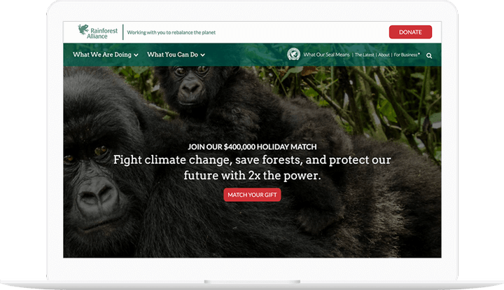
In the fall of 2016, the Rainforest Alliance and Last Call Media launched an exciting redesign of www.rainforest-alliance.org, built on Drupal 8, employing seasoned agile software development methodologies. Our productive partnership with the Rainforest Alliance resulted in a technically groundbreaking site that allowed users unprecedented access to the riches of their content after just four months of development. The tool is now primed to drive the Rainforest Alliance’s critical end-of-year development activities. 

People seem really, really happy with it. YAY!!

Danielle Cranmer, Web Manager

Over the years, RA has cultivated a repository of structured content to support their mission. While the content is primarily displayed as long form text, there is a wide variety of metadata and assets associated with each piece of content. One of the primary goals of the new site was to enable discovery of new content on the site through automatic selection of related content driven by the metadata of the content the user was viewing. Additionally, RA had a future requirement for advanced permissioning and publishing workflows to enable stakeholders outside of the web team to play a role in the content lifecycle.

Rainforest Alliance shown on phones

Drupal 8 was selected for this project based on several factors. First, its focus on structured data fit well with Rainforest Alliance’s need for portable and searchable content. Second, the deep integrations with Apache Solr allowed for a nuanced content relation engine. Solr was also used to power the various search interfaces. Third, Drupal has historically had powerful workflow tools for managing content. While these tools weren’t quite ready for Drupal 8 when we built it, we knew they would be simple to integrate when they were ready. In short, Drupal was a perfect fit for the immediate needs, and Drupal 8 met the organization’s longer term goals.
 

We’ve been getting lots or praise, internally and externally.  Brava, team!

Melissa Normann, Senior Manager Web Strategy and Development

At the close of Sprint 6, there were zero critical and only 3 moderate issues to address. The final Sprint/Project review had only 3 support questions, launching as arguably the most impressive Drupal 8 site launched within a year of the initial release of this latest major version on the Open Source CMS, and most importantly, in time for Rainforest Alliance’s major end-of-year donation campaign. The site delivers on its promise to showcase the Rainforest Alliance’s exciting and informative messages and beautiful imagery, and stands as testimony for the efficacy of the agile approach.

Read the full case study here.

Hide additional information on this project
Show additional information on this project Expand
Branding and design for site and event collateral.
Processes
  • Continuous Delivery
Team Leadership
  • Art Director
    Colin Panetta

Last Call Media makes it a priority to give back to the Drupal community, so we were excited when the nice folks at Baltimore Drupal Camp reached out to us for branding and design.

Getting alignment

For the discovery phase, we had some in-depth conversations with the team at Baltimore Drupal Camp about design trends on the web, and which ones we wanted to explore for this project. We decided that the designs should express both the historic and the punk sensibilities of Fells Point, the neighborhood the event was to take place in, while also paying homage to Frederick Douglass, as the venue was the great Frederick Douglass-Isaac Myers Maritime Park.

Drupal Boh logo

Baltimore Drupal Camp had in previous years done a few mash-ups of the Drupal and National Bohemian logos in previous years (the National Bohemian logo being the unofficial logo of Baltimore), and we were excited to try our hand at it. We produced a clean, durable logo that was used in all our subsequent material and that the Baltimore Drupal Camp also adopted for use across their social media platforms. Baltimore’s own Not Mr. Boh even gave it a shout-out on Twitter.

The Drupal and National Bohemian logos combining into the Drupal Boh logo

Illustrations

In order to capture the historic and punk aspects of Fells Point that we discussed during discovery, we produced a series of gritty, vibrantly colored illustrations for use as visual assets on the site.

Illustration of a raven holding a feather in its mouth

Illustration of Fells Point

Illustration of a historic shipSite Design

Taking both the direction we established in discovery and the assets we generated, we produced a design deliverable for the Baltimore Drupal Camp website. Because the site would change so much as the event got closer (and “Submit Your Session” became “Schedule”, among other changes) we needed to deliver a wide-ranging design that would account for multiple versions of the site.

Designs for the Baltimore Drupal Camp site

Portion of Baltimore Drupal Camp site design that includes Frederick Douglass
We included this powerful quote from the great Frederick Douglass in the site design.

We worked with the team at Baltimore Drupal Camp while we created the designs and formatted them for handoff, enjoying a productive information exchange about tools and process while we were at it.

There aren’t enough words of thanks for Colin and Last Call Media. Amazing site design, fabulous t-shirts, awesome stickers! You are Drupal!

Liz Lipinski, Baltimore Drupal Camp

Event Material

We were thrilled to see the aesthetic and assets we generated for this project in use on event collateral on the day of the camp itself. Congrats to the Baltimore Drupal Camp on a successful 2016!

Baltimore Drupal Camp stickers with Drupal Boh icon

Baltimore Drupal Camp shirts with historic ship drawing

Room at Baltimore Drupal Camp with sign

Birds of Feather sign at Baltimore Drupal camp with raven illustration

Hide additional information on this project
Show additional information on this project Expand
A new design for PVPC.

Processes
  • Continuous Delivery
Team Leadership
  • Senior Producer
    Colin Panetta
  • Art Director
    Colin Panetta

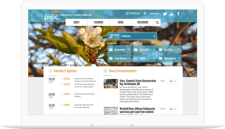
The Pioneer Valley Planning Committee, the regional planning body for the Pioneer Valley region, which encompasses 43 cities and towns in the Hamden and Hampshire county areas of Massachusetts, asked LCM to redesign their aging Drupal site with a new look and feel and to also be compliant with new government regulations surrounding content and site accessibility.

Working with PVPC 

We took the project from initial discovery and strategy through information architecture, design, and development. We were able to deliver a compelling, modern, and effective design, with PVPC’s target users in mind. Our discovery and strategy informed a new design for improved site navigation and menu structure, re-working the existing navigation system to create a more fluid experience visiting the site.

Hide additional information on this project
Show additional information on this project Expand
Redesigning the College of Biological Sciences.

Processes
  • Agile/Scrum
Team Leadership
  • Senior Producer
    Kelly Albrecht
  • Senior Architect
    Tom Fleming
  • Senior Development
    Tom Fleming
  • Art Director
    Colin Panetta

Developing a digital media strategy with measurable results.

Challenged to increase enrollment, the College of Biological Sciences at the University of Minnesota looked to Last Call Media for ways to develop a digital media strategy with measurable results. Last Call Media focused on increasing engagement with CBS’ primary audiences— prospective and current students— by implementing fresh designs with improved pathways and navigation. LCM also coordinated the final migration and deployment of the site to the University’s Acquia platform.
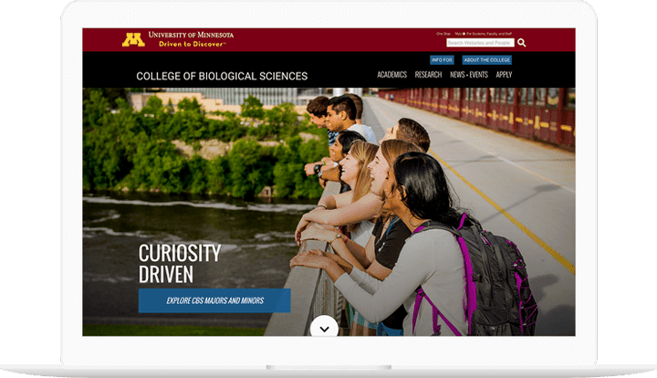
Working with CBS, we took the project from initial discovery and goal validation through information architecture, design, and development.

We were able to deliver a compelling, modern, and effective site. With CBS’s target users in mind, Last Call Media improved site navigation and menu structure, re-working the existing navigation system to create a more fluid experience visiting the site.

The site was launched in summer, in time to function as an active recruitment tool for the school year. After receiving consistent positive feedback, CBS and LCM received an award for the design and functionality. The CBS team has continued to add and manage new content on top of the sound foundation built by Last Call Media.

Hide additional information on this project
Show additional information on this project Expand
The new RMA.edu.

Processes
  • Agile/Scrum
Team Leadership
  • Senior Architect
    Tom Fleming
  • Senior Development
    Tom Fleming

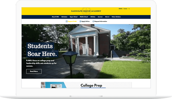
Randolph-Macon Academy desired a responsive digital experience that incorporated a consistent, compelling design focused on furthering the school’s mission, and that could easily be modified by appropriate staff with the proper permissions.

How we did it

We were able to deliver modern visual stylings and multimedia capabilities that loaded quickly and performed optimally, while incorporating best practices for analytics, social media integration, and search engine optimization.

Three layered screens show the landing page and secondary pages of the Randolph-Macon Academy website.

In addition to informing prospective students and their families about the school, the site met the needs of other important stakeholders such as current parents, current students, alumni, faculty, and staff— each of whom had their own needs from the site. The site also housed faculty and staff human resource forms and information, serving as an intranet behind the scenes.

Hide additional information on this project
Show additional information on this project Expand
Redesign and upgrade for Dr.G.

Processes
  • Continuous Delivery
Team Leadership
  • Senior Producer
    Kelly Albrecht
  • Senior Development
    Tom Fleming

An upgrade to increased conversions, better sales, and more flexibility.

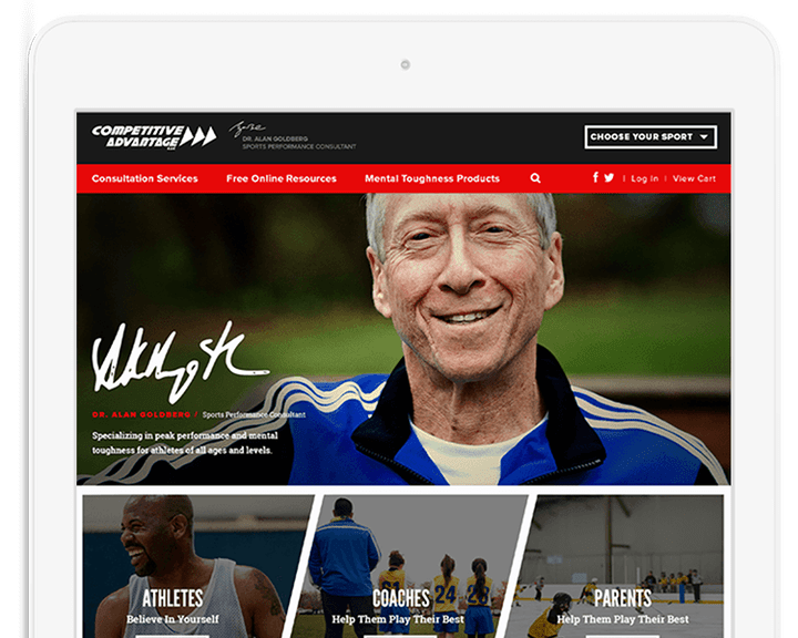
Competitive Advantage was experiencing a decline in their online sales. Their existing website was outdated and originally built as hundreds of static HTML pages, some inconsistent with the others. Additionally, the main site was originally laid over top of an aging proprietary eCommerce solution that wasn’t serving their needs or their customers well.

We worked with Competitive Advantage to update the design of their website, port it to the most current version of Drupal, and migrate away from their former eCommerce system to Commerce. Improvements to the checkout workflow were implemented, product images were updated, and full content control was given to Competitive Advantage to maintain product copy.

Three iphones show the Competitive Advantage homepage on mobile.

Since the transition, Competitive Advantage has seen their eCommerce sales far exceed their expectations and more than double in volume from their previous site.

We truly appreciate everything you have done for us.

Dr. Alan Goldberg, Sports Performance Consultant
Hide additional information on this project
Show additional information on this project Expand
The Technology Transfer Office rebrand.

Processes
  • Continuous Delivery
Team Leadership
  • Senior Producer
    Kelly Albrecht
  • Senior Development
    Tom Fleming

The Technology Transfer Office (TTO) at the University of Massachusetts was seeking a total rebrand. They needed to divorce themselves from a department image that had become stale and tired. They replaced a large portion of their staff, brought in new fresh ideas and leadership, and wanted to demonstrate their successful internal restructuring through a bold new website.

We were hired to build a new corporate identity package including logos, branding, a slogan, and a website.

Launching later that fall, we successfully captured the spirit of the restructured department and brought forward their mission to help inventors, artists, and forward-thinkers to access patents, copyrights, protections, and most importantly, attention to their creations.

I’m impressed with the clean look, bold photos and functional organization. The mobile version is especially cool, and is really usable.

Robert MacWright, Director, Technology Transfer Office, University of Massachusetts Amherst
Hide additional information on this project
Show additional information on this project Expand
Brand New NERDy!

Team Leadership
  • Art Director
    Molly Taaffe

Rethinking the Lil NERDy character

NERD has used the Lil NERDy character for a long time, but we felt the character could use a little refresh for the 2020 NERD Summit. We wanted to bring a warmer more illustrative tone to Lil NERDy, and give the event a unique theme that helped to express the values and mission of NERD.


Bringing a refreshed NERDy to life

We brainstormed several ideas but landed on a theme around cooking and food. This theme is rich with metaphors about working together, each ingredient adding to the final result, and a robust menu of content for attendees. From there we started sketching layouts. It turned out that Lil NERDy looked really cute in a chef’s hat!

lil NERDy character slicing a tomato over their head

We tried to produce images that spoke to the metaphorical meanings of the theme. NERDys sharing food, cooking together, or adding lots of ingredients. We also created some custom images, such as the call for volunteers, and hackathon email images.


Nerdy cooking with child
Nerdys sharing pizza

Remixing an existing character was a challenge, because it had to remain true to the feeling of the mascot, but also be refreshed enough that it was clear 2020 had a unique look and theme. We had to establish rules, such as the eyes always being darker than the body color, to make sure they looked cheerful and lighthearted, and hands and feet being simple shapes.
 

2020 NERD Summit Tee Design

Another element we brought to this theme was patterned backgrounds. We illustrated foods and cooking tools, and added them behind event collateral, to add another dimension to the illustrations when used in emails and on social media. This added depth to the imagery, and consistency to event collateral.

Food Pattern for NERD Summit 2020


We were able to create a library of Lil NERDys, supplemented by two patterns, that tied into the theme and were informative in the event marketing materials and collateral. NERD Summit had to make a quick pivot due to Covid-19, and was a remote event. We were still able to utilize Lil NERDy across many digital assets and bring some warmth to a then-unfamiliar new event type.

Hide additional information on this project
Show additional information on this project Expand
Bringing buyers and sellers closer together.
Processes
  • Agile/Kanban
Team Leadership

As the world’s largest independent marketplace for digital advertising, AppNexus delivers powerful enterprise technology for buyers and sellers of digital ads. The marketing team at AppNexus needed a robust digital platform to communicate their value, experience, and products to bring potential ad buyers and sellers together to support their goal of creating a better internet.

After the completion of a series of creative exercises, the LCM team delivered a modern, dynamic, global rebrand of AppNexus.com in fewer than 5 weeks. The platform tested well with key audiences and led to tangible positive business outcomes for AppNexus, including helping facilitate their multibillion-dollar acquisition by AT&T

Theming swiftly and efficiently with components 

One of the major outcomes of this project was a dynamic yet simple to use site building experience for content authors and theming experience for front-end developers. A component-based approach allows AppNexus to browse a library of reusable content patterns to build pages that are on-brand throughout the site while also making it easier for front-end developers to implement creative feedback. 

Using Mannequin, our component library tool, the front end team was able to focus on standard front end technology without worrying about CMS implementation details to quickly theme the front end using paragraphs. This was useful as many of the front end developers on the team were not familiar with Drupal but were able to theme parts of the site easily using Mannequin. 

The homepage animations, a critical piece to the visual experience, were delivered by the front end team who used particles.js. 


Managing first impressions and talent recruitment in one spot

To support their rapid growth strategy, AppNexus needed a robust careers section, “Life at AppNexus”. The careers section highlights the authentic employee experience at AppNexus, the various teams, the application process, and clear calls to action to their Applicant Tracking System (ATS), COMPAS, which is embedded in the Drupal CMS. Job applications are pulled in from COMPAS. With this new talent acquisition initiative in place, AppNexus is able to efficiently promote itself as a desirable place to work and creating a positive first impression for prospective candidates, leading to increased direct hires. 

Increasing analytical visibility using Marketo

By implementing a Marketo integration that sends form responses directly into predefined workflows in AppNexus’ CRM, we were able to give more visibility into valuable business analytics that were not previously captured. AppNexus was also able to utilize their content more effectively for lead generation, by introducing gated content such as whitepapers.

With multiple vendor involvement and a tight timeline, the AppNexus project had a lot of moving parts from the start. Even with frequent changes, LCM, the creative agency, and AppNexus benefited from a frictionless, highly collaborative, and efficient working relationship, which lead to a compelling and well built finished product. 

Hide additional information on this project
Show additional information on this project Expand
Learning Page Redesign.

Processes
  • Agile/Kanban
  • Agile/Scrum
Team Leadership
  • Senior Producer
    Kelly Albrecht

Working with the International Land Coalition gave us another opportunity to use our agile design process, generating ideas and a few unique solutions.

ILC has a lot of work going on around the world and we wanted to give users a way to explore the content on the site about each specific project that’s going on and the members involved.

Our approach was to focus in on the exploration aspects. What would give users the best sense of context of these global projects? How do we give attention to the members involved? What’s the best experience for sorting through the variety of project categories, subcategories and locations? And how do we present all this information without overwhelming the user?

How We Did It.

Building a relationship at the start

It was crucial we let ILC know that this is a journey we’ll both overcome together and they have our full support, as well as expertise with regards to questions or insight. They had many different goals for the project, but with the specifics undefined, we worked with them to help figure out the details and create a fully-realized vision.

The project’s dynamic was healthy constant dialogue between our creative team and everyone on the ILC team. We listened to their insights, we heard the things we needed to consider and the parameters we should work within. As things progressed, we started checking off the points on everyone’s checklists in order to be confident about the direction we were going.

First problem: Tools for finding relevant content

As mentioned before, ILC has many internal organizational projects. We needed an experience that helped users easily find content relevant to them. We mocked up a few ideas for a filter mechanism then iterated, each time pointing out the pros and cons then making changes specific to the drawbacks. This was our solution:

Image of ILC Filter
Image of ILC Learning Page Filter

The thought process behind it was pretty straight forward. Present a lot of options and information without overwhelming the user, make it accessible while browsing and allow some filter terms to tell their own story on hover. It took a few tries to get here, but we believe it accomplishes those goals.

Second problem: The Map

I mentioned context earlier, during the project we decided a map did a great job of showing the global reach of ILC.  We utilized the core framework of an existing map on their website but completely redesigned the visuals and added a little more functionality. On first load, we show users the globe with a few markers showing the number of their members. Users from there have the ability to zero into an area or region of interest, finding which member(s) are doing work and what the projects going on in those areas are. Here’s the break down:

Image of ILC Learning Page map

Our work was well received by the ILC board and our solutions for giving their site users the best sense of context of resource content from all over the globe was deployed on time and budget. Site users are now experiencing new ways to learn about ILC members through new ways of exploring a variety of categories and locations.