We're proud to provide User Experience services.

Expand
Improving the Drupal authoring experience.

Processes
  • Continuous Delivery
Team Leadership
  • Senior Producer
    Kelly Albrecht
  • Senior Architect
    Colin Panetta
  • Art Director
    Colin Panetta

In our engagement with Mass.gov, Drupal is essentially the product being developed and operated in.

So we had to ask ourselves, “In what ways can we make Drupal better for our customers, to give them a better experience, get better feedback from them, and build that relationship?”

The Commonwealth of Massachusetts embarked on a large-scale web replatform to modernize and make it easier to continuously improve the way the Commonwealth engages with and provides services to its constituents online. By improving the user experience for its constituents, and providing, as comprehensively as possible, a “single face of government”, Mass.gov® has become an essential platform in the Commonwealth’s ability to serve its constituents by delivering information and critical day-to-day social services to the Commonwealth’s 6.8 million people. With 15 million page views each month, the Mass.gov platform hosts over 400+ government agencies and content to support anyone who wants to move, visit, or do business in the state. All of which is fueled by the Commonwealth’s 600+ content authors, who have been able to use the platform to improve constituent satisfaction, making a noticeable positive difference on how the public sees their organization and the services they provide.

As early adopters of Drupal 8, Mass.gov and its ecosystem of web properties are the primary platforms for the delivery of government services and information in the Commonwealth of Massachusetts. 
 

Wicked awesome content

The Commonwealth of Massachusetts was faced with a difficult to use web experience that stood in the way of a constituent base that wanted to interact with government services through the web. The goal was set to create new primary face of Massachusetts government that was constituent centric to enable fast, easy, and wicked awesome interactions with state services.

Prior to the migration to Drupal 8, the Commonwealth’s antiquated, proprietary content management system reflected its internal hierarchical structure instead of organizing content in a way that made sense to its visitors. That meant, for example, that a visitor looking to start a business in Massachusetts had to visit four or more separate department sites in order to get started. The Commonwealth sought to improve the user’s experience by focusing on guiding the visitor through the various services the Commonwealth provides over helping them navigate the complexities often found in a massive state organization. 

Massachusetts Digital Service (MassGovDigital) had two core philosophies that drove their decision making: focus on the constituent experience and use data to support all decisions. They envisioned a unified user experience, where tasks like preparing to renew a driver’s license matched the ease of use of shopping on a major retail website. The MassGovDigital team was challenged to apply private-sector data analytics savvy, like defining and tracking constituent “conversions.” Gaining access to analytics at their fingertips was key for site authors to make fully-informed decisions to optimize their content for readers. A high-performing site search would ensure content findability. 

Last Call Media and the MassGovDigital teams worked together to improve the Drupal authoring experience in order to deliver the next chapter of the state’s digital future. The end result represents a significant leap towards the goal of a new primary face of Massachusetts government that centers on constituents—enabling fast, easy, and wicked awesome interactions with state services.

Improving the Drupal authoring experience

If you can improve the authors’ ability to create and improve content, then the constituents will be better enabled for fast, easy, and wicked awesome interactions with state services. For Last Call Media, improving the authoring experience meant a better interface for communicating data about each piece of content. This data was a mix of content scoring and direct feedback from constituents. For example, a site visitor submits the feedback form (available on any page) and says whether they found the page to be helpful or not (“Did you find what you were looking for on this webpage?”). The raw data goes into the calculation of their “grades.” The raw feedback comments also become visible in a tab in the editor interface, where the editor can focus in on what is or isn’t working well about the page. Surfacing this data, along with making the interfaces more intuitive and the content easier to add and manage, enabled authors to more rapidly improve their content in a more targeted way. According to ForeSee results, the release of the reimagined authoring experience directly correlated with a never before seen increase in Customer Satisfaction.


Retheming Drupal’s default admin site was a critical opportunity to improve usability for authors. With a pattern library, Last Call Media applied these improvements at a large scale without the prohibitively high effort of creating designs for every single page. Paying extra attention to vertical spacing intervals Last Call Media created a clearly defined page hierarchy. At the same time, flipping the brand color scheme provided a user experience that’s consistent with the main site, yet unique.

Screenshot of new branding guidelines being created


By using a shared design vocabulary, these ideas could be applied site wide—even the pages that weren’t yet designed—to start development and apply the broad strokes to the theme, while the design team focused on some areas of the site that required more attention for usability. Faced with the challenge to deliver complex content with forms assembled from a number of differently-styled modules, form elements became a focus area. In addition to a unified styling system to improve usability for all form elements, horizontal lines now mark the end of one form element and the beginning of the next. Vertical lines do the same for nested re-orderable elements.

A clear path to publish content 

Last Call Media also created a new and improved version of the Admin Toolbar to streamline navigation for content editors and creators. In addition to the Admin Toolbar module, a separate custom toolbar module specific to the Admin Theme was created to handle customizations. Now, buttons provide easy access back to the login page, with a separate button to return to the main site. A custom tab directs content editors to their most important pages.

The Mass.gov Admin Theme homepage
The final “home page” of the Admin theme for Mass.gov.

Before, there was no direct way for authors to quickly access their top two pages: the page to add content and the page to create new documents. To balance that functionality with a slim line top bar experience, buttons were added to those pages right to the tab menu. Last Call Media built a custom “Add Content” page with attentional experience in mind; Mass.gov, at the time of this project, had about 35 content types for an author to scroll through. 

Screenshot of filtered "Content Add" screen
Using the search box, content editors can filter the types of content they want to add.

A faster and easier authoring experience has allowed authors to keep improving and adding to their content. This keeps constituents in the know and continues to grow Mass.gov as a single source of all the information they need to interact with government services. Read more about how Last Call Media did this here.

Outcomes

  • Leading the Way Among State Government Websites: Mass.gov placed 3rd nationwide in a review of 400 state government websites by ITIF and was recognized for performance in page-load speed, mobile friendliness, security, and accessibility.  
  • Constituent-Centric UX: Produced 23 content types using structured content to ensure consistent and constituent-centric UX.
  • Huge improvements in both the front and back end performance: We achieved a 50% overall improvement in the back end performance, and a 30% overall improvement in the front end performance all while maintaining content freshness.
  • Empowering Content Authors With an Improved Drupal Admin UI: Updating, adding, and reviewing content moved from requiring technical expertise to being open and usable to non-technical subject matter experts. Now, hundreds of users login to Mass.gov each week to update, add, and review content performance to support the services their organization provides to the people of the Commonwealth. 
  • Streamlined on-boarding with guided tours: A series of guided tours support a refined publishing process, which accelerated on-boarding new content authors. 
  • Collecting Insights from User Feedback: Verbatim content feedback from constituents is now available to authors, and feedback helps create content performance scores in an improved Drupal admin interface. 

Key features and functionality 

Reimagined authoring experience

  • Content Categories: Content types were organized into categories and jump-links to them can be found on the “Add Content” page.
  • A Deeper Search: Custom search functionality sorts through both the content type names and the description text.
  • Clear Visualization and Direction: A “thumbnail” example of each content type shows authors a sample preview. Cleaner and more strategically-positioned description texts give easy-to-follow direction.
  • Extra Guidance: Links to Mass.gov’s document site provide additional information about each content type, including how it’s used, tips for creating new content, and links to live examples.

New welcome page experience for authors


Key Drupal Modules

Why these modules/theme/distribution were chosen

Flag: Used to notify editors about content updates. 
Paragraphs: Used to guide authors in creating structured and reusable content.
Tour: Used to improve the authoring experience by introducing them to the functionality of their content types.
Tour UI: Used to assist Product Owners and Customer Success in tailoring Tours as needed, based on customer feedback, minimizing the interruption to the feature development work stream.
Pathologic
Redirect: Having migrated from a very large legacy site with a long history, Redirects were a critical consideration.
TFA
Password Policy
Metatag
Seven: Hooking in to Seven, a Drupal 8 theme, provided a base that is maintained and receives security updates from the Drupal community. One of the main challenges in building an admin theme for Drupal are the number of modules that require different user interfaces; some modules make minor tweaks to the UI to meet their needs, but some create their own from scratch. It’s very difficult for an admin theme to support all of these use cases without something breaking, let alone making the UX cohesive. By creating the theme from Seven, Last Call Media ensured that it wouldn’t unexpectedly break module UIs for modules that we hadn’t even anticipated needing yet, and it makes sure not to be breaking anything that’s already there.
 

Final Thoughts

Currently, Last Call Media is a leading digital agency working to transform Mass.gov’s digital platform and strengthen government-constituent interaction. This provided technical architecture leadership to develop and support the new digital platform, by working closely with the MassGovDigital internal team and several other vendors. 

Over the past 12-months, by relying on constituent feedback and analytics and a commitment to collaboration and flexibility, the teams have been able to improve constituent satisfaction with Mass.gov month over month, according to data collected by Foresee.
 

Expand
Massive performance wins.

Processes
  • Continuous Delivery
Team Leadership

Last Call Media team members were invited to join the Digital Services team at Mass.gov, to help them operationalize their Drupal 8 platform following the public launch.

Mass.gov is the website of the Commonwealth of Massachusetts. The primary stakeholders are the constituents who visit the website, and the state organizations who publish content on and visit the website for aspects of their job. It receives upward of 15 million page views a month and changes to the site are released twice weekly by a team of developers. The traffic profile for the site is interesting, yet very predictable. The vast majority of the site traffic occurs between 8:00 am and 8:00 pm during the business week. Site editors are working during the business day (9:00 am - 5:00 pm), and releases happen after the work day is over (after 8:00 pm). On analytics graphs, there are always five traffic spikes corresponding with work days, except when there is a holiday—and then there are four.

LCM assisted in making some pretty dramatic changes on both the front and back end of the site; every action we took was in service of either site stabilization or improving content “freshness.” State employees need to be able to publish content quickly, and constituents need fast access to the information that’s being published, without disruptions while they’re visiting the site. These two needs can be considered opposing forces, since site speed and stability suffers as content freshness (the length of time an editor waits to see the effect of their changes) increases. Our challenge was to find a way to balance those two needs, and we can break down our progress across an eight-month timeline:

September, 2017

The new Mass.gov site launched after roughly a month in pilot mode, and we saw an increase in traffic which corresponded with a small response time bump. The site initially launched with a cache lifetime of over an hour for both the CDN and the Varnish cache. This meant that the site was stable (well insulated from traffic spikes), but that editors had to wait a relatively long time to see the content they were publishing.

November, 2017

We rolled out the Purge module, which we used to clear Varnish whenever content was updated. Editors now knew that it would take less than an hour for their content changes to go out, but at this point, we still weren’t clearing the CDN, which also had an hour lifetime. Site response time spiked up to about two and a quarter seconds as a result of this work; introducing “freshness” was slowing things down on the back end.

December, 2017

We realized that we had a cache-tagging problem. Authors were updating content and not seeing their changes reflected everywhere they expected. This was fixed by “linking up” all the site cache tags so that they were propagating to the pages that they should be. We continued to push in the direction of content freshness, at the expense of backend performance.

To address the growing performance problem, we increased the Drupal cache lifetime to three hours, meaning Varnish would hold onto things for up to three hours, so long as the content didn’t get purged out. As a result of our Purge work, any content updates would be pushed up to Varnish, so if a page was built and then immediately updated, Varnish would show that update right away. However, we saw very little performance improvement as a result of this.

January, 2018

Early in the month, we experienced a backend disruption due to some JavaScript changes that were deployed for a new emergency alert system. In development, we added a cache-busting query parameter to the end of our JSON API URL to get the emergency alerts. However, in the production environment, we were adding one additional, completely uncached request for every person that hit the site. As a result of this relatively minor change, the backend was struggling to keep up (although constituents saw almost no impact because of the layered caching). This illustrated the importance of considering the performance impact of every single PR.

Careful study of the cache data revealed that each time an editor touched a piece of content, the majority of the site’s pages were being cleared from Varnish. This explained the large spike in the response time when the Purge work was rolled out, and why raising the Drupal cache lifetime really didn’t affect our overall response time. We found the culprit to be the node_list cache tag, and so we replaced it with a system that does what we called “relationship clearing.” Relationship clearing means that when any piece of content on the site is updated, we reach out to any “related” content, and clear the “cache tag” for that content as well. This let us replace the overly-broad node_list cache tag with a more targeted and efficient system, while retaining the ability to show fresh content on “related” pages right away. The system was backed by a test suite that ensured that we did not have node_list usages creep back in the future. This earned us a massive performance boost, cutting our page load time in half.  

We found that the metatag module was generating tokens for the metatags on each page twice. The token generation on this site was very heavy, so we patched that issue and submitted the patch back to Drupal.org.

February, 2018

We had another backend disruption due to some heavy editor traffic hitting on admin view; our backend response time spiked up suddenly by about 12 seconds. A pre-existing admin view had been modified to add a highly desired new search feature. While the search feature didn’t actually change the performance of the view, it did make it much more usable for editors, and as a result, editors were using it much more heavily than before. This was a small change, but it took what we already knew was a performance bottleneck, and forced more traffic through it. It demonstrates the value of being proactive about fixing bottlenecks, even if they aren’t causing immediate stability issues. It also taught us a valuable lesson—that traffic profile changes (for example, as a result of a highly desired new feature) can have a large impact on overall performance.

We got a free performance win just by upgrading to PHP 7.1, bringing our backend response time from about 500 milliseconds down to around 300.

We used New Relic for monitoring, but the transaction table it gave us presented information in a relatively obtuse way. We renamed the transactions so that they made more sense to us, and had them broken down by the specific buckets that we wanted them in, which just required a little bit of custom PHP code on the backend. This gave us the ability to get more granular about what was costing us on the performance side, and changed how we started thinking about performance overall.

We added additional metadata to our New Relic transactions so we could begin answering questions like “What percentage of our anonymous page views are coming from the dynamic page cache?” This also gave us granular insight on the performance effects of changes to particular types of content.

We performed a deep analysis of the cache data in order to figure out how we could improve the site’s efficiency. We broke down all the cache bins that we had by the number of reads, the number of writes, and the size. We looked for ways to make the dynamic page cache table, cache entity table, and the render cache bin a little bit more efficient.

We replaced usages of the url.path “cache context” with “route” to make sure that we were generating data based on the Drupal route, not the URL path.

On the feedback form at the bottom of each page on the site, the form takes a node ID parameter, and that’s the only thing that changes when it’s generated from page to page. We were able to use “the lazy builder” to inject that node ID after it was already cached, and we were able to generate this once, cache it everywhere, and just inject the node ID in right as it was used.

We took a long hard look at the difference between the dynamic page cache and the static page cache. Without using the Drupal page caching, our average response time was 477 milliseconds. When we flipped on the dynamic page cache, we ended up with a 161 millisecond response, and with the addition of the static page cache, we had a 48 millisecond response. Closer analysis showed that since Varnish already handled the same use case as the Drupal page cache (caching per exact URL), the dynamic page cache was the most performant option.

We automated a nightly deployment and subsequent crawl of site pages in a “Continuous Delivery” environment. While this was originally intended as a check for fatal errors, it gave us a very consistent snapshot of the site’s performance, since we were hitting the same pages every night. This allowed us to predict the performance impact of upcoming changes, which is critical to catching performance-killers before they go to production.

As a result of all the work done over the previous 5 months, we were able improve our content freshness (cache lifetime) from 60 minutes to 30 minutes.

April, 2018

We enabled HTTP2, an addition to the HTTP protocol that allows you to stream multiple static assets over the same pipeline.

We discovered that the HTML response was coming across the wire with, in some cases, up to a megabyte of data. That entire chunk of data had to be downloaded first before the page could proceed onto the static assets. We traced this back to the embedded SVG icons. Any time an icon appeared, the XML was being embedded in the page. In some cases, we were ending up with the exact same XML SVG content embedded in the page over 100 times. Our solution for this was to replace the embedded icon with an SVG “use” statement pointing to the icon’s SVG element. Each “used” icon was embedded in the page once. This brought pages that were previously over a megabyte down to under 80 kilobytes, and cut page load time for the worst offenders from more than 30 seconds to less than three seconds.

We reformulated the URL of the emergency alerts we’d added previously to specify exactly the fields that we wanted to receive in that response, and we were able to cut it down from 781 kilobytes to 16 kilobytes for the exact same data, with no change for the end users.

We switched from WOFF web fonts to WOFF2 for any browsers that would support it.

We used preloading to make those fonts requested immediately after the HTML response was received, shortening the amount of time it took for the first render of the page pretty significantly.

We added the ImageMagick toolkit contrib module, and enabled the “Optimize Images” option. This reduced the weight of our content images, with some of the hero images being cut by over 100 kilobytes.

We analyzed the “Did you find what you were looking for?” form at the bottom of every page, and realized that the JavaScript embed method we were using was costing our users a lot in terms of bandwidth and load time. Switching this to a static HTML embed with a snippet of JavaScript to submit the form had a dramatic improvement in load time.

The Mass.gov logo was costing the site over 100 kilobytes, because it existed as one large image. We broke it up so that the image of the seal would be able to be reused between the header and the footer, and then utilized the site web font as live text to create the text to the right of the seal.

Additional efforts throughout this time included:

  • Cleaning up the JavaScript. We found an extra copy of Modernizer, one of Handlebars, and a lot of deprecated JS that we were able to get rid of.

  • We removed the Google Maps load script from every page and only added it back on pages that actually had a map.

  • We lazy-loaded Google search so that the auto-complete only loads when you click on the search box and start typing.

Our work across these eight months resulted in huge improvements in both the front and back end performance of the Mass.gov site. We achieved a 50% overall improvement in the back end performance, and a 30% overall improvement in the front end performance. We continue to work alongside the Digital Services team on these and other efforts, striving for the best possible experience for every single user and constituent.

See the BADCamp presentation about this work here.

Expand
Paid Family and Medical Leave for the Commonwealth of Massachusetts

Processes
  • Agile/Kanban
  • Agile/Scrum
Team Leadership
  • Senior Producer
    Kelly Albrecht

Last Call Media joined the Commonwealth’s Department of Family and Medical Leave (DFML) to implement new technology for assuring the stability of PFML claims intake and administration in time for launch of the New Year’s Day deadline.  

Last Call’s focus was to facilitate communication, quality control, and confidence among the teams—establishing an “End to End” vision of the applicant journey that crossed multiple layers of technology. Last Call Media was one of several teams that came together with DFML to achieve the ultimate goal of the project: to create a system that made applying for and managing PFML claims as easy as possible and to achieve a required careful orchestration between the teams working on the discrete components.

Earlier in the year, Last Call Media worked with the Massachusetts Department of Unemployment Assistance on a project in which we implemented automated testing and other automation processes. Word of the successful outcomes traveled through departments. When it came time to enhance the DFML’s program with DevOps automation, they contacted LCM.

What the DFML had was a team of teams each optimized to their own workflows and working on individual pieces of one greater product. The component-based team model increases efficiency as the larger technical foundations of a product are built, yet the integrations between those components can become a blind spot needing special consideration: integration testing was a known need in the project strategy. Last Call Media was brought on to be the integration testing team, and we knew from experience that concentrating testing of all functionality to a separate group, and as a final “phase” all work must pass through, leads to surprise issues arising too late in the life of the project. This was important as the timeline was one of the most important factors of this project: constituents needed to be able to apply for PFML benefits on January 1, 2021, no matter what.

As we began to work with the existing teams, we saw exactly what we could bring to the table: a strong strategy, clear approach, and defined process for integrating all work across every team, and systematically testing that work, as early in the development process as possible, so that fully tested product releases could be done with confidence and ease.

There were four main aspects of this project that needed to be considered in order to achieve success:

  • The claimant portal, built using React, where constituents would be able to submit PFML claims and receive updates about the status of those claims,
  • The claim call center, where customer service representatives would take calls from claimants and enter their claim information into the claimant portal,
  • The claims processing system, the tool in which customer service representatives can process PFML claims via a task queue (and which is fed information from the portal, call center, and other third-party tools), and
  • The API that would bring all of these parts together to work seamlessly.

Then, of course, there’s the testing. LCM began our work by establishing three types of tests that all project work would need to pass in order to be considered complete:

  • End-to-End (E2E) testing: automated continuous verification of the functionality and integration of all 4 systems.
  • Load and Stress testing: verifying the E2E functionality and integration under substantial strain to see what the system can sustain, where it breaks, what breaks it, etc.
  • Business Simulation testing: verifying if the people behind the scenes who will be doing this work on a daily basis can effectively perform said work with the systems and functionality that have been put into place, and whether this work can be performed when there is a substantial amount of it.

As we worked to set up the proper tests for the product, we found many opportunities to gain alignment across all of the development teams with our overall testing philosophy: it should be a part of each team’s workflow instead of a final phase removed from the team(s) performing the work. We helped coach each team on delivering value incrementally, and their eventual ownership of where the E2E testing suite impacts their work. LCM brought testing to the program and enabled the teams to absorb it as their own.

I have been impressed with you and team from day 1.

Matthew Kristen, Executive Program Manager, State of Massachusetts

Last Call Media came to the PFML project not just to establish automated testing, but to ask timely, hard questions about how the program was managing dependencies, how the sequencing of each team’s deliverables was planned, and how completed work was being demonstrated; when something wasn’t previously considered or prioritized, LCM made sure to find out why. Through the understanding that our experience in DevOps and application readiness affords us, we sought to shine a light into the cracks of the program, making it possible to deliver, with certainty, a functional and effective product to the constituents of Massachusetts.

Last Call Media takes an immense amount of pride in the difficult work all of the teams performed, and their willingness to embrace the testing processes we implemented within their workflows. With the successful launch of the PFML program, LCM is happy to see further proof of the strength of enabling teams to own 100% of their work.

Expand
Reimagined on Drupal 8, in six sprints.

Processes
  • Agile/Kanban
  • Agile/Scrum
Team Leadership
  • Senior Producer
    Kelly Albrecht

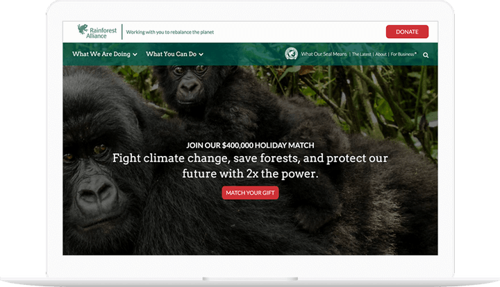
In the fall of 2016, the Rainforest Alliance and Last Call Media launched an exciting redesign of www.rainforest-alliance.org, built on Drupal 8, employing seasoned agile software development methodologies. Our productive partnership with the Rainforest Alliance resulted in a technically groundbreaking site that allowed users unprecedented access to the riches of their content after just four months of development. The tool is now primed to drive the Rainforest Alliance’s critical end-of-year development activities. 

People seem really, really happy with it. YAY!!

Danielle Cranmer, Web Manager

Over the years, RA has cultivated a repository of structured content to support their mission. While the content is primarily displayed as long form text, there is a wide variety of metadata and assets associated with each piece of content. One of the primary goals of the new site was to enable discovery of new content on the site through automatic selection of related content driven by the metadata of the content the user was viewing. Additionally, RA had a future requirement for advanced permissioning and publishing workflows to enable stakeholders outside of the web team to play a role in the content lifecycle.

Rainforest Alliance shown on phones

Drupal 8 was selected for this project based on several factors. First, its focus on structured data fit well with Rainforest Alliance’s need for portable and searchable content. Second, the deep integrations with Apache Solr allowed for a nuanced content relation engine. Solr was also used to power the various search interfaces. Third, Drupal has historically had powerful workflow tools for managing content. While these tools weren’t quite ready for Drupal 8 when we built it, we knew they would be simple to integrate when they were ready. In short, Drupal was a perfect fit for the immediate needs, and Drupal 8 met the organization’s longer term goals.
 

We’ve been getting lots or praise, internally and externally.  Brava, team!

Melissa Normann, Senior Manager Web Strategy and Development

At the close of Sprint 6, there were zero critical and only 3 moderate issues to address. The final Sprint/Project review had only 3 support questions, launching as arguably the most impressive Drupal 8 site launched within a year of the initial release of this latest major version on the Open Source CMS, and most importantly, in time for Rainforest Alliance’s major end-of-year donation campaign. The site delivers on its promise to showcase the Rainforest Alliance’s exciting and informative messages and beautiful imagery, and stands as testimony for the efficacy of the agile approach.

Read the full case study here.

Expand
Seramount's Online Portal in WordPress

Processes
  • Agile/Kanban
  • Agile/Scrum
Team Leadership
  • Art Director
    Colin Panetta

We are proud of the work we did with Seramount.

As one of the more mature organizations in an increasingly competitive field, Seramount needed a multidisciplinary business, creative, and technology partner to help position them as a leader in the constantly changing diversity, equity, and inclusion space. 

Seramount is the result of a consolidation of three businesses: Diversity Best Practices, Culture@Work, and the events and research divisions of Working Mother Media. Since they also focus on research and consulting, they were looking for an improved membership experience with their gated content and membership portal. They also needed an improved search functionality and tagging system as well as improved ways to track site metrics. 

Our Approach

Seramount engaged Last Call Media to deliver a more focused and compelling narrative to tie the products, tools, and services from those three disparate lines of business together into an end-to-end solution for purpose-driven leaders and teams at Fortune 1000 organizations. 

Our work began with an assessment of the three lines of business through interviews with Seramount leadership and employees who support the delivery of Seramount’s products and services. We then completed a series of structured customer interviews to learn more about how Seramount meets the needs of its customers. We then used that data to build a product roadmap to gain alignment on the customer opportunity and product vision with Seramount leadership. 

We approached building the new Seramount iteratively. Once we had a working prototype, we met with customers again to show them work in progress, to test our vision and to refine it based on their feedback. 

Challenges

Some of the challenges addressed involved building an easy-to-use online portal for Seramount customers and employees to access and update gated content only available with a Seramount membership. We solved one of the major customer challenges by eliminating the need to use passwords to access gated content. On the new Seramount, customers enter their work email and if their employer is a customer, they get an email inviting them to login to Seramount. By requiring employees to use their own accounts, Seramount now has additional data to demonstrate the value of their membership to existing customers. 


The final deliverable is a B2B online learning and development platform built on WordPress.

Expand
Purchasing workflow and subscription management.

Processes
  • Agile/Scrum
Team Leadership
  • Senior Development
    Tom Fleming

Success meant they needed new automation for their process.

Unable to keep up with manually processing a high volume of new and existing B2B customer requests, DEEP Information Sciences (DeepIS) asked Last Call Media to build an online self-service subscription management service on top of their Drupal 7 site.

The service needed to enable customers to create an account, provide necessary marketing metadata for DeepIS’ marketing team, and guide customers through the sales process from subscription estimation to subscription purchase, renewal, and upgrade. Customers also needed to access content related to their service, DeepSQL, online in real time. 

How we did it

Leveraging AngularJS, LCM built a seamless custom subscription purchasing workflow app to guide the user through the dynamic purchasing workflow by feeding and pulling data as necessary to and from HubSpot, their marketing automation tool; SalesForce, their CRM; and Zuora, their subscription management service.

The custom subscription calculator in the AngularJS app pulled in data in real time from Zuora, using Zuora’s APIs, so users were presented with the most up-to-date pricing. Once the purchasing workflow was complete, the user’s card was charged and they received an email with their receipt and license key moments later, all without needing to speak to a DeepIS representative.

This implementation solved the problem where a prospective customer had to email or call DeepIS to purchase a subscription and manage their account. The new online workflow slashed the conversion time by eliminating the need to call DeepIS to purchase a subscription, increased customer satisfaction, and significantly increased revenue for DeepIS. With the biggest barrier to conversion eliminated, users were now clicks away from purchasing a subscription.

Further, with event-triggered email campaigns using HubSpot, DeepIS was able to strategically nurture customers on the trial or free plan to upgrade to a paid plan. Data from SalesForce, Drupal, and Zuora was fed to HubSpot email campaigns, increasing the likelihood of a user purchasing a paid subscription. The emails had a unique URL generated by SalesForce, and the user could provide their credit card information and upgrade their subscription with a few clicks.

Expand
Branding Computational Cardiology.

Processes
  • Agile/Scrum
Team Leadership
  • Senior Producer
    Colin Panetta

Telling the story of the personal virtual heart.

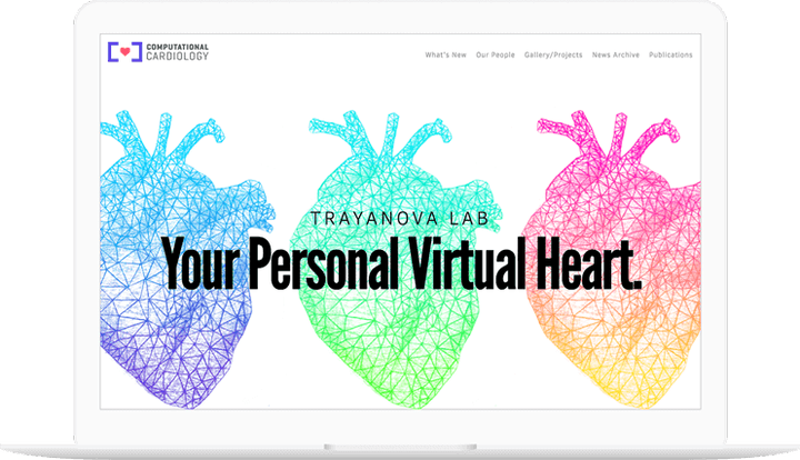
Last Call Media partnered with the Computational Cardiology Lab at the Institute for Computational Medicine at Johns Hopkins University to establish a unique and approachable identity and website design for their very technical work. This work was completed in only two design sprints.

The Trayanova Lab of Computational Cardiology represented a rare intersection of art and science.

Discovery

During discovery, which consisted of an extensive on-site meeting, we learned a few important facts about Computational Cardiology that served as guiding lights for the design work we did with them. First, we learned about what they do. In a nutshell, Computational Cardiology creates virtual models of hearts that can be used for diagnosis or study. (Saving everyone the messy business of taking real hearts out of people’s bodies which can be, let’s say, not particularly healthy for the subject.) Here’s an Endgadget article about one of their recent studies.

Computational Cardiology uses design as a tool to set themselves apart from their peers and get attention drawn to their important work.

Our second big takeaway from discovery is that Computational Cardiology places a high value on design, a quality they told us can be rare in the scientific community. As such, Computational Cardiology uses design as a tool to set themselves apart from their peers and get attention drawn to their important work. And beyond just good design, they wanted a distinctive, exciting look. The leadership at Computational Cardiology has a keen eye for art and fashion, and they felt it was important that this sensibility be reflected in their identity. This was music to our ears!

Getting alignment

With all this in mind, we developed a few aesthetic directions that we could use to get creative alignment. These directions mostly represented Computational Cardiology’s identity using the bold, artistic direction they expressed to us, along with some more conservative elements to make sure a full range of choices was available for consideration. After quickly responding to some of the bolder directions, we selected the elements we thought worked especially well and went to work developing a unified direction based around them.

Three aesthetic directions designed for this project.
The three initial aesthetic directions we mapped out for this project.

Our work has heart

One of those elements was a graphite illustration of Computational Cardiology’s computer models of hearts. That drawing would go through multiple iterations before taking the final form seen on the site, all of which can be seen below.

Three early iterations of the heart illustration used in the site design.
Evolution of a heart.

Designing a logo

Our Creative Director Nolan was able to quickly design a thematically dense logo in a very short amount of time. The heart icon, rendered with angles to reinforce the theme of technology, is surrounded by brackets, indicating that the heart is made of computer code. Those brackets also represent the two “C”s of Computational Cardiology and the negative space between them creates a cross, a symbol commonly used to indicate healthcare.

The final logo design for this project.

Building the site

Throughout the design process we remained aware that Computational Cardiology would be building the site themselves, and frequently checked in with their in-house developer to make sure we weren’t designing anything that would be problematic for them. After the designs were complete we provided them with the assets they’d need to build the site, which they did using the service Webflow. That the final, developed version of the site (which can be seen here) is so faithful to our designs is a testament to both their developer’s skill and the robust functionality of Webflow!

Driven by the need to have a compelling presence in place for the year-end graduate student application season, Last Call Media worked within a tight timeline to design a new logo and a distinctive and approachable visual experience that showcases the lab’s groundbreaking work with illustrations that were drawn by hand in-house. The project completed in two agile design sprints.

Expand
Delivering a high stakes MVP.

Processes
  • Agile/Kanban
  • Agile/Scrum
  • Continuous Delivery
Team Leadership
  • Senior Architect
    Tom Fleming

Following a branding initiative, Designow worked with Last Call Media to build and launch the initial release of a complex crowdfunding platform on Drupal.

When we began, initial prototyping and feature development had already been started. As is often the case, much of the prototyping had made its way into substantial portions of what was now the project’s foundational work. It had become difficult to determine exactly what was completely done, what was partially done, and what requirements had been left out along the way.

How we did it

We used our expertise in Agile methodologies to bring order to complexity and the product to launch. We began by building and prioritizing a backlog of tasks, and getting high-priority tasks into a ready state by defining appropriate definitions of done. We focused on implementing strategies for limiting the work in progress present in the project when we started. We forecasted a few sprint goals, informed by our backlog development and resulting strategies, and quickly went into heavy development.

Immediate visibility for stakeholders into development progress became of major importance for their own ability to make quick business decisions concerning their investment. In order to maximize the value of the work, we adapted our initial Scrum iteration approach into shorter, one-week sprints of continuous delivery to get small groups of completed tasks out faster. This soon evolved into more of an ideal Kanban flow, allowing a continuous awareness and continuous delivery of the right value.

Since the initial release, LCM and Designow have continuously measured and inspected valuable feedback. Our work is ongoing, as the product is currently receiving regular releases of new features and refinements.

Expand
A new design for PVPC.

Processes
  • Continuous Delivery
Team Leadership
  • Senior Producer
    Colin Panetta
  • Art Director
    Colin Panetta

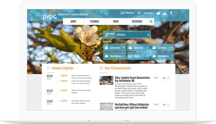
The Pioneer Valley Planning Committee, the regional planning body for the Pioneer Valley region, which encompasses 43 cities and towns in the Hamden and Hampshire county areas of Massachusetts, asked LCM to redesign their aging Drupal site with a new look and feel and to also be compliant with new government regulations surrounding content and site accessibility.

Working with PVPC 

We took the project from initial discovery and strategy through information architecture, design, and development. We were able to deliver a compelling, modern, and effective design, with PVPC’s target users in mind. Our discovery and strategy informed a new design for improved site navigation and menu structure, re-working the existing navigation system to create a more fluid experience visiting the site.

Expand
Consortium Assault Services app.

Processes
  • Continuous Delivery
Team Leadership
  • Senior Producer
    Kelly Albrecht

In response to growing concerns and attention around Sexual Harassment and Assault Nationwide, Amherst College needed a tool to serve students of the Five Colleges with rapid access to Title IX office information and emergency services.

How we did it

LCM and Amherst College worked together with student advocates, Title IX, LGBTQ, and other campus offices and organizations to design and develop an iOS App that puts valuable information, from a Drupal site Amherst can administer, into the hands of students. The major feature of the app was to direct assault survivors to emergency contact information, help services, and other advocacy groups, anonymously and quickly.

The app was announced to all incoming and returning students during new school year orientation. Information about the app has been circulated through the Five Colleges on promotional materials and “get help” brochures and posters.