We're proud to provide Strategy services.

Expand
Improving the Drupal authoring experience.

Processes
  • Continuous Delivery
Team Leadership
  • Senior Producer
    Kelly Albrecht
  • Senior Architect
    Colin Panetta
  • Art Director
    Colin Panetta

In our engagement with Mass.gov, Drupal is essentially the product being developed and operated in.

So we had to ask ourselves, “In what ways can we make Drupal better for our customers, to give them a better experience, get better feedback from them, and build that relationship?”

The Commonwealth of Massachusetts embarked on a large-scale web replatform to modernize and make it easier to continuously improve the way the Commonwealth engages with and provides services to its constituents online. By improving the user experience for its constituents, and providing, as comprehensively as possible, a “single face of government”, Mass.gov® has become an essential platform in the Commonwealth’s ability to serve its constituents by delivering information and critical day-to-day social services to the Commonwealth’s 6.8 million people. With 15 million page views each month, the Mass.gov platform hosts over 400+ government agencies and content to support anyone who wants to move, visit, or do business in the state. All of which is fueled by the Commonwealth’s 600+ content authors, who have been able to use the platform to improve constituent satisfaction, making a noticeable positive difference on how the public sees their organization and the services they provide.

As early adopters of Drupal 8, Mass.gov and its ecosystem of web properties are the primary platforms for the delivery of government services and information in the Commonwealth of Massachusetts. 
 

Wicked awesome content

The Commonwealth of Massachusetts was faced with a difficult to use web experience that stood in the way of a constituent base that wanted to interact with government services through the web. The goal was set to create new primary face of Massachusetts government that was constituent centric to enable fast, easy, and wicked awesome interactions with state services.

Prior to the migration to Drupal 8, the Commonwealth’s antiquated, proprietary content management system reflected its internal hierarchical structure instead of organizing content in a way that made sense to its visitors. That meant, for example, that a visitor looking to start a business in Massachusetts had to visit four or more separate department sites in order to get started. The Commonwealth sought to improve the user’s experience by focusing on guiding the visitor through the various services the Commonwealth provides over helping them navigate the complexities often found in a massive state organization. 

Massachusetts Digital Service (MassGovDigital) had two core philosophies that drove their decision making: focus on the constituent experience and use data to support all decisions. They envisioned a unified user experience, where tasks like preparing to renew a driver’s license matched the ease of use of shopping on a major retail website. The MassGovDigital team was challenged to apply private-sector data analytics savvy, like defining and tracking constituent “conversions.” Gaining access to analytics at their fingertips was key for site authors to make fully-informed decisions to optimize their content for readers. A high-performing site search would ensure content findability. 

Last Call Media and the MassGovDigital teams worked together to improve the Drupal authoring experience in order to deliver the next chapter of the state’s digital future. The end result represents a significant leap towards the goal of a new primary face of Massachusetts government that centers on constituents—enabling fast, easy, and wicked awesome interactions with state services.

Improving the Drupal authoring experience

If you can improve the authors’ ability to create and improve content, then the constituents will be better enabled for fast, easy, and wicked awesome interactions with state services. For Last Call Media, improving the authoring experience meant a better interface for communicating data about each piece of content. This data was a mix of content scoring and direct feedback from constituents. For example, a site visitor submits the feedback form (available on any page) and says whether they found the page to be helpful or not (“Did you find what you were looking for on this webpage?”). The raw data goes into the calculation of their “grades.” The raw feedback comments also become visible in a tab in the editor interface, where the editor can focus in on what is or isn’t working well about the page. Surfacing this data, along with making the interfaces more intuitive and the content easier to add and manage, enabled authors to more rapidly improve their content in a more targeted way. According to ForeSee results, the release of the reimagined authoring experience directly correlated with a never before seen increase in Customer Satisfaction.


Retheming Drupal’s default admin site was a critical opportunity to improve usability for authors. With a pattern library, Last Call Media applied these improvements at a large scale without the prohibitively high effort of creating designs for every single page. Paying extra attention to vertical spacing intervals Last Call Media created a clearly defined page hierarchy. At the same time, flipping the brand color scheme provided a user experience that’s consistent with the main site, yet unique.

Screenshot of new branding guidelines being created


By using a shared design vocabulary, these ideas could be applied site wide—even the pages that weren’t yet designed—to start development and apply the broad strokes to the theme, while the design team focused on some areas of the site that required more attention for usability. Faced with the challenge to deliver complex content with forms assembled from a number of differently-styled modules, form elements became a focus area. In addition to a unified styling system to improve usability for all form elements, horizontal lines now mark the end of one form element and the beginning of the next. Vertical lines do the same for nested re-orderable elements.

A clear path to publish content 

Last Call Media also created a new and improved version of the Admin Toolbar to streamline navigation for content editors and creators. In addition to the Admin Toolbar module, a separate custom toolbar module specific to the Admin Theme was created to handle customizations. Now, buttons provide easy access back to the login page, with a separate button to return to the main site. A custom tab directs content editors to their most important pages.

The Mass.gov Admin Theme homepage
The final “home page” of the Admin theme for Mass.gov.

Before, there was no direct way for authors to quickly access their top two pages: the page to add content and the page to create new documents. To balance that functionality with a slim line top bar experience, buttons were added to those pages right to the tab menu. Last Call Media built a custom “Add Content” page with attentional experience in mind; Mass.gov, at the time of this project, had about 35 content types for an author to scroll through. 

Screenshot of filtered "Content Add" screen
Using the search box, content editors can filter the types of content they want to add.

A faster and easier authoring experience has allowed authors to keep improving and adding to their content. This keeps constituents in the know and continues to grow Mass.gov as a single source of all the information they need to interact with government services. Read more about how Last Call Media did this here.

Outcomes

  • Leading the Way Among State Government Websites: Mass.gov placed 3rd nationwide in a review of 400 state government websites by ITIF and was recognized for performance in page-load speed, mobile friendliness, security, and accessibility.  
  • Constituent-Centric UX: Produced 23 content types using structured content to ensure consistent and constituent-centric UX.
  • Huge improvements in both the front and back end performance: We achieved a 50% overall improvement in the back end performance, and a 30% overall improvement in the front end performance all while maintaining content freshness.
  • Empowering Content Authors With an Improved Drupal Admin UI: Updating, adding, and reviewing content moved from requiring technical expertise to being open and usable to non-technical subject matter experts. Now, hundreds of users login to Mass.gov each week to update, add, and review content performance to support the services their organization provides to the people of the Commonwealth. 
  • Streamlined on-boarding with guided tours: A series of guided tours support a refined publishing process, which accelerated on-boarding new content authors. 
  • Collecting Insights from User Feedback: Verbatim content feedback from constituents is now available to authors, and feedback helps create content performance scores in an improved Drupal admin interface. 

Key features and functionality 

Reimagined authoring experience

  • Content Categories: Content types were organized into categories and jump-links to them can be found on the “Add Content” page.
  • A Deeper Search: Custom search functionality sorts through both the content type names and the description text.
  • Clear Visualization and Direction: A “thumbnail” example of each content type shows authors a sample preview. Cleaner and more strategically-positioned description texts give easy-to-follow direction.
  • Extra Guidance: Links to Mass.gov’s document site provide additional information about each content type, including how it’s used, tips for creating new content, and links to live examples.

New welcome page experience for authors


Key Drupal Modules

Why these modules/theme/distribution were chosen

Flag: Used to notify editors about content updates. 
Paragraphs: Used to guide authors in creating structured and reusable content.
Tour: Used to improve the authoring experience by introducing them to the functionality of their content types.
Tour UI: Used to assist Product Owners and Customer Success in tailoring Tours as needed, based on customer feedback, minimizing the interruption to the feature development work stream.
Pathologic
Redirect: Having migrated from a very large legacy site with a long history, Redirects were a critical consideration.
TFA
Password Policy
Metatag
Seven: Hooking in to Seven, a Drupal 8 theme, provided a base that is maintained and receives security updates from the Drupal community. One of the main challenges in building an admin theme for Drupal are the number of modules that require different user interfaces; some modules make minor tweaks to the UI to meet their needs, but some create their own from scratch. It’s very difficult for an admin theme to support all of these use cases without something breaking, let alone making the UX cohesive. By creating the theme from Seven, Last Call Media ensured that it wouldn’t unexpectedly break module UIs for modules that we hadn’t even anticipated needing yet, and it makes sure not to be breaking anything that’s already there.
 

Final Thoughts

Currently, Last Call Media is a leading digital agency working to transform Mass.gov’s digital platform and strengthen government-constituent interaction. This provided technical architecture leadership to develop and support the new digital platform, by working closely with the MassGovDigital internal team and several other vendors. 

Over the past 12-months, by relying on constituent feedback and analytics and a commitment to collaboration and flexibility, the teams have been able to improve constituent satisfaction with Mass.gov month over month, according to data collected by Foresee.
 

Expand
Reimagined on Drupal 8, in six sprints.

Processes
  • Agile/Kanban
  • Agile/Scrum
Team Leadership
  • Senior Producer
    Kelly Albrecht

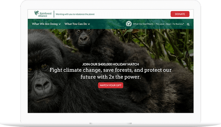
In the fall of 2016, the Rainforest Alliance and Last Call Media launched an exciting redesign of www.rainforest-alliance.org, built on Drupal 8, employing seasoned agile software development methodologies. Our productive partnership with the Rainforest Alliance resulted in a technically groundbreaking site that allowed users unprecedented access to the riches of their content after just four months of development. The tool is now primed to drive the Rainforest Alliance’s critical end-of-year development activities. 

People seem really, really happy with it. YAY!!

Danielle Cranmer, Web Manager

Over the years, RA has cultivated a repository of structured content to support their mission. While the content is primarily displayed as long form text, there is a wide variety of metadata and assets associated with each piece of content. One of the primary goals of the new site was to enable discovery of new content on the site through automatic selection of related content driven by the metadata of the content the user was viewing. Additionally, RA had a future requirement for advanced permissioning and publishing workflows to enable stakeholders outside of the web team to play a role in the content lifecycle.

Rainforest Alliance shown on phones

Drupal 8 was selected for this project based on several factors. First, its focus on structured data fit well with Rainforest Alliance’s need for portable and searchable content. Second, the deep integrations with Apache Solr allowed for a nuanced content relation engine. Solr was also used to power the various search interfaces. Third, Drupal has historically had powerful workflow tools for managing content. While these tools weren’t quite ready for Drupal 8 when we built it, we knew they would be simple to integrate when they were ready. In short, Drupal was a perfect fit for the immediate needs, and Drupal 8 met the organization’s longer term goals.
 

We’ve been getting lots or praise, internally and externally.  Brava, team!

Melissa Normann, Senior Manager Web Strategy and Development

At the close of Sprint 6, there were zero critical and only 3 moderate issues to address. The final Sprint/Project review had only 3 support questions, launching as arguably the most impressive Drupal 8 site launched within a year of the initial release of this latest major version on the Open Source CMS, and most importantly, in time for Rainforest Alliance’s major end-of-year donation campaign. The site delivers on its promise to showcase the Rainforest Alliance’s exciting and informative messages and beautiful imagery, and stands as testimony for the efficacy of the agile approach.

Read the full case study here.

Expand
Seramount's Online Portal in WordPress

Processes
  • Agile/Kanban
  • Agile/Scrum
Team Leadership
  • Art Director
    Colin Panetta

We are proud of the work we did with Seramount.

As one of the more mature organizations in an increasingly competitive field, Seramount needed a multidisciplinary business, creative, and technology partner to help position them as a leader in the constantly changing diversity, equity, and inclusion space. 

Seramount is the result of a consolidation of three businesses: Diversity Best Practices, Culture@Work, and the events and research divisions of Working Mother Media. Since they also focus on research and consulting, they were looking for an improved membership experience with their gated content and membership portal. They also needed an improved search functionality and tagging system as well as improved ways to track site metrics. 

Our Approach

Seramount engaged Last Call Media to deliver a more focused and compelling narrative to tie the products, tools, and services from those three disparate lines of business together into an end-to-end solution for purpose-driven leaders and teams at Fortune 1000 organizations. 

Our work began with an assessment of the three lines of business through interviews with Seramount leadership and employees who support the delivery of Seramount’s products and services. We then completed a series of structured customer interviews to learn more about how Seramount meets the needs of its customers. We then used that data to build a product roadmap to gain alignment on the customer opportunity and product vision with Seramount leadership. 

We approached building the new Seramount iteratively. Once we had a working prototype, we met with customers again to show them work in progress, to test our vision and to refine it based on their feedback. 

Challenges

Some of the challenges addressed involved building an easy-to-use online portal for Seramount customers and employees to access and update gated content only available with a Seramount membership. We solved one of the major customer challenges by eliminating the need to use passwords to access gated content. On the new Seramount, customers enter their work email and if their employer is a customer, they get an email inviting them to login to Seramount. By requiring employees to use their own accounts, Seramount now has additional data to demonstrate the value of their membership to existing customers. 


The final deliverable is a B2B online learning and development platform built on WordPress.

Expand
Branding and design for site and event collateral.

Processes
  • Continuous Delivery
Team Leadership
  • Art Director
    Colin Panetta

Last Call Media makes it a priority to give back to the Drupal community, so we were excited when the nice folks at Baltimore Drupal Camp reached out to us for branding and design.

Getting alignment

For the discovery phase, we had some in-depth conversations with the team at Baltimore Drupal Camp about design trends on the web, and which ones we wanted to explore for this project. We decided that the designs should express both the historic and the punk sensibilities of Fells Point, the neighborhood the event was to take place in, while also paying homage to Frederick Douglass, as the venue was the great Frederick Douglass-Isaac Myers Maritime Park.

Drupal Boh logo

Baltimore Drupal Camp had in previous years done a few mash-ups of the Drupal and National Bohemian logos in previous years (the National Bohemian logo being the unofficial logo of Baltimore), and we were excited to try our hand at it. We produced a clean, durable logo that was used in all our subsequent material and that the Baltimore Drupal Camp also adopted for use across their social media platforms. Baltimore’s own Not Mr. Boh even gave it a shout-out on Twitter.

The Drupal and National Bohemian logos combining into the Drupal Boh logo

Illustrations

In order to capture the historic and punk aspects of Fells Point that we discussed during discovery, we produced a series of gritty, vibrantly colored illustrations for use as visual assets on the site.

Illustration of a raven holding a feather in its mouth

Illustration of Fells Point

Illustration of a historic shipSite Design

Taking both the direction we established in discovery and the assets we generated, we produced a design deliverable for the Baltimore Drupal Camp website. Because the site would change so much as the event got closer (and “Submit Your Session” became “Schedule”, among other changes) we needed to deliver a wide-ranging design that would account for multiple versions of the site.

Designs for the Baltimore Drupal Camp site

Portion of Baltimore Drupal Camp site design that includes Frederick Douglass
We included this powerful quote from the great Frederick Douglass in the site design.

We worked with the team at Baltimore Drupal Camp while we created the designs and formatted them for handoff, enjoying a productive information exchange about tools and process while we were at it.

There aren’t enough words of thanks for Colin and Last Call Media. Amazing site design, fabulous t-shirts, awesome stickers! You are Drupal!

Liz Lipinski, Baltimore Drupal Camp

Event Material

We were thrilled to see the aesthetic and assets we generated for this project in use on event collateral on the day of the camp itself. Congrats to the Baltimore Drupal Camp on a successful 2016!

Baltimore Drupal Camp stickers with Drupal Boh icon

Baltimore Drupal Camp shirts with historic ship drawing

Room at Baltimore Drupal Camp with sign

Birds of Feather sign at Baltimore Drupal camp with raven illustration

Expand
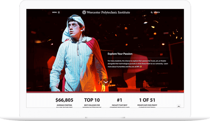
Building the new WPI.edu.

Processes
  • Agile/Scrum
  • XP
Team Leadership

Clinically speaking, our recent work with Worcester Polytechnic Institute is a testimony to Last Call Media’s approach to the initial project phases of Discovery, Strategy, and Information Architecture. That said, the most important part of this story is how our flexible and adaptable work process embraced by both the WPI and Last Call Media teams resulted in a process and a final outcome that meets WPI’s stakeholder needs. Strong partnership-building was the goal from the outset, and it paid off in strong relationships and expectations satisfied.

Project Goals
Last year, WPI embarked on a Discovery and Strategy phase with Last Call Media in order to:

  • Improve performance
  • Increase engagement
  • Reduce technical debt and operating costs

Thanks to WPI’s commitment to collaboration, the redesign of wpi.edu represents one of Last Call Media’s most comprehensive involvements from start to finish of any project to date. We acted as more than designers and developers, but instead as all-encompassing strategic management consultants, working with WPI to organize multiple stakeholders toward the realization of stated and unstated goals.

How we did it

The project had humble beginnings. WPI had a lot of ideas, which they’d translated into a giant content model spreadsheet. We meticulously ensured that we understood it all, guiding a wireframe process in which we were able to make significant contribution to the decision-making that yielded a highly intuitive structure. We took each step iteratively, building piece-by-piece, soliciting feedback, and then building the next iteration. We facilitated a dialogue between administrators, college communications, their design department, their IT department, and Acquia to map the landscape of business requirements, organizational needs, and their desired design aesthetic.  

On the technical side, we reviewed their existing RedDot site, and built a ‘scraper’ to scrape select content out of it and import the data into its new structure in Drupal. We open-sourced the scraper, too. Next, we built a flexible layout system of building blocks that enabled them to build pages however they needed. We dubbed them “widgets,” and WPI called them “elements,” but they were central to satisfying their desire for incredible flexibility that allowed them to build unique layouts on any given page.

As part of the creative partnership, Last Call Media’s creative team worked closely with WPI to improve the look and utility of the Events Pages, the Calendar, and a database of accolades they maintain. The outcome was a set of tools that present information in simple and digestible ways. WPI’s communications team helped LCM fully understand their brand, which enabled us to showcase their identity as we applied it to the work product.

Every step of the way as we constructed functionality, WPI developers, content authors, and staff gave feedback on the project as fidelity increased from a rough, unthemed Drupal site, to a polished release candidate. At the same time, Last Call Media was enabling WPI Developers to be self-sufficient in Drupal so they could help build new functionality. Last Call Media also built a custom ‘faculty importer’ that synced data from their Ellucian Banner system into Drupal, greatly simplifying the construction and accuracy of faculty pages.

Because we were in constant contact, there were never any ‘big reveals’ for WPI leadership to react to that represented hours of work they had to wrestle with approving or sending us back to the drawing board - they’d been part of the process at two week intervals and on board with each decision as it was made.

Today, the ability of the various administrative and academic departments at WPI to use the site is unparalleled in Last Call Media’s experience. The partnership enabled WPI’s content developers, in-house communications staff, designers, and developers to fully leverage the new wpi.edu. As a result, we’re seeing profound stakeholder use of the tools we collectively built. WPI embraces our approach and recognizes the value in the systems our working partnership designed. Such engagement is the dream of every project, and we’re proud it’s being realized at Worcester Polytechnic Institute.

We continue an ongoing relationship with WPI providing support and strategic counsel as necessary. What can Last Call Media do for you?

Expand
Delivering a high stakes MVP.

Processes
  • Agile/Kanban
  • Agile/Scrum
  • Continuous Delivery
Team Leadership
  • Senior Architect
    Tom Fleming

Following a branding initiative, Designow worked with Last Call Media to build and launch the initial release of a complex crowdfunding platform on Drupal.

When we began, initial prototyping and feature development had already been started. As is often the case, much of the prototyping had made its way into substantial portions of what was now the project’s foundational work. It had become difficult to determine exactly what was completely done, what was partially done, and what requirements had been left out along the way.

How we did it

We used our expertise in Agile methodologies to bring order to complexity and the product to launch. We began by building and prioritizing a backlog of tasks, and getting high-priority tasks into a ready state by defining appropriate definitions of done. We focused on implementing strategies for limiting the work in progress present in the project when we started. We forecasted a few sprint goals, informed by our backlog development and resulting strategies, and quickly went into heavy development.

Immediate visibility for stakeholders into development progress became of major importance for their own ability to make quick business decisions concerning their investment. In order to maximize the value of the work, we adapted our initial Scrum iteration approach into shorter, one-week sprints of continuous delivery to get small groups of completed tasks out faster. This soon evolved into more of an ideal Kanban flow, allowing a continuous awareness and continuous delivery of the right value.

Since the initial release, LCM and Designow have continuously measured and inspected valuable feedback. Our work is ongoing, as the product is currently receiving regular releases of new features and refinements.

Expand
A new design for PVPC.

Processes
  • Continuous Delivery
Team Leadership
  • Senior Producer
    Colin Panetta
  • Art Director
    Colin Panetta

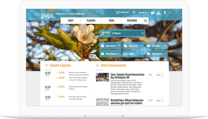
The Pioneer Valley Planning Committee, the regional planning body for the Pioneer Valley region, which encompasses 43 cities and towns in the Hamden and Hampshire county areas of Massachusetts, asked LCM to redesign their aging Drupal site with a new look and feel and to also be compliant with new government regulations surrounding content and site accessibility.

Working with PVPC 

We took the project from initial discovery and strategy through information architecture, design, and development. We were able to deliver a compelling, modern, and effective design, with PVPC’s target users in mind. Our discovery and strategy informed a new design for improved site navigation and menu structure, re-working the existing navigation system to create a more fluid experience visiting the site.

Expand
Consortium Assault Services app.

Processes
  • Continuous Delivery
Team Leadership
  • Senior Producer
    Kelly Albrecht

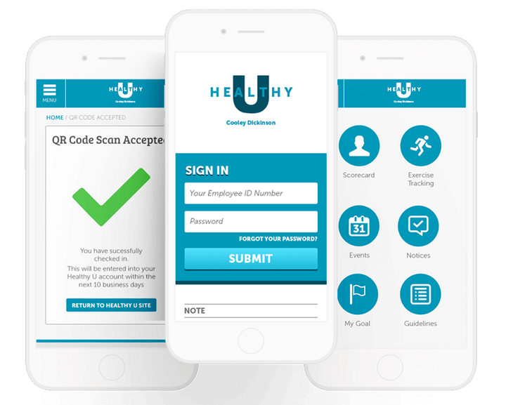
In response to growing concerns and attention around Sexual Harassment and Assault Nationwide, Amherst College needed a tool to serve students of the Five Colleges with rapid access to Title IX office information and emergency services.

How we did it

LCM and Amherst College worked together with student advocates, Title IX, LGBTQ, and other campus offices and organizations to design and develop an iOS App that puts valuable information, from a Drupal site Amherst can administer, into the hands of students. The major feature of the app was to direct assault survivors to emergency contact information, help services, and other advocacy groups, anonymously and quickly.

The app was announced to all incoming and returning students during new school year orientation. Information about the app has been circulated through the Five Colleges on promotional materials and “get help” brochures and posters.

Expand
Looking before we leap.

Team Leadership
  • Art Director
    Colin Panetta

After working with Blackboard—the largest education technology and services company in the world—on restructuring and retheming their corporate site Blackboard.com, we knew we needed to test our efforts in order to iron out any problems before the site went live. Normally we may conduct remote moderated user testing for this (watching users navigate the site over a video call to gauge how well it works for them), but Blackboard’s annual user convention, BbWorld, provided a perfect opportunity to conduct this testing in person.

Goals

We wrote a list of goals for our user testing that included learning about user behavior, whether the site was intuitive to navigate, whether free trials were easy to find, and what users thought about the new design. We worked with the team at Blackboard to define these goals and to ensure we were all on the same page about what we would hope to learn from these interviews. We then constructed our interview questions around meeting these goals, asking users to complete tasks that would ultimately give us the necessary insights for the next phase of work.

Testing setup

On-site at BbWorld, we used Formstack to conduct our user interviews. This gave us an adaptable setup that enabled Blackboard staff to conduct testing right alongside us, even though many of them had never done so before. Speaking directly to users about the site gave Blackboard staff a higher level of empathy with their users than if they had just read a report, giving them deeper insight into how users viewed the site. We also made screen recordings of our interviews, for later reference.

The BbWorld attendees we interviewed consisted of institution technologists, instructors, academic leaders, corporate partners (resellers, ed tech vendors), and trainers, mostly in higher education, as opposed to K-12, government, or business. Most were influencers or decision-makers when it comes to purchasing education software for their institution—a valuable perspective to be sure! In the end, we facilitated almost 70 total interviews over just a couple of days! 

There were a number of initiatives in place to encourage people to test the site. These included push notifications from the BbWorld app, a $15 Starbucks gift card that was given at the end of the testing, and an event-wide “passport” attendees could only complete by visiting our table. Most of the people we spoke to came to us for one of these reasons.

Original Blackboard.com site with dark interface and many links
The old Blackboard.com

Learning about the old site

The majority of people we spoke to at BbWorld said they had used Blackboard.com before. We were particularly interested to hear from these experienced users, so we could establish a baseline experience using the old site, to later compare their experience using new site. Measuring these experiences against each other would tell us whether or not the restructure and retheme was an improvement. For example, if someone used the site for gathering specific information about Blackboard, did the new site make it easier or harder for them to do that?

Here’s what that baseline experience looked like:

  • Half of the people we spoke to said the current Blackboard.com was easy to use, with a quarter each saying it was hard or neutral.
  • Most common uses for the site included navigating to Blackboard’s Community site, reviewing the Higher Education section for language on products, or seeking help or support.
  • Finding things or navigating the site were listed as the most common difficulty, although some thought it worked well!
  • Opinions about the navigation were mostly negative.
  • Testers felt that site was clean, but some thought it presented too much information.
  • Most people said they access the site by typing the url in their address bar. (A sure sign of an experienced user!)
  • Almost universally, people accessed the site from a desktop computer.
Redesigned Blackboard.com site with brighter interface and consolidated links
The rethemed Blackboard.com

Learning about the new site

Moderated user testing is often the first time people outside of your team sees your product. While this can be daunting, it’s important to be open to constructive criticism big and small—after all, that’s the point of user testing! So while we were prepared (as always) for negative feedback, the overall response to the new Blackboard.com was extremely positive. Whew!

While we walked into testing thinking that, visually, the new theme was more of a small facelift than a full redesign, people were enthusiastic about the design of the new site. Before we could even ask about the design, many people immediately stated that they thought it was a big improvement, using words like “clean,” “modern,” and “professional” to describe it.

Many people also liked the new navigation structure. Comments about it included “All the overwhelming links are gone. Now I can digest what the navigation is offering. It’s highlighting the important information,” and “Navigation is simplified and to the point. More intuitive and easy to navigate, it will take a shorter time to get to what I want.”

Despite having a high level of familiarity with Blackboard, two thirds of the people we spoke to said that they learned something new about Blackboard during their brief time on the new site. Blackboard is working to let the public know that they’re more than just an LMS, so we were happy to hear the site is now aiding in that. Blackboard’s recruiting, safety, and social media management services were among the things people most commonly cited having learned about. 

After performing a few tasks on the new site, half of the people we spoke to said the new site was easier to use than the old site, with a quarter each saying it was harder or the same.

But of course there was still room for improvement. Things that people thought could be improved included:

  • Many people thought the site wasn’t doing a good job of explaining who Blackboard is and what they do.
  • While the new navigation worked well for many people, some expressed confusion over the specifics of what it was presenting. Specifically, they were unsure what was a product and what was a service, and confused about the word “community” being used in two different places to indicate different things.
  • Users would often miss the button for free trials, sometimes not seeing it at all until we pointed it out.

Results

The thing that gives our partners the most pause when pulling the trigger on user testing is that you don’t always know what the results will be ahead of time. How can you justify dedicating time and resources to something when you don’t know what you’re going to get? But that’s the point of testing—to find out things you don’t know. We’ve never walked away from testing without valuable insights that went on to inform the rest of the project, and our Blackboard testing was no exception.

One small but impactful result was that we changed the color of the free trial CTA. We made this pivot quickly in the middle of testing, which enabled us to gauge the impact immediately. People started noticing the button more, and thus the issue was resolved immediately — no muss no fuss! It was gratifying to have something so small make an immediate positive impact and we all laughed at how long we chatted about that button color prior to testing! Post-launch, this CTA is used six times more than it was before the redesign, and the page it links to is now the third most viewed on the site, leading more users to this essential content.

Following user testing we did an extensive redesign of the homepage, and the feedback we received stating the site should tell users who Blackboard is and what they do was our guiding light. The new Blackboard homepage is a top to bottom narrative that tells the story of Blackboard starting with a broad overview, then moves into some specifics, and then shows what Blackboard does in action. Post-launch, Blackboard has seen a decrease in the bounce rate of their homepage, meaning more users are engaging with it.

What we learned in user testing also informed the new site navigation. The site structure had been massively rearranged, shifting from being market-based to value-based. The feedback we received about certain parts of the navigation being unclear helped refine the language used. Post-launch, more Blackboard users have been getting to their destination in 0-2 clicks, meaning they’re using the new navigation to find what they’re looking for faster.

The insight that user testing provides can come in the form of reassurance. Since people were enthusiastic about the new site being easy-to-use, we could move forward with the confidence that there were no big missing pieces. Furthermore, since the new theme was so well received, we realized the visual changes provided a larger impact, shifting our perception of it from being a “facelift” to something closer to a redesign.

Blackboard.com subsequently relaunched and, with the help of the insights we gained in user testing, is seeing a decreased bounce rate on the homepage, more users finding their destination quickly, and a dramatic increase in traffic to the free trial page, meaning teachers and students worldwide have better access to some of the best digital learning tools on the market.

Expand
Custom tailoring Haverford.edu.

Processes
  • Agile/Scrum
  • Continuous Delivery
Team Leadership
  • Senior Producer
    Kelly Albrecht

When LCM got the call from Haverford about redoing their site in Drupal, we thought it was going to be a redesign. After an initial conversation we agreed to do a Discovery and Strategy engagement first, to determine what the true needs were and then develop a strategy for solutions. We conducted stakeholder interviews and developed the User Personas of who our work was to be for. Interestingly, none of these personas ended up being an anonymous site visitor, but instead were different types of content editors and administrators.

Haverford didn’t need a redesign; their site looked great already. The biggest issue they needed to solve was not having enough time to do new feature development themselves. They were a smart and capable team and over many years had developed and maintained a large custom PHP implementation for college’s website needs. They were finding, however, that too much of their time was being spent updating pages for college members and groups. Their hope was for us to build them a site that looked and functioned like their current site, but built on a modern CMS with exceptional user management and publishing workflows.

Once we had alignment on their needs and a strategy for solutions, we built out a Content Model, Product Backlog, and Information Architecture. The project was completed with Drupal in steady collaboration with the Haverford Communications team, in 5 development Sprints, and launched on the Acquia Infrastructure.

The Haverford Team really jumped in and took off with it. It was really great!

You can read more about this project as LCM’s Acquia Certified Grand Master Developer, Jeff Landfried shares details of his experience here.

Since then, Last Call Media has continued to work with Haverford on an ongoing basis as part of our dedicated Continuous Delivery relationship, where our dedicated team of developers helps to keep their site secure, up-to-date, and assists as needed with anything from strategy to design to development.

The migration of Haverford to Drupal on Acquia remains one of our favorite projects to date, and it’s a great source of professional pride for all of us. We look forward to a long partnership with Haverford as we continuously evaluate how their online experience is meeting the needs of the College.