Let’s make moves!


-
Art DirectorMolly Taaffe
This summer, Last Call Media teamed up with Blackboard to build a new customer-facing site, using a component-based design system that could afford content editors novel flexibility while still reaping the benefits of a content management system.
In building out Blackboard.com in Drupal 8 this summer, we found a fresh opportunity to position Blackboard as a user-friendly, customer-focused, and modern brand — the big idea was to introduce subtle elements of motion design into the theme in order to create a more engaging user experience.
So, once we’d built out the new site architecture, components, and theme, we shifted our focus to visual refinement; our goal was not only to guide users through their experience through the use of animation, hover effects, and motion design, but also to delight visitors in subtle, unexpected ways by thoughtfully introducing some of these elements into the theme.
How we got things moving.
Goals
The main goal of this effort was to liven up the site and encourage users to interact with elements on the page. As an unintended consequence of implementing a highly flexible component-based theme — in which pieces of content could be mixed and matched in basically unlimited ways on any given page — the overall look and feel had come out very clean and organized, but at the same time more boxy and “dull” than we’d anticipated! Alongside this, there was also the challenge of giving the theme an institutional, educational feel that still felt friendly and helpful instead of overly corporate and austere.
Process
The first step in the process of adding microinteractions was to make sure the interactions were unified in their intent. For example, a rise on hover means the item is clickable, and if implemented on something that doesn’t click, would confuse the user.
Hover is a near universal sign for “this is clickable”, so we utilised a hover effect with shadow for the menu. For buttons, we opted to change from a simple color fade on hover, to a left to right swipe to change the color. This is more engaging than a simple color change, but it isn’t distracting from what the call to action is asking the user to do. It also matches the movement exhibited in the menu when items are hovered over. This addition of motion design to the menu helps users better understand where they are in a detailed navigation, and have a stronger understanding of the menu and product hierarchies.

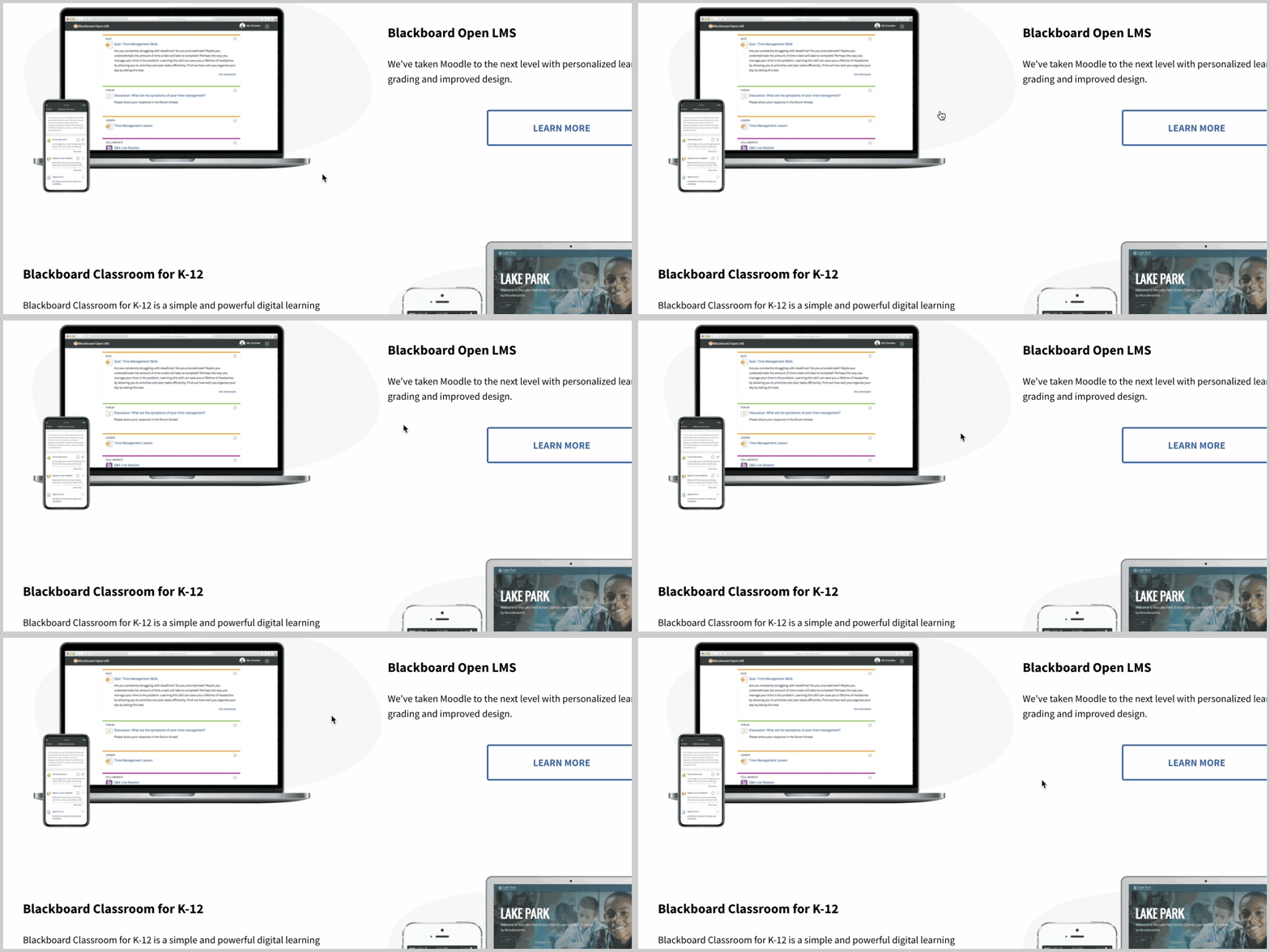
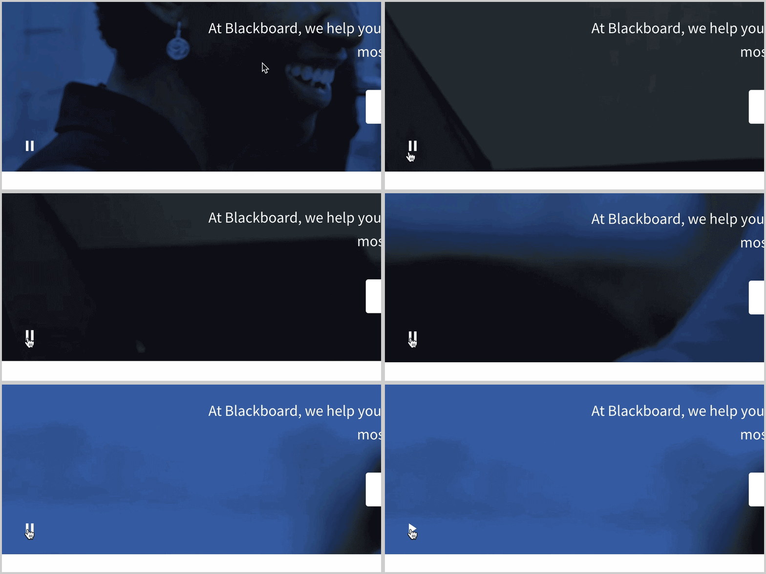
Some other elements of movement added, purely for aesthetics and to engage the user, were a hover effect where the background shapes move behind a product shot when moused over. This added interest to otherwise somewhat repetitive images of computers, and hopefully caused the user to take a second look. Another was a fade and slide in of images, from the side the image is on. This creates a very welcoming feeling as you scroll down the page. In addition, we added a video background to the banner area of the homepage, tinted Blackboard blue so as not to distract from the text and call to action button over it.

In order to maintain our accessibility standards we had to think about users that may not be comfortable with the video at the top of the homepage, so we included a pause button to stop it from playing.

Results
The team at Blackboard is happy with the results of this effort, and it brings a really fresh engaging experience to the site. We would love to do another round of user testing (link to solution story about that) to see how or why these additions add to the site for users.
Microinteractions are a great way to engage the user, and add a wow factor to your site. However, we believe that handling these specifically and thoughtfully is the only way to achieve an effect that really makes sense to the user, rather than just a decoration. This means that every movement and reaction should be consistent and rational, with a meaning and result that are predictable to the user after a short period of interaction. We look forward to bringing what we learned here to anything we work on to add another level of sophistication.
