Accessible form validation (examples and guidance)


Topics
Accessible form validation helps people complete forms correctly and fix mistakes easily. It involves providing clear instructions, layout, labels, and error messages that all users can perceive, understand, and operate — including through assistive technologies like screen readers.
When forms fail accessibility, they cause more than frustration — they lock people out of essential services and information. Every organization has a responsibility to make forms work for all users, including those with disabilities. In the public sector, it’s a legal requirement under Section 508 and the Americans with Disabilities Act (ADA) Title II.
But it can be hard to know where to start. It’s not always obvious which WCAG success criteria apply to form validation and error messages. And there are a few myths around what’s accessible and what isn’t.
I recently addressed these challenges at FormFest 2025, presenting ‘Beyond the Basics: Accessible Form Validation That Works’ with Alexandra DeVoe, Accessibility Engineer at the Massachusetts ACCESS Team. Our session covered best practices, relevant WCAG criteria, and a tour of Massachusetts’ accessible form validation example.
This guide covers:
- Styling and responsiveness
- Color contrast
- Zoom and resize
- Custom components
- Instructions and structure
- Global form instructions
- Labels, helper text, and sections
- Autocomplete
- Error messages
- Show errors on submit
- Display errors below the field
- “Accessibility” widgets and overlays
- Further learning resources
Styling and responsiveness
Your form may look perfect on your screen, but it also needs to be built to work reliably across various devices, screen sizes, and browsers for all users. Insufficient color contrast, poor responsiveness, and interference with native styling are common accessibility issues in HTML forms.
Color contrast
The WCAG success criteria (SC) relating to color contrast in forms include:
Text should have a color contrast of at least 4.5:1 (or 3:1 for large-scale text.) Default borders, focus outlines, and other meaningful visual cues need a 3:1 contrast. Use a digital tool to help you get it right, like WebAim’s color contrast checker. Our example below uses #949494 borders on a white background, which is the lightest gray to meet the 3:1 ratio rule. It’s common to find #CCC borders on white-background forms, but these fail WCAG criteria.
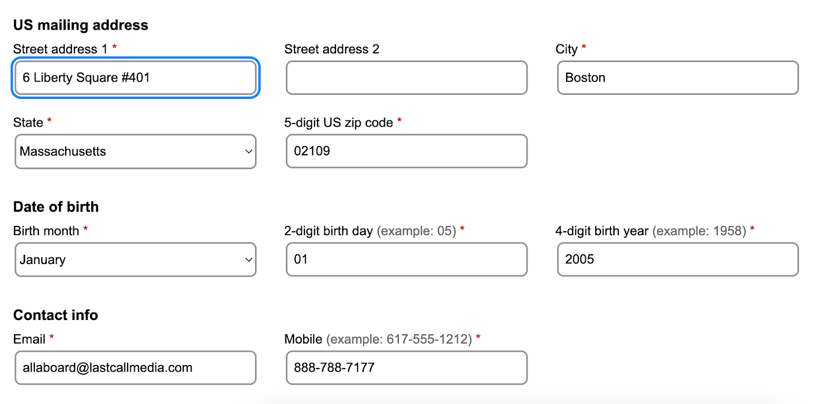
Don’t rely on color alone to convey meaning. A red outline showing an error may look gray or black to someone with color blindness. But a red outline with an error icon and clear error messaging works for everyone.
Keyboard focus is often indicated by an outline around form fields. WCAG recommends using a blue box shadow with a white outline, allowing it to be visible on both dark and light backgrounds.
:focus {
	outline: 2px #F9F9F9 solid;
	outline-offset: 0;
		box-shadow: 0 0 0 4px #0088ff;
}
Zoom and resize
Ensure forms are visible by supporting browser zoom and text resizing. WCAG SC 1.4.10 Reflow (AA) requires support for up to 400% browser zoom without the line length increasing. SC 1.4.4 Resize Text (AA) says users should be able to resize text by 200% without assistive technology or loss of content or functionality. Avoid hardcoded widths and heights as this can disrupt browser zoom and text resize — use min-width and min-height instead. I also recommend using a font size no smaller than 16px.
Test your form with browser zoom and text resize on different devices and screen sizes. This can be done using Chrome DevTools, for example. Make sure nothing is truncated or clipped, including error messages — it’s fine if text gets wrapped over more lines.
Custom components
Use native HTML elements to create custom components. Try not to customize radio buttons and checkboxes — these are hard to make accessible, especially for things like high-contrast themes and dark mode. Many public sector organizations use or adapt the USWDS (U.S. Web Design System). Search USWDS components on the official website for guidance on using them accessibly, plus information about their WCAG compliance and any known accessibility issues.
Instructions and structure
The best error handling strategy is to avoid errors in the first place with accessible forms that are easy for anyone to fill out correctly. All users should be able to perceive, understand, and operate your form through clear instructions, labels, structure, and accessible code.
Global form instructions
At the top of the page, provide clear instructions that apply to the form as a whole, like: “Fields marked with a red asterisk * are required.” If most fields are required, consider this alternative: “All fields are required unless marked as optional.” If you’re creating a multi-page form, include the global instructions on every page where they’re applicable.
Labels, helper text, and sections
WCAG SC 3.3.2 (A) Labels or Instructions calls for important cues and instructions that help users do a task without confusion or extra navigation. When it comes to HTML forms, every input needs a descriptive label. Some also need helper text explaining how to format an answer. Add section headings where it makes sense to group form elements, like fields for a mailing address or the user’s date of birth.
Avoid using placeholder text to give instructions. It disappears once you start typing, making it inaccessible for users with memory impairments and cognitive disabilities — as well as anyone who’s simply a bit distracted. What’s more, placeholder text isn’t announced by all screen readers.

It’s not enough for instructions to be available on a surface level alone. WCAG SC (A) 1.3.1 Information and Relationships says that information, structure, and relationships conveyed through presentation should also be programmatically determined (unless available in text). This often calls for the use of WAI-ARIA (Web Accessibility Initiative – Accessible Rich Internet Applications), a set of HTML attributes supporting accessibility. For example, aria-label directly labels components like buttons or links with a description that screen readers can announce. We can also use aria-required to indicate if input is required or optional.
You can also use fieldset and legend tags to indicate when form fields are grouped, like for a mailing address. Fieldset wraps all the form elements, while the legend serves as the section heading — which is better than a heading tag because it can be announced by screen readers, helping users understand when they’re entering a new section.
Autocomplete
Autocomplete attributes can indicate the purpose of common inputs, like a mailing address or phone number. It helps users fill out forms faster and with less typing. What’s more, some assistive technologies display icons to help users understand the input purpose. This often helps users who have difficulty reading text. For example, an icon of a birthday cake may be shown in front of an input field using autocomplete=”bday”. Autocomplete is required by the WCAG SC 1.3.5 (AA) Identity Input Purpose.
Error messages
Error messages should clearly identify when something’s wrong with the user input, like an incomplete email address or empty required field. WCAG SC 3.3.3 (AA) Error Suggestion also requires error messages to suggest how to fix the problem — for example, instead of “Invalid password”, use something more helpful like “Please create a password with at least eight characters.”

You can use the aria-invalid attribute to programmatically identify fields that have failed validation. In the example below, most screen readers will announce “contact info” (the legend), “email” (the field label), “required”, and “invalid”, before also reading the error message.
<div class="ads-formField">
	<label id="emailLabel" for="email">Email <span class="ads-asterisk" aria-hidden="true">*</span></label>
	<div class="ads-inputWrapper">
		<input type="text" name="email" id="email" autocomplete="email" aria-required="true" aria-describedby="emailError" class="ads-errorBorder" aria-invalid="true">
	</div>
	<div class="ads-error-message" data-error-for="email" id="emailError"><svg xmlns="http://www.w3.org/2000/svg" width="20" height="20" aria-label="Error:" viewBox="0 0 256 256"></svg> <span>Email domain extension must be at least 2 characters.</span></div>
</div>
Show errors on submit
Show error messages only after a user hits the submit button. Announcing errors as a user moves through a form can be confusing and disruptive for people with disabilities. For example, screen reader users may tab through an entire form before completing it, as this helps them know what to expect.
When a form is submitted with input errors, keyboard focus should move to the first field with an error to make it immediately clear what needs attention. Remove each error message as soon as the issue’s fixed, so users can clearly see if they should try submitting the form again.
Display errors below the field
Error messages should appear directly below the field they relate to. This creates a clear visual association between the invalid input and the error message. We also want this connection to be defined programmatically. In the code example above, aria-describedby points to “emailError”, which is the ID selector of the container holding the error message. The error container also includes an SVG error icon with the aria-label “Error”. This ensures assistive technologies can announce both the error state and the explanation.
“Accessibility” widgets and overlays
There’s a common myth that widgets and overlays can make forms more accessible. In reality, they often make things worse. These tools only change things on the surface, whereas real accessibility work changes the underlying code. As a result, widgets and overlays interfere with assistive technologies instead of helping them. If you do need a pop-up message, the JavaScript alert function is accessible and consistently announced by assistive technologies.
Further learning resources
The Commonwealth of Massachusetts has produced a detailed guide on creating HTML forms. It includes coding best-practices for accessible form validation, which you can see applied in their form example on CodePen.
Looking for broader strategies to embed accessibility into your design practices? Check out my article on improving accessibility through empathy-driven design.
Acknowledgements
We’re very grateful to Alexandra and the whole Massachusetts ACCESS Team for sharing their incredible expertise and resources. We also appreciate all FormFest 2025 speakers for their valuable insights and stories. Big thanks to the Beeck Center for Social Impact + Innovation and Code for America for hosting another fantastic event to make government better, one form at a time.