Looking before we leap.


After working with Blackboard—the largest education technology and services company in the world—on restructuring and retheming their corporate site Blackboard.com, we knew we needed to test our efforts in order to iron out any problems before the site went live. Normally we may conduct remote moderated user testing for this (watching users navigate the site over a video call to gauge how well it works for them), but Blackboard’s annual user convention, BbWorld, provided a perfect opportunity to conduct this testing in person.
How we did it.
Goals
We wrote a list of goals for our user testing that included learning about user behavior, whether the site was intuitive to navigate, whether free trials were easy to find, and what users thought about the new design. We worked with the team at Blackboard to define these goals and to ensure we were all on the same page about what we would hope to learn from these interviews. We then constructed our interview questions around meeting these goals, asking users to complete tasks that would ultimately give us the necessary insights for the next phase of work.
Testing setup
On-site at BbWorld, we used Formstack to conduct our user interviews. This gave us an adaptable setup that enabled Blackboard staff to conduct testing right alongside us, even though many of them had never done so before. Speaking directly to users about the site gave Blackboard staff a higher level of empathy with their users than if they had just read a report, giving them deeper insight into how users viewed the site. We also made screen recordings of our interviews, for later reference.
The BbWorld attendees we interviewed consisted of institution technologists, instructors, academic leaders, corporate partners (resellers, ed tech vendors), and trainers, mostly in higher education, as opposed to K-12, government, or business. Most were influencers or decision-makers when it comes to purchasing education software for their institution—a valuable perspective to be sure! In the end, we facilitated almost 70 total interviews over just a couple of days!
There were a number of initiatives in place to encourage people to test the site. These included push notifications from the BbWorld app, a $15 Starbucks gift card that was given at the end of the testing, and an event-wide “passport” attendees could only complete by visiting our table. Most of the people we spoke to came to us for one of these reasons.

Learning about the old site
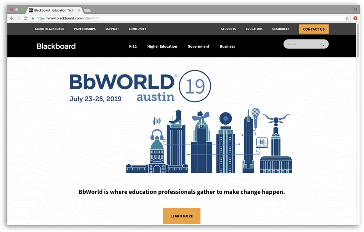
The majority of people we spoke to at BbWorld said they had used Blackboard.com before. We were particularly interested to hear from these experienced users, so we could establish a baseline experience using the old site, to later compare their experience using new site. Measuring these experiences against each other would tell us whether or not the restructure and retheme was an improvement. For example, if someone used the site for gathering specific information about Blackboard, did the new site make it easier or harder for them to do that?
Here’s what that baseline experience looked like:
- Half of the people we spoke to said the current Blackboard.com was easy to use, with a quarter each saying it was hard or neutral.
- Most common uses for the site included navigating to Blackboard’s Community site, reviewing the Higher Education section for language on products, or seeking help or support.
- Finding things or navigating the site were listed as the most common difficulty, although some thought it worked well!
- Opinions about the navigation were mostly negative.
- Testers felt that site was clean, but some thought it presented too much information.
- Most people said they access the site by typing the url in their address bar. (A sure sign of an experienced user!)
- Almost universally, people accessed the site from a desktop computer.

Learning about the new site
Moderated user testing is often the first time people outside of your team sees your product. While this can be daunting, it’s important to be open to constructive criticism big and small—after all, that’s the point of user testing! So while we were prepared (as always) for negative feedback, the overall response to the new Blackboard.com was extremely positive. Whew!
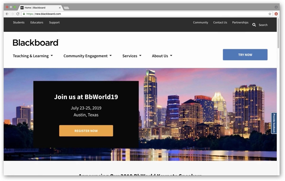
While we walked into testing thinking that, visually, the new theme was more of a small facelift than a full redesign, people were enthusiastic about the design of the new site. Before we could even ask about the design, many people immediately stated that they thought it was a big improvement, using words like “clean,” “modern,” and “professional” to describe it.
Many people also liked the new navigation structure. Comments about it included “All the overwhelming links are gone. Now I can digest what the navigation is offering. It’s highlighting the important information,” and “Navigation is simplified and to the point. More intuitive and easy to navigate, it will take a shorter time to get to what I want.”
Despite having a high level of familiarity with Blackboard, two thirds of the people we spoke to said that they learned something new about Blackboard during their brief time on the new site. Blackboard is working to let the public know that they’re more than just an LMS, so we were happy to hear the site is now aiding in that. Blackboard’s recruiting, safety, and social media management services were among the things people most commonly cited having learned about.
After performing a few tasks on the new site, half of the people we spoke to said the new site was easier to use than the old site, with a quarter each saying it was harder or the same.
But of course there was still room for improvement. Things that people thought could be improved included:
- Many people thought the site wasn’t doing a good job of explaining who Blackboard is and what they do.
- While the new navigation worked well for many people, some expressed confusion over the specifics of what it was presenting. Specifically, they were unsure what was a product and what was a service, and confused about the word “community” being used in two different places to indicate different things.
- Users would often miss the button for free trials, sometimes not seeing it at all until we pointed it out.
Results
The thing that gives our partners the most pause when pulling the trigger on user testing is that you don’t always know what the results will be ahead of time. How can you justify dedicating time and resources to something when you don’t know what you’re going to get? But that’s the point of testing—to find out things you don’t know. We’ve never walked away from testing without valuable insights that went on to inform the rest of the project, and our Blackboard testing was no exception.
One small but impactful result was that we changed the color of the free trial CTA. We made this pivot quickly in the middle of testing, which enabled us to gauge the impact immediately. People started noticing the button more, and thus the issue was resolved immediately — no muss no fuss! It was gratifying to have something so small make an immediate positive impact and we all laughed at how long we chatted about that button color prior to testing! Post-launch, this CTA is used six times more than it was before the redesign, and the page it links to is now the third most viewed on the site, leading more users to this essential content.
Following user testing we did an extensive redesign of the homepage, and the feedback we received stating the site should tell users who Blackboard is and what they do was our guiding light. The new Blackboard homepage is a top to bottom narrative that tells the story of Blackboard starting with a broad overview, then moves into some specifics, and then shows what Blackboard does in action. Post-launch, Blackboard has seen a decrease in the bounce rate of their homepage, meaning more users are engaging with it.
What we learned in user testing also informed the new site navigation. The site structure had been massively rearranged, shifting from being market-based to value-based. The feedback we received about certain parts of the navigation being unclear helped refine the language used. Post-launch, more Blackboard users have been getting to their destination in 0-2 clicks, meaning they’re using the new navigation to find what they’re looking for faster.
The insight that user testing provides can come in the form of reassurance. Since people were enthusiastic about the new site being easy-to-use, we could move forward with the confidence that there were no big missing pieces. Furthermore, since the new theme was so well received, we realized the visual changes provided a larger impact, shifting our perception of it from being a “facelift” to something closer to a redesign.
Blackboard.com subsequently relaunched and, with the help of the insights we gained in user testing, is seeing a decreased bounce rate on the homepage, more users finding their destination quickly, and a dramatic increase in traffic to the free trial page, meaning teachers and students worldwide have better access to some of the best digital learning tools on the market.
