Learning Page Redesign.


- Agile/Kanban
- Agile/Scrum
-
Senior ProducerKelly Albrecht
Working with the International Land Coalition gave us another opportunity to use our agile design process, generating ideas and a few unique solutions.
ILC has a lot of work going on around the world and we wanted to give users a way to explore the content on the site about each specific project that’s going on and the members involved.
Our approach was to focus in on the exploration aspects. What would give users the best sense of context of these global projects? How do we give attention to the members involved? What’s the best experience for sorting through the variety of project categories, subcategories and locations? And how do we present all this information without overwhelming the user?
How We Did It.
Building a relationship at the start
It was crucial we let ILC know that this is a journey we’ll both overcome together and they have our full support, as well as expertise with regards to questions or insight. They had many different goals for the project, but with the specifics undefined, we worked with them to help figure out the details and create a fully-realized vision.
The project’s dynamic was healthy constant dialogue between our creative team and everyone on the ILC team. We listened to their insights, we heard the things we needed to consider and the parameters we should work within. As things progressed, we started checking off the points on everyone’s checklists in order to be confident about the direction we were going.
First problem: Tools for finding relevant content
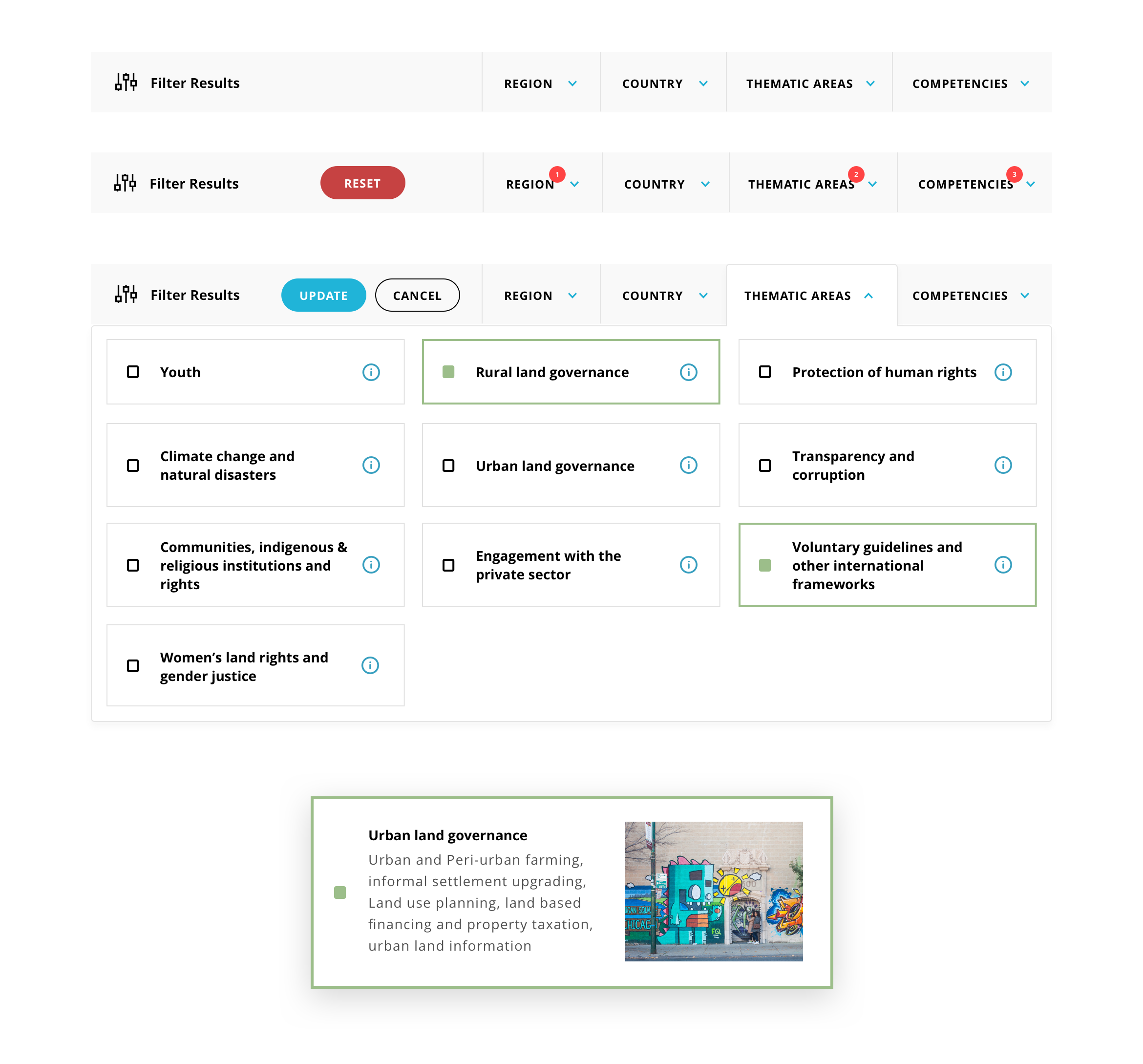
As mentioned before, ILC has many internal organizational projects. We needed an experience that helped users easily find content relevant to them. We mocked up a few ideas for a filter mechanism then iterated, each time pointing out the pros and cons then making changes specific to the drawbacks. This was our solution:

The thought process behind it was pretty straight forward. Present a lot of options and information without overwhelming the user, make it accessible while browsing and allow some filter terms to tell their own story on hover. It took a few tries to get here, but we believe it accomplishes those goals.
Second problem: The Map
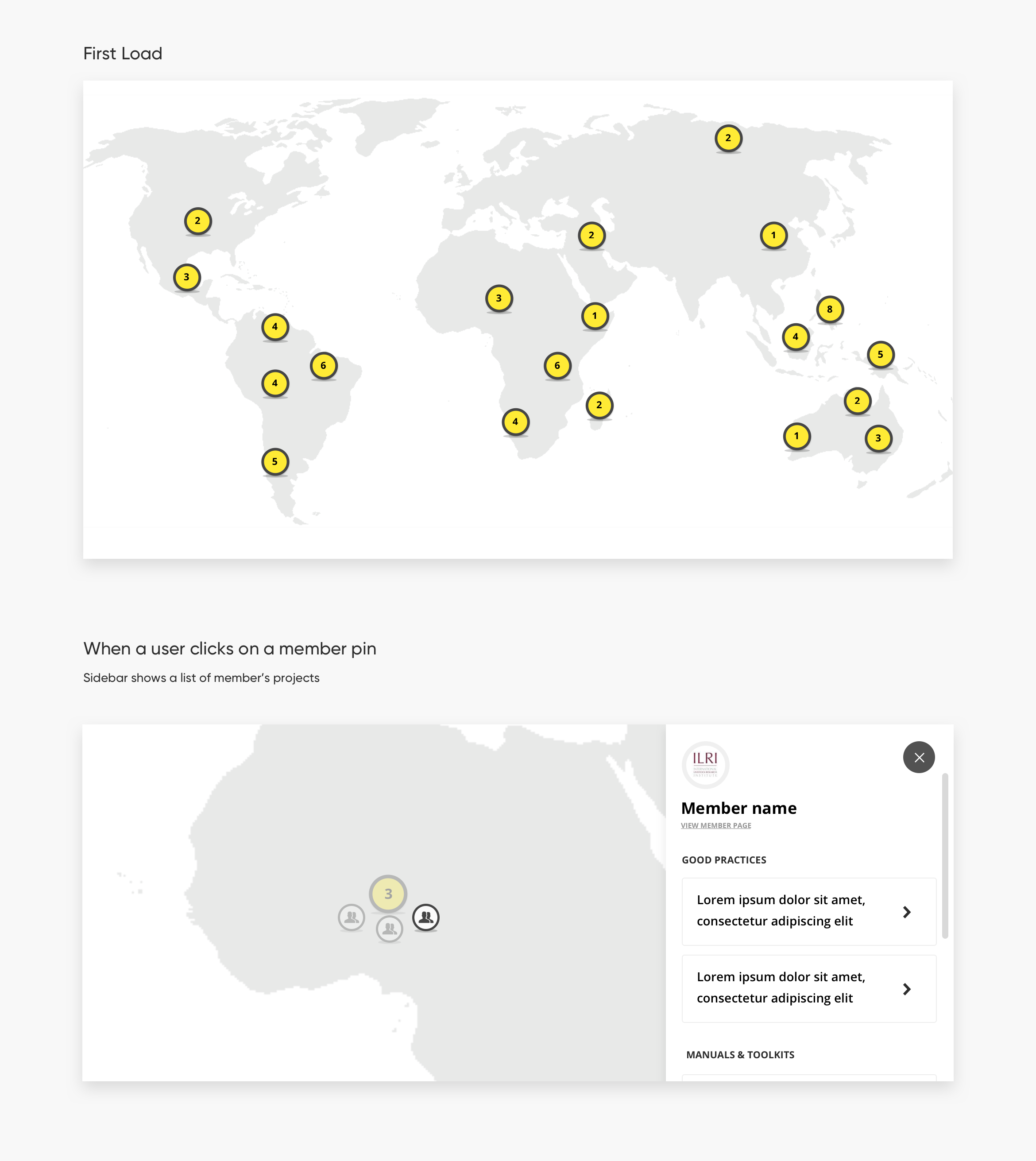
I mentioned context earlier, during the project we decided a map did a great job of showing the global reach of ILC. We utilized the core framework of an existing map on their website but completely redesigned the visuals and added a little more functionality. On first load, we show users the globe with a few markers showing the number of their members. Users from there have the ability to zero into an area or region of interest, finding which member(s) are doing work and what the projects going on in those areas are. Here’s the break down:

Our work was well received by the ILC board and our solutions for giving their site users the best sense of context of resource content from all over the globe was deployed on time and budget. Site users are now experiencing new ways to learn about ILC members through new ways of exploring a variety of categories and locations.