Enabling continuous improvement by listening to constituents.


Getting feedback from constituents to site authors.
Discovery
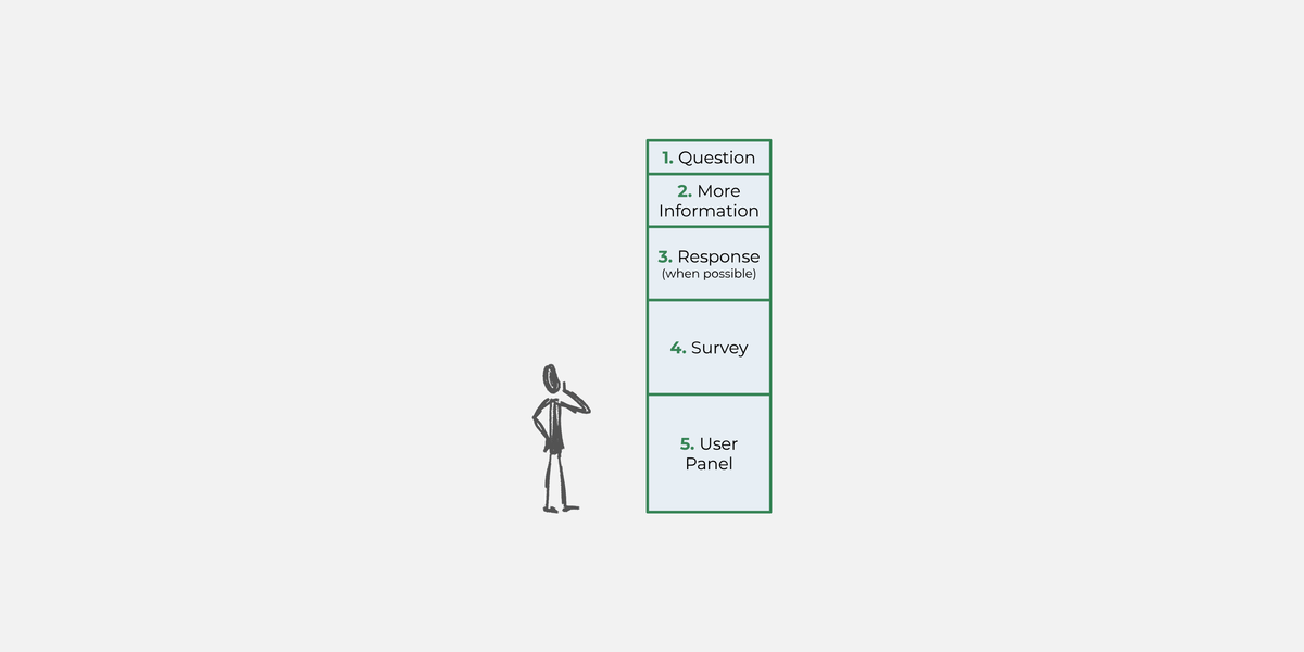
The success of Mass.gov hinges on getting the right feedback from constituents to site authors. Our first step in overhauling the way Mass.gov collects feedback was to define what we needed to know about each page in order to improve it, so we could design the feedback component around that. It consisted of the following:
- Whether or not users found what they were looking for, and what that was.
- Contextualize the above by knowing how satisfied users are with the page, and what they came to the site to do.
- Very detailed feedback that could only be provided through their user panel, a list of nearly 500 constituents who have volunteered to test new features for the site.
With our broad goals defined, we wanted to make sure the feedback component was working on a more granular level as well. We conducted a series of interviews with site authors asking how to best reach their users, and gained some valuable insight. Here’s what they told us:
- Too much information in the feedback form would scare users away.
- Feedback was being submitted with the expectation of a response, and organizations wanted to be able to respond.
- But, not all organizations would be able to respond, so a variety of contact options needed to be available to them.
Strategy
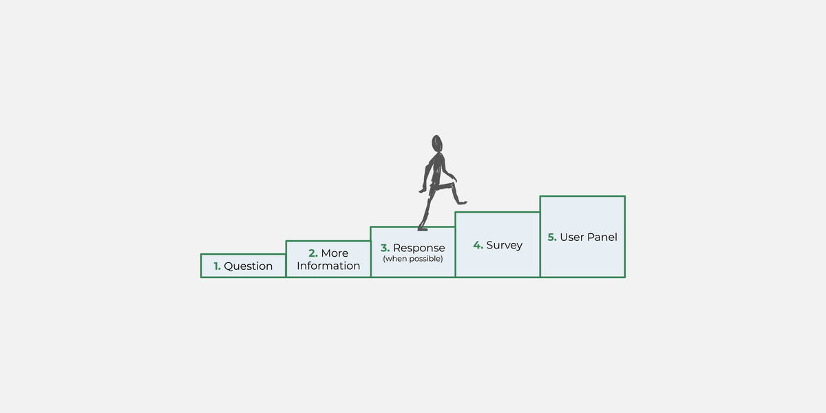
We combined what we learned above with our best practices to make a set of requirements that we used to define a strategy. It was immediately obvious that this feedback component needed to do a lot! And like site authors told us, if we showed that to users all at once, we might scare them away.
So to maximize the amount of responses we’d get, we decided to lower the effort for submission by presenting these options one at a time, starting with the step that takes the least amount of commitment, and increasing with each step. So users can submit a little bit of feedback, and then opt into submitting a little more, and then keep going.
Designing the feedback form
With a clear strategy in place, we designed the following component.
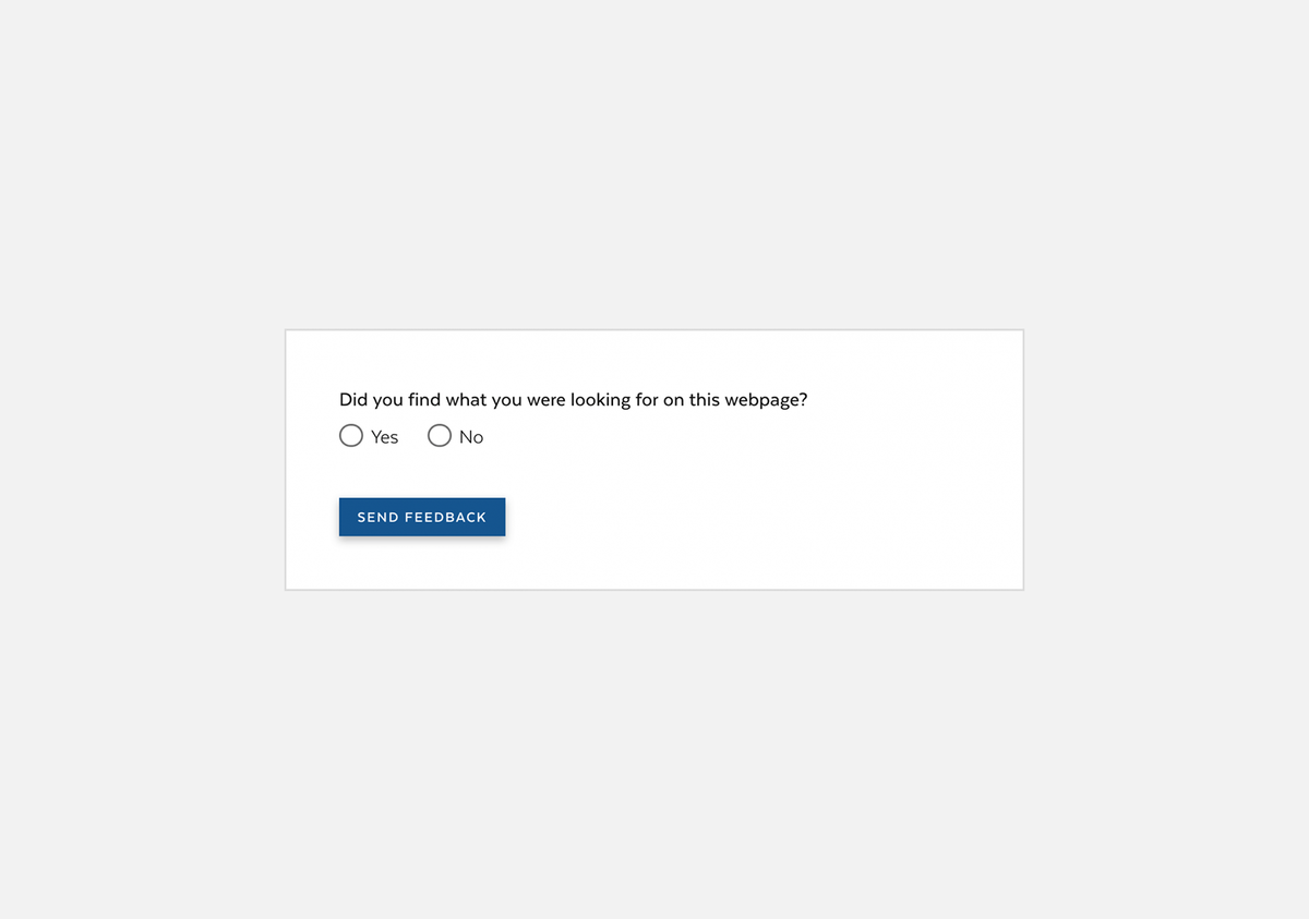
On first load, the component is very simple — it’s only asking users if they found what they were looking for.
Once users have made a selection, the component expands with fields asking them what they were looking for.
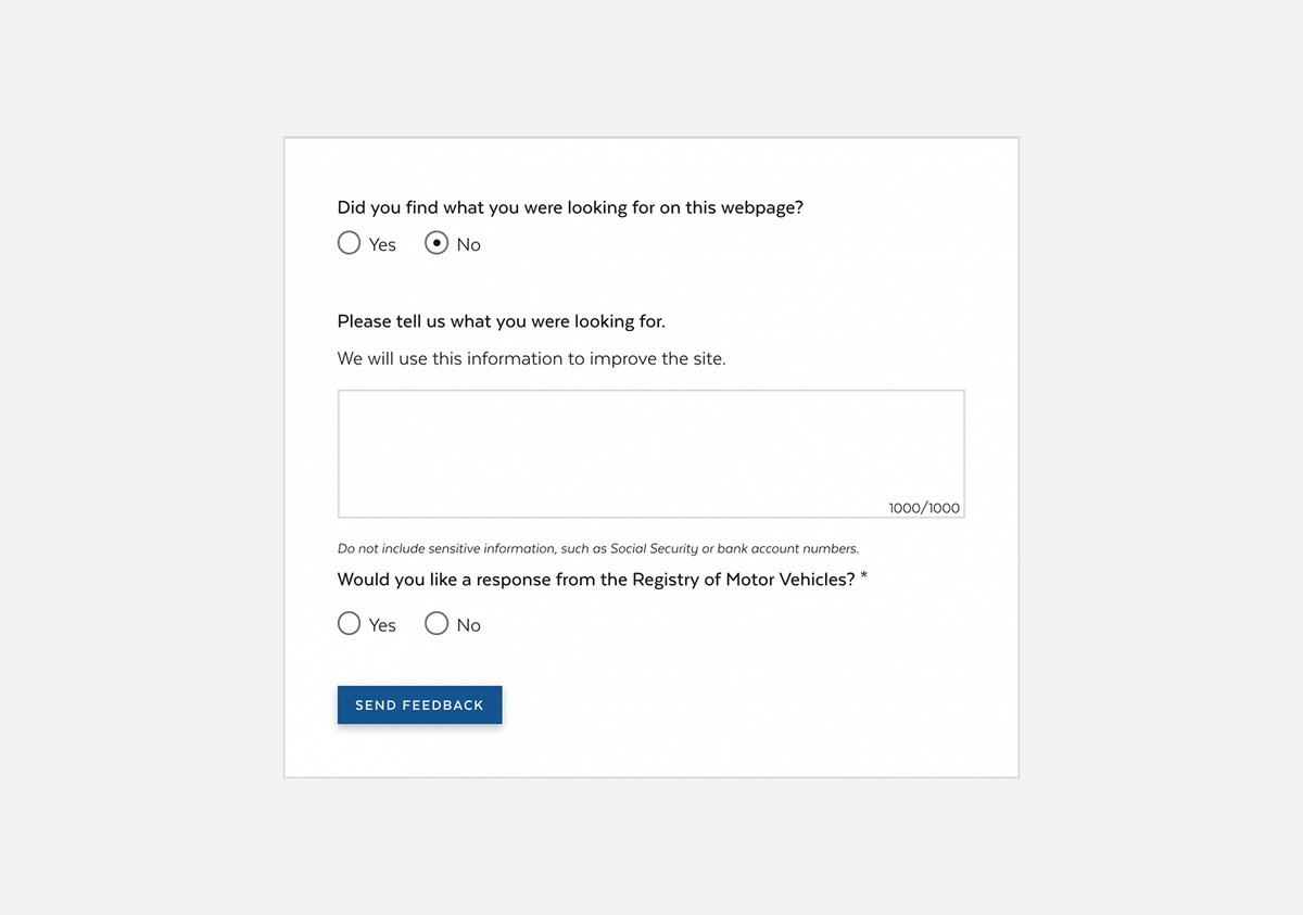
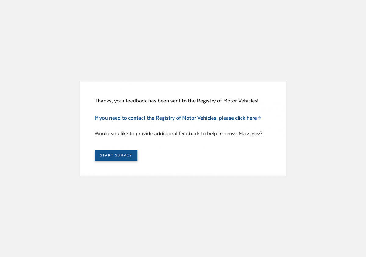
Site authors have the option of including an alert here that tells users this form is not for urgent assistance, and directs them to a better place where they can do that.
In the above example, the organization who is responsible for this page is able to respond directly to feedback. So if users say they would like a response, a form opens up for them to enter their contact information. If the organization was not able to respond directly to feedback, a brief explanation of why would appear there instead.
After submitting, users are thanked for their feedback.
Seen above, organizations are given the option to link to their contact page. This is commonly used if the organization is unable to respond directly to feedback.
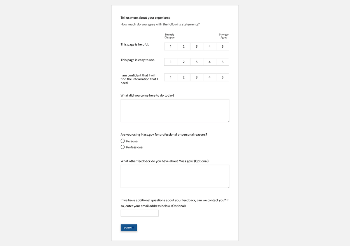
Users are then given the option to take a short survey, where they can provide more detailed feedback.
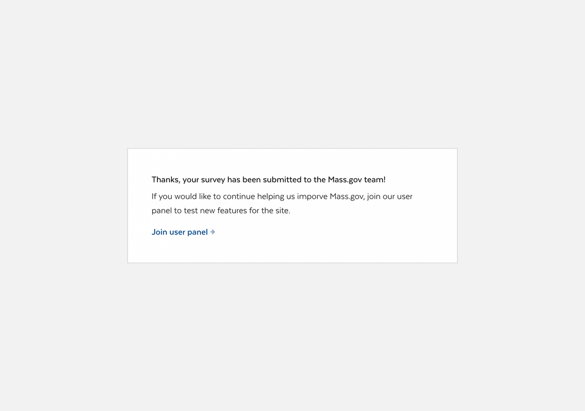
After submitting the survey, users are given the opportunity to join the Mass.gov user panel. This is the largest commitment available for providing feedback, so it’s at the very end!
So that’s how feedback is collected on the site. But what happens to it after that?
Displaying feedback to site authors
Feedback submitted through the site can be viewed per node, i.e. a site author can go to a specific page through the backend of the site and view all the feedback submitted for that page. But a lot of feedback can be submitted for a single page, and on top of that, site authors are often responsible for multiple or even many pages. Combing through all that feedback can be a prohibitively daunting task, or simply not possible.
To help with this, we designed the “Content that needs attention” panel for site authors.
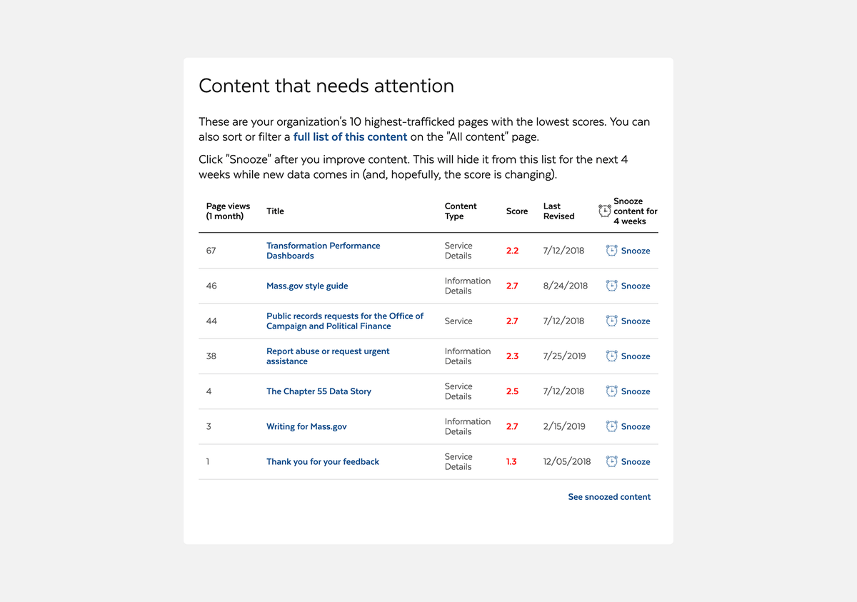
The “Content that needs attention” panel appears on the welcome page on the backend of the site, making it one of the first things site authors see after logging in. It displays the page titles of their 10 pages with the lowest scores from users, sorted by page views. By showing site authors their content that’s seen by the most people first, we’re helping them prioritize what to work on next.
We’re giving site authors additional information about the content right in the component, helping them make decisions at a glance. In addition to the aforementioned page titles, scores, and page views, we’re showing them the content type (since some titles can be very similar on this site), the date they last revised it (in case that helps them know how badly this content needs attention), and something a little surprising… a “Snooze” button!
We put a snooze button in because once site authors make an improvement to content, it’s no longer helpful for them to see it here. So, the way it works is that they make an improvement to content, then hit “Snooze,” and it’ll disappear from this list for one month. At the end of that month, one of two things will have happened: 1) the content will have improved enough to no longer appear on this list, or 2) the content needs more improvement, and will appear back on this list.