
Check out our related post specific to DevOps here.
Think about the work you do, the things you produce, and who you produce it for. Think about your customers, about your day-to-day processes, and about how close you are, right now, to your customer. Do you communicate with them? Is there another person in between you and your customer who communicates for you? Do you know if your customer likes the work you’re producing? Do they know if they’re changing their mind, or if what you want to develop is the right thing for them or not? How close are you?
If you’re part of a small team, it’s pretty easy to be close to your customer. It can be as if the customers just walk in the door and say, “Hey, I need help. Can you do this for me?” As your projects and products get bigger and bigger, and more people get involved, you start to get further and further away from your customer. Why might that be a problem? Why might you want to have a closer relationship with your customer?
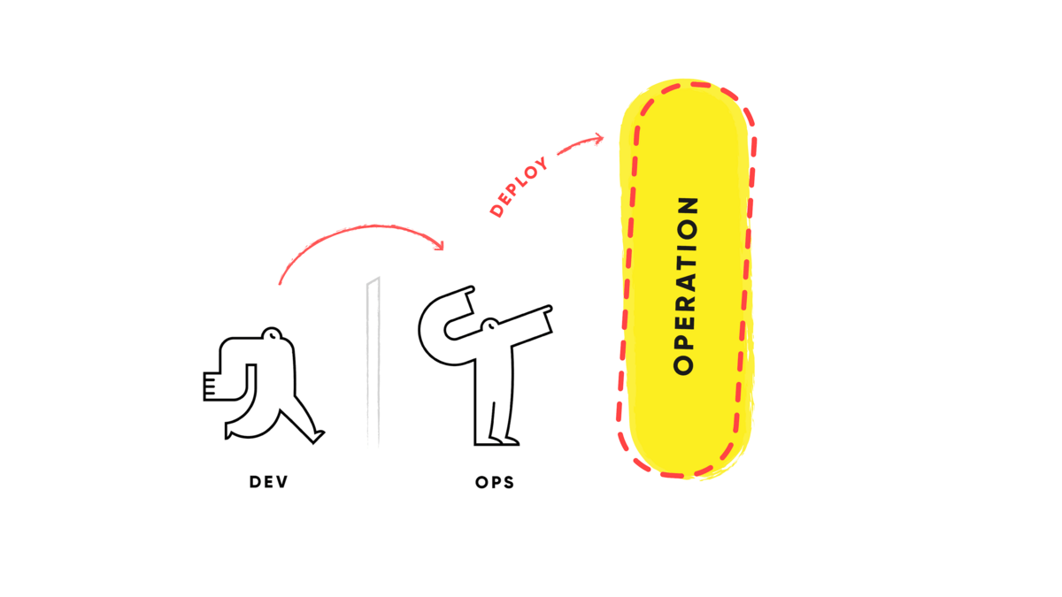
For many of us, this can represent our day-to-day. We develop things, and either somebody puts them into operation for us or, maybe, we just put on a different hat and deploy our work into operation. Our tasks come in through our task-tracking system, and we have to do them by a certain date. Then, we just ship off our work to our customers, who we may not ever actually talk to or communicate with. If you have a larger product, there can be a lot more to it.
As your team and your product get larger, the dynamic changes. You might have a community around your product. At some point, there will be some customers that many people on the team never really interact with. The team pushes work down the stream, the customers get it eventually, and then, maybe, feedback gets back up to the team. Best-case scenario, it’s like a game of telephone.
The customer is the one who’s deciding if we’re delivering the right thing or not. If we’re on the team developing that thing, we should want to know as quickly as possible, and as often as possible, if it is the right thing. We don’t want to waste time guessing or doing too much work that’s going in the wrong direction. The larger the team, the longer the feedback loop can get; we need to think about how to shorten that loop so we spend less time getting things wrong, and more time getting things right.
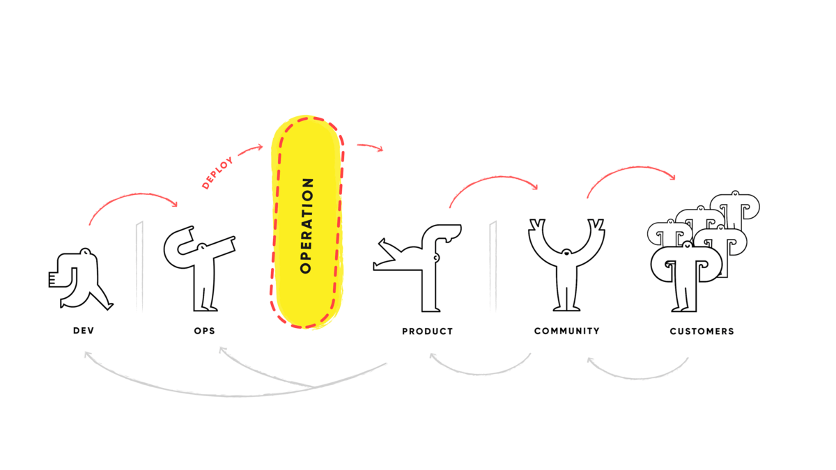
This is really the kind of thing that happens when you’re in a DevOps mindset. The yellow area of this circle is the product in production. On the bottom toward the left, there’s “Planning New Features,” or fixing features that we’ve gotten from feedback. Then we proceed into building things, automating testing, and integration into deployment. Most teams, including ours working with Mass.gov, are really good at building and delivering things. We can build and deliver a lot of things very quickly, but a place where a lot of work was done was getting closer to the customer, in the sense that we needed to let them know what we’ve built and what we’ve fixed. We needed them to know how to use what we’ve built for them, and we needed to ask them directly in our product, “How’s it going?”
Everybody’s probably been experiencing this in a lot of products they use. You probably ignore it all the time, like, “Yes, this page was helpful, but I’m… just gonna close this window.” Maybe, after reading this, you might give feedback more often. We know we do.
In our engagement with Mass.gov, Drupal is essentially the product being developed and operated in. So we had to ask ourselves, “In what ways can we make Drupal better for our customers, to give them a better experience, get better feedback from them, and build that relationship?”
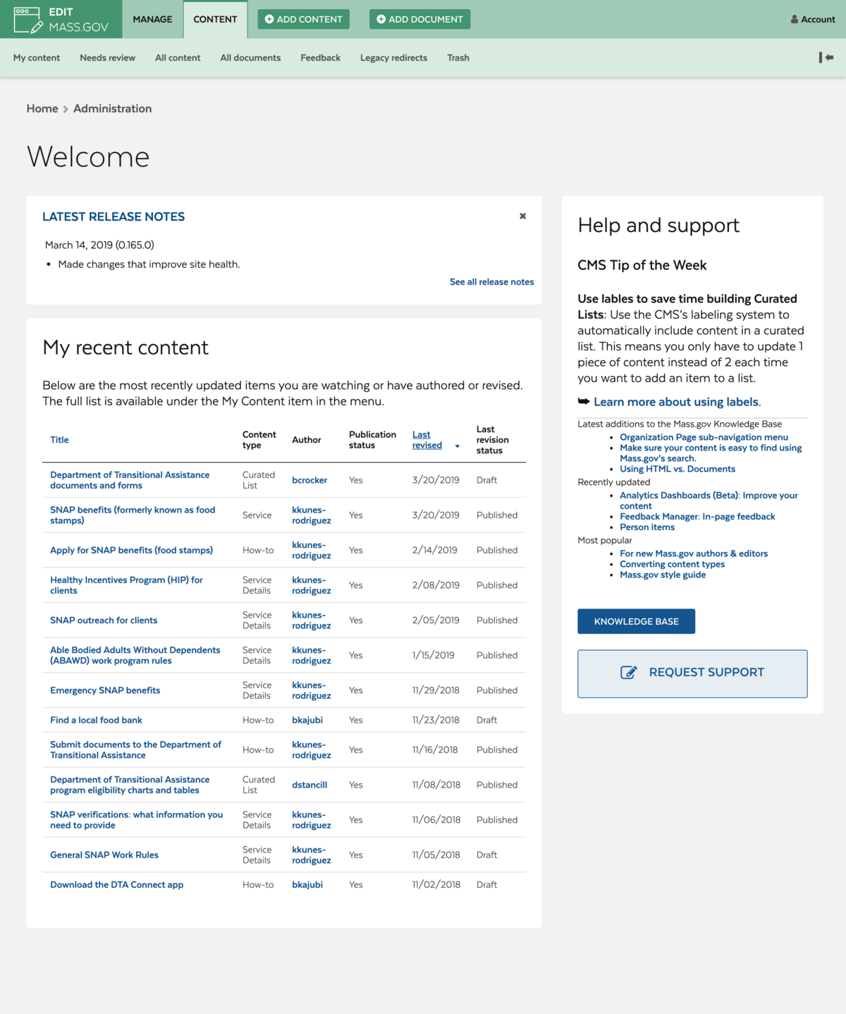
We started by working on the admin site for Mass.gov, where their authors go into to create and edit content. We’d received feedback that users wanted the ability to move the authoring of content into the hands of the actual subject matter experts writing the content, instead of keeping it in the hands of web experts or technical folks as the old system dictated by simply being difficult for non-technical people to use. Mass.gov was using the default Drupal admin theme, where the UX/UI definitely had room for improvement. The theme can have unclear page hierarchy, which Colin Panetta—LCM’s Director of UX/UI, who took the lead on this project—described as having no strong distinctions between what’s more important or less important on the page. It can be hard to tell where specific areas begin or end, and it’s just not visually appealing; it has a drab color scheme, and the generic appearance doesn’t create a relationship with the user.
We decided to retheme the admin site. Doing so allowed us to create a more engaging experience for our users, focus on the areas where usability could be improved, and make those improvements. We did this with a pattern library, which allowed us to apply these improvements at a large scale without the prohibitively high effort of creating designs for every single page. We wanted users to know they’re in a space that’s related to, but distinct from, the main content site, so we used the same fonts and colors but flipped their usage. On the main site, a blue color is used for decoration and green is used for action, so on the admin site, we used blue for action and green for decoration, and the display font uses thin weights instead of bold.
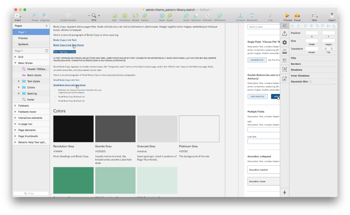
We took the fact that this was a dashboard site into account and made special considerations for that. As with many dashboard sites, the experienced users of this site were more likely to know where they’re going and need less hand-holding, so we were able to use smaller font sizes and tighter spacing than we did on the main site. In order to make page hierarchy clearer, we made relationship-based vertical spacing rules; elements that are closer together always appear more closely-related, and elements that are further apart are less related. For this site, we made unrelated elements 48 pixels apart; somewhat related elements were 36 pixels apart; closely related elements were 24 pixels apart, and, when things were part of the same element, they were just 12 pixels apart.
Using a shared design vocabulary we could take these ideas and apply them site wide—even the pages that weren’t yet designed—to start development and apply the broad strokes to the theme, while the design team focused on some of the areas of the site that required more attention for usability. One of these major areas we wanted to focus on were form elements, which we used to create or edit content.
On Mass.gov this was especially tricky, because the content is pretty complex and the forms are being assembled from a number of differently-styled modules. This created a few problems, mainly that it was unclear where specific form elements began or ended, and it was difficult to tell which form elements were nested inside of which other elements. We came up with a unified styling for all form elements. Besides the sitewide restyling, there were two main strategies in place: horizontal lines showing the end of one form element and the beginning of the next, and vertical lines showing the beginning and end of nested re-orderable elements.
Functionality to accommodate the UX of author and editorial experiences in Drupal was something that had not gotten a lot of emphasis in the Drupal Core or Contrib community when we started this project. Modules like Tour, Admin Tool Bar, and themes like Adminimal, Material Admin, and Thunder, got close to the idea of what we needed but didn’t quite work for our purposes. However, they did inspire us; Adminimal, for example, is a contrib sub-theme of Seven, and we decided to begin our work the same way.
We hooked into Seven, which gave us the benefit of working with a base that is maintained and receives security updates. One of the main challenges in building an admin theme for Drupal are the number of modules that require different user interfaces; some modules make minor tweaks to the UI to meet their needs, but some create their own from scratch. It’s very difficult for an admin theme to support all of these use cases without something breaking, let alone making the UX cohesive. By creating our theme from Seven, we could ensure that it wouldn’t unexpectedly break module UIs for modules that we hadn’t even anticipated needing yet, and it makes sure that we’re not breaking anything that we’ve already got there.
There were some drawbacks to this approach, though. The technique of building something off of Seven was never really intended to be used for a re-theme of this size. In order to accomodate all of the customizations we needed, and the feedback we were receiving throughout the project, the admin theme started to feel larger than the site itself. We also realized that the sub-theme couldn’t do the job we needed it to entirely on its own, and we ended up needing to create some modules in order to make sure that our styles would override anything that the front end theme was using.
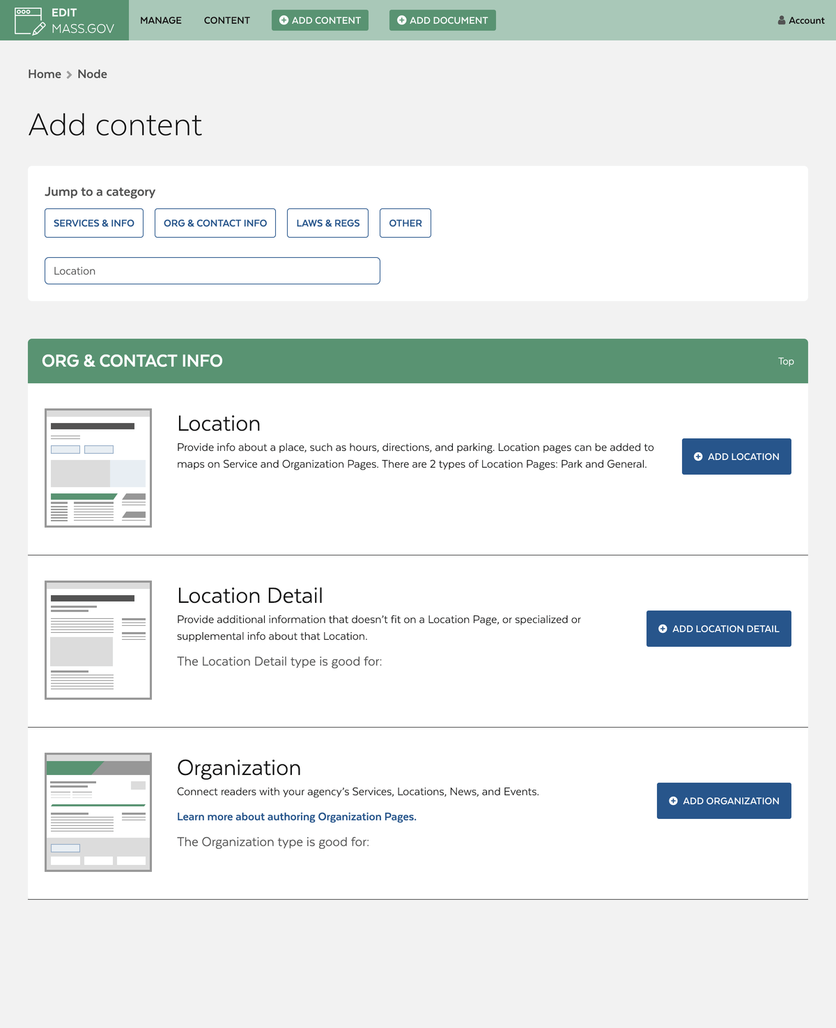
Ultimately, everything came together. We developed a new and improved version of the Admin Toolbar, specifically with the intention of making navigation more efficient for content editors and creators. To build it, we started with the Admin Toolbar module and then created a separate custom toolbar module specific to the Admin Theme to put our customizations in. We added buttons for easy access back to the login page, and a separate button to return to the main site. We hooked into the tab bar and created a custom tab just for authors containing a suite of links to take them to pages that are specific to their needs only.
Originally, there was no direct way for authors to immediately get to the two most important pages that they needed: the page to add content and the page to create new documents. In order to add that functionality, and still keep a slim line top bar experience, we added buttons to those pages right to the tab menu. We built a custom “Add Content” page with attentional experience in mind; Mass.gov, at the time of this project, had about 35 content types for an author to scroll through. The first thing we did was create categories for the content types to fall into, and then add jump-links to them on the “Add Content” page. With the aim of making it as easy as possible for authors to be able to find the right content type for their content, we also:
- Added custom search functionality, which looks through both the content type names and the description text.
- Added a “thumbnail” example of each content type to give authors a preview of what each type might look like.
- Added cleaner and more strategically-positioned description texts.
- Added links to Mass.gov’s document site, where authors can find even more information about each content type, including how it’s used, tips for how to create one for yourself, a bulleted list of the different things that it’s good for, and a link to a live example of the node itself.
We believe that Drupal as a community has a long way to go on the road to empathetically putting ourselves in the mindset of site authors, the customers of our product, by developing an interface that makes sense for them to use. It’s something that other content management systems have gotten right, and something Last Call Media feels like we successfully achieved with Mass.gov on this project. Even looking at the current efforts where a tremendous amount of work is going into the help system for Drupal (with the addition of modules like Tour), it still looks and feels like something where developers—technically-minded people—are improving the mechanisms by which they add help. It doesn’t really feel as though the question is being asked: “Our customers are going to be using this. Not all of them are technical users. How do they want help, and what help do they want?”
We got very lucky with Mass.gov. There was an incredible alignment across the entire team and with the stakeholders that responding to feedback and having a close relationship with the customers was of the utmost importance. They knew they possessed a system which was so unintuitive and painful to use, that they needed a web expert to add their content; they knew that this was not sustainable, and they prioritized the time, budget, and effort for fixing this problem. It’s rare, however, that an organization has the resources for this, and so the Drupal community needs to continue improving, and continue asking ourselves, “What is best for everyone?”