Color my world - Color Blind Awareness

Recently I have been coming across lots of great information about colorblindness, and it has been a real eye-opener. There are lots of really great articles and podcasts out there, and since September 6 is Color Blind Awareness Day, I thought I’d do a post to aggregate some of my favorite readings and resources.
A few basics
First, the basics that are helpful to bear in mind:
“Color blindness” is not really an accurate description of the condition - most people who are color blind do not see the world in black and white. Color vision deficiency (CVD) is a more accurate description. But the term “colorblind” is the most familiar and widely used term.
There is no “cure” for color blindness. It is typically inherited and is more common in males than females. Color blindness can also develop later in life through damage to the eye, optic nerve, or brain. Inherited color blindness can be present at birth, begin in childhood, or not appear until the adult years.
In populations with a European ancestry, color blindness occurs in approximately 8 percent of males (roughly 1 in 12) and 0.5 percent of females (roughly 1 in 200). However, there are different types of CVD and some types are more common than others.
Different types of color blindness
Full color vision, also called trichromacy is the result of three types of cone structures in the retina of the eye working together and in harmony with the visual cortex, which processes the signals from them. The three different types of cones have different photoreceptors that respond to wavelengths of light that we identify as red, blue, and green. Fully functioning vision also makes use of rod structures in the retina. These structures are more sensitive to dim light, and so they are relied upon heavily for night vision. Rod structures have only one type of photoreceptor.
The most common forms of color blindness arise from the reduced functioning or absence of functioning of the red or green cones. These forms are sometimes grouped as “red-green color blindness”. The gene that leads to red-green color blindness is found in the X chromosome and consequently, red-green forms of CVD occur predominantly in males. Limited or absent functioning of the blue cones is less common, and is sometimes referred to as “blue-yellow color blindness”. This form of CVD occurs with similar prevalence in men and women because it arises from a mutation on a gene that is shared equally by men and women.
People with reduced functioning of one type of cone experience anomalous trichromacy, which may be very pronounced or relatively mild. Reduced sensitivity to green is called deuteranomaly, reduced sensitivity to red light is called protanomaly, and reduced sensitivity to blue light is tritanomaly. If a person has one type of cone that does not function at all, i.e. only two types of cones are responsive, that person has dichromacy. Inability to perceive green light is called deuteranopia, inability to perceive red light is called protanopia, and inability to perceive blue light is tritanopia.
Individuals with monochromacy, the most rare and severe form of color blindness, do not experience color at all. This can result from having only one of the three types of cones functioning (cone monochromacy), or from having no cones functioning (rod monochromacy). In the latter case, vision is limited to shades of black, white and grey, and the individual is often quite sensitive to bright light. Having one type of cone working is a unique case. In order to distinguish colors, the brain needs to compare the signals from the different photoreceptors in the eye. If only one photoreceptor is working, this is not possible.
What does color blindness look like?
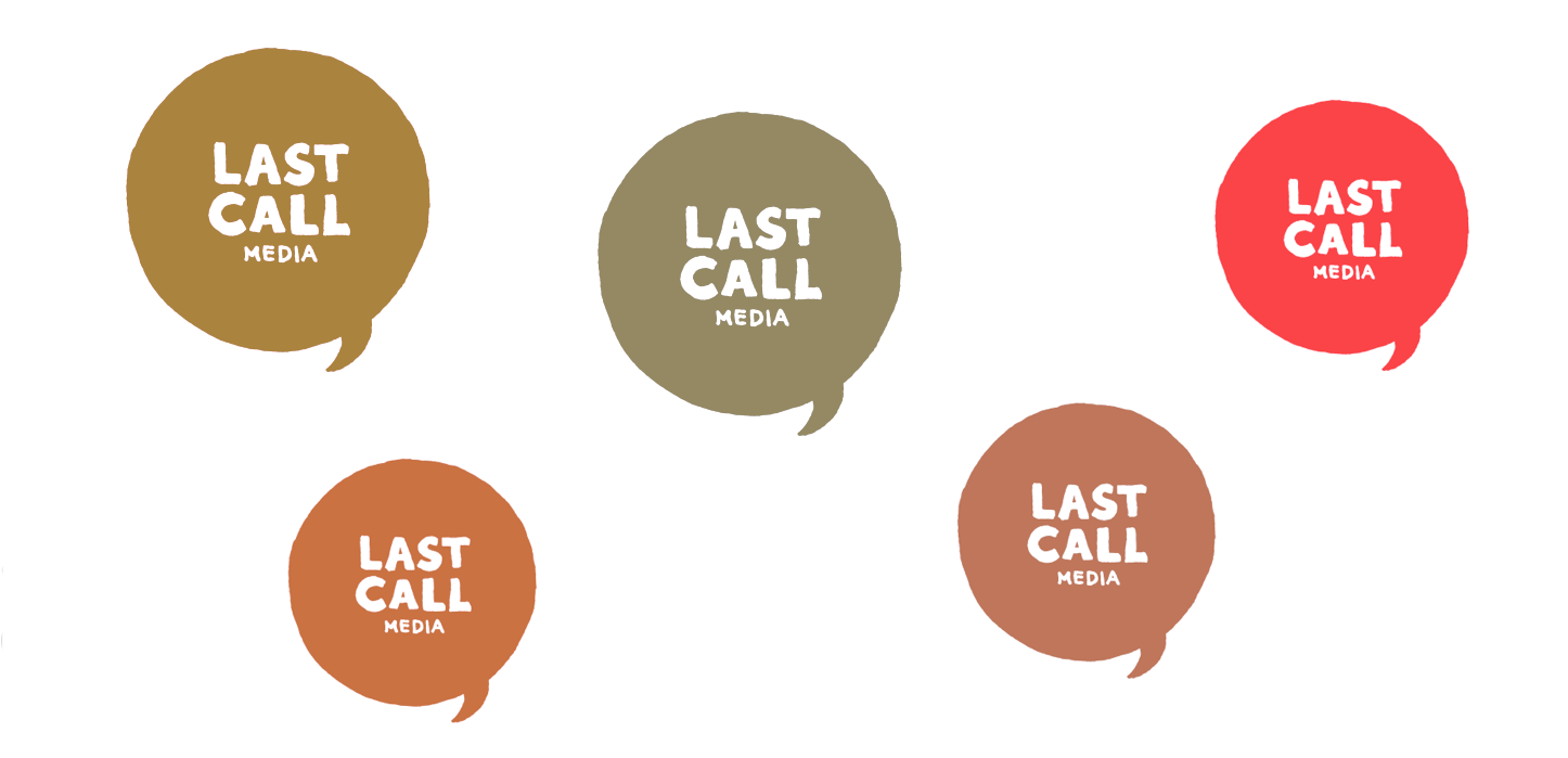
If you have read this far, you know that the answer is “it depends”. The header image for this post shows the LCM logo as seen through filters applied for deuteranopia (top left), deuteranomaly (bottom left), protanopia (top center), protanomaly (bottom center), and tritanopia (right side). This logo is very strong in the red part of the spectrum (rgb 251,68,73), so there is very little change when viewed with a tritanopia filter.
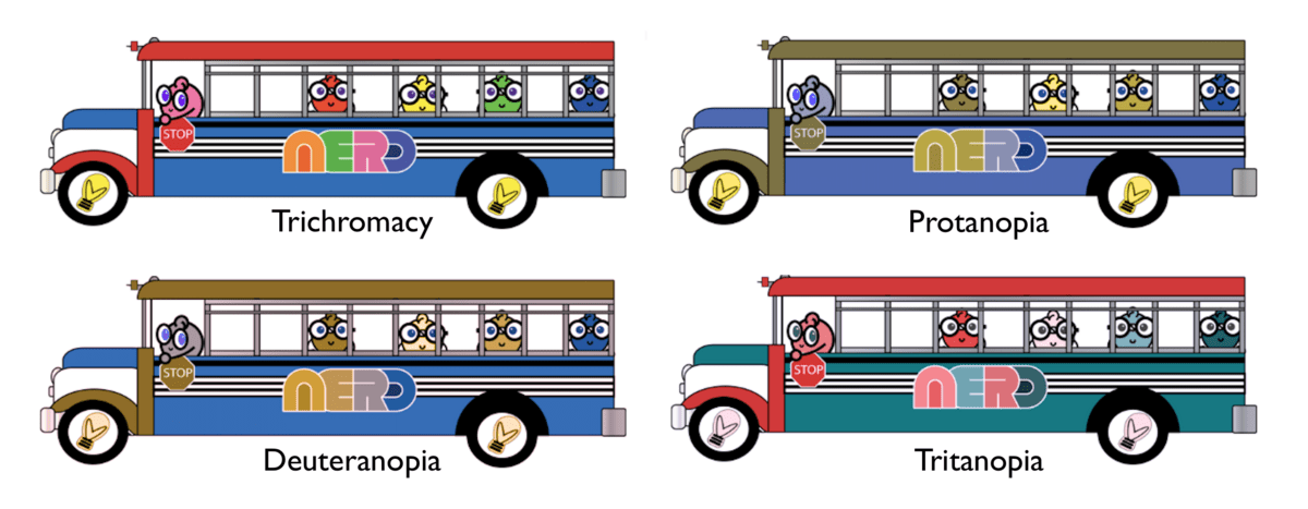
To show the effects of dichromacy on a more colorful image, I made the collage image below. This shows a piece of art work for our upcoming conference event, NERD Summit 2019, filtered for different forms of CVD.
What does this mean for accessibility?
Three of the WCAG 2.1 standards are directly applicable for ensuring that websites are accessible to individuals with CVD.
- Success Criterion 1.4.1 - Color is not used as the only visual means of conveying information, indicating an action, prompting a response, or distinguishing a visual element.
- Success Criterion 1.4.3 - The visual presentation of text and images of text has a contrast ratio of at least 4.5:1, and large-scale text and images of large-scale text have a contrast ratio of at least 3:1.
- Success Crieterion 1.4.11 - The visual presentation of user interface components and graphical objects have a contrast ratio of at least 3:1 against adjacent color(s).
Last year, Jared Smith of WebAIM did a nice talk about Rethinking Color and Contrast for the Inclusive Design 24 (#ID24) online conference. It has much more detail than provided above about color vision and how it works, along with dicsussion about avoiding reliance on color and ensuring sufficient contrast. A number of great examples of design failures and alternatives is presented in a recent article by Lizzy Hillier, Considering colour blindness in UX design. Adding symbols or textures along with color makes all the difference for infographics, charts, menus, and other information.
For many of us, working on web accessibility is an exercise in empathy. In Going Colorblind: An Experiment in Empathy and Accessibility, Sarah Novak wrote about the experience of putting a colorblind filter for deuteranomaly on her desktop, laptop, and mobile device for three days. One of her realizations in discussing her experience with a co-worker with deuteranopa was that the color palette that appeared very limited to her was “normal” to him. Many individuals with colorblindness have adapted to most situations, but some empathy goes a long way. Color coded comments in documents, for example, can be difficult to decipher.
Designing the web in an inclusive manner means including color blindness in design decisions. At LCM, our design team makes use of a Sketch plugin called Stark, which is a contrast checker and colorblindness simulator. It works by providing an overlay window that can be moved around in the work area. This is part of all of our work, so colors are evaluated before a line of code is entered.
How to see like the colorblind
Since talking about colors is sort of like looking at food, I think the best way to explore the world of CVD is to try out the many many amazing tools that are available. There are different tools for each browser and operating system. Since I use a Mac, that is where my toolkit is the deepest.
A growing list of browser extensions are available that will simulate different kinds of CVD for content on the web. For Chrome, I use I want to see like the colorblind and Funkify, which also simulates a wide variety of other vision deficiencies. I have seen favorable mentions of See, No Coffee, and Spectrum. For Firefox, the RGBlind add on will simulate deuteranopia and protanopia.
If you work on a Mac or on iOS devices, you can use the Sim Daltonism app that is available on the app store. Like the Stark plug in described above, this app works by presenting an overlay window that can be resized and moved around on the screen, so you are not limited to content on the web. The Color Oracle tool is a free color blindness simulator for Windows, Mac and Linux that works in a similar way. There are a number of sites where you can upload an image then view it with a colorblindness filter. I have used the Coblis (Color BLIndness Simulator) site for this.
Where to learn more
In addition to the links embedded above, there are a number of sites that are packed with information about CVD. Here are a few:
- Colour Blind Awareness.org
- Colblindor at www.color-blindness.com
- National Eye Institute of the National Institutes of Health
These references have lists of resources as well, so you are all set for hours and hours of exploration!
I’m surely not an expert since I am not color blind myself, but I’m hoping that this information can help others who might want a crash course to get started on understanding color blindness.