Accessible Comics???

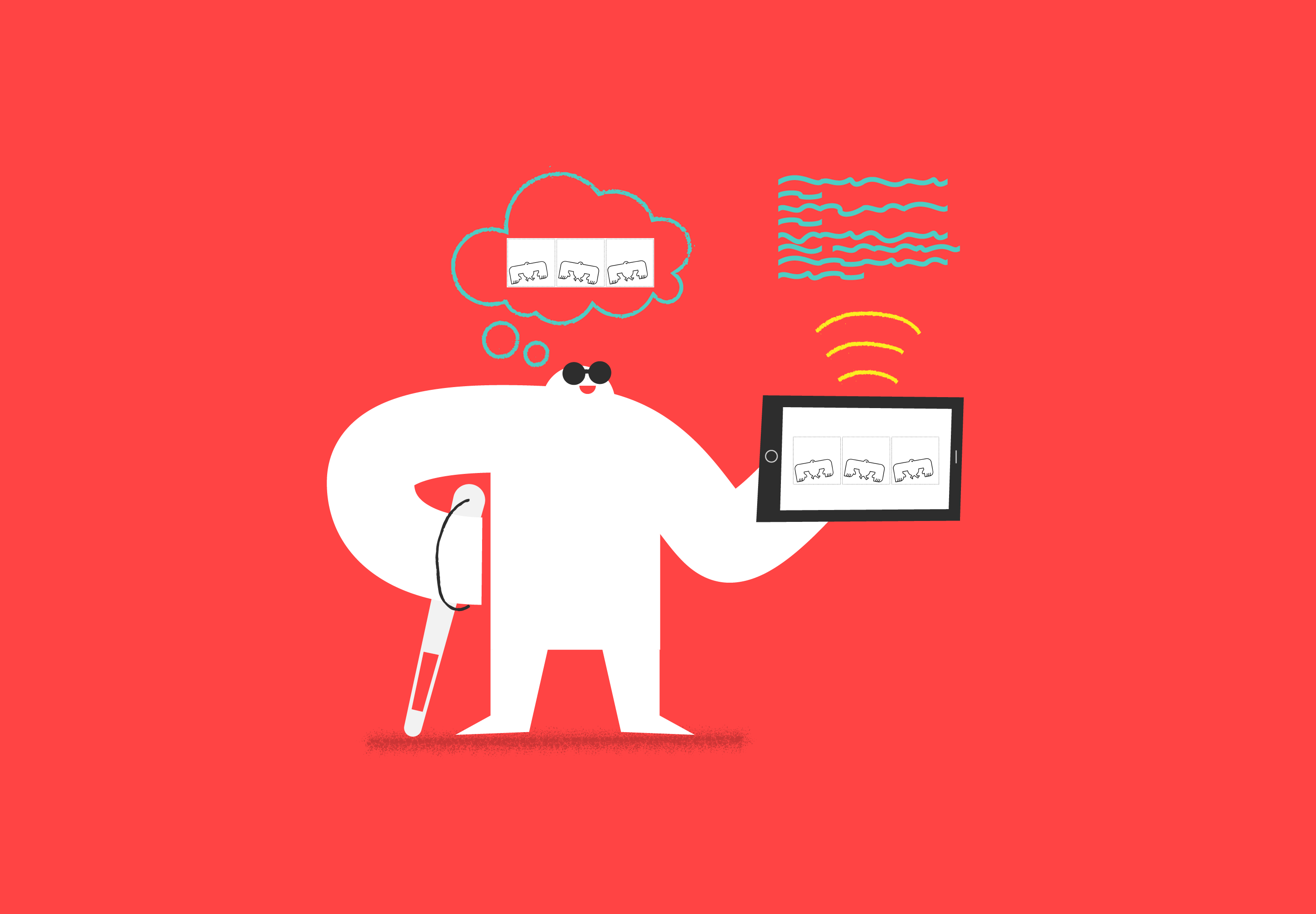
In a recent newsletter, Last Call Media introduced a new feature. Colin Panetta, our Director of UX/UI, has many talents and one of them is drawing comics. He has lately focused that talent on the Yeti character that you can find all over our site. Now you can sometimes find Yetis in a comic in our newsletter. The Yeti is surprising, inquisitive, inscrutable, transformable, and much more. Colin and Molly Taffe, our Graphic & Motion Designer, have been having fun doing lots of creative things with the Yetis, so you can look forward to seeing their ideas come to life.
When I saw the first comic, the second thought I had (right after “Wow, so cool!”) was “I wonder if that can be made accessible?” I have to admit that I’m not a regular comics reader, and I had not ever thought about accessibility in the context of comics. So, I posted a question in one of my favorite online communities, the WebAIM Web Accessibility Email Discussion List. As expected I got some good answers, and I spent most of my time over the next few days thinking and reading based on those responses.
To alt or not to alt?
My simplistic assumption about making comics accessible was that each panel would be treated as a separate image, and that the image for each panel would be provided with alt text. I learned that this is sometimes partially correct, but not always completely correct. As with all things regarding alt text, context is everything.
Is alt text needed?
When I posted my question in the WebAIM forum, the very first responses posed one of the key alt text questions - is it functional or is it decorative?
Are the comics just for entertainment? Or do they convey important information or ideas?…How much do the comics rely on the visual aspect, and how much not? If the comics are just for entertainment purposes, and rely heavily on the visual aspect, then you might want to forgo ALT text.
Colin’s comic is highly visual (the few that I’ve seen have no text at all), and are definitely intended to be for entertainment. So there is a solid argument that we could just enter null alt text (alt=” “) and move on. Screen reader users without sight would skip right over the comic and not know it is there, and screen reader users with limited sight would see that they are missing something. But, I think that is a missed opportunity for both sides.
The comic is indeed entertaining, so why assume that users of assistive technology don’t want to be entertained? In addition, since we strive to be inclusive in our work every day, composing alt text for each comic provides the author with another opportunity to be thinking about the broadest audience possible. Things like thinking inclusively and writing good alt text are like developing a muscle - the more you do these things the better you get at them and the easier they become. So, while there certainly may be times when it would be appropriate to enter a null alt attribute, I decided that was not the approach I wanted for Colin’s comic.
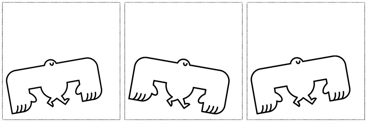
For the relatively simple comic included in the LCM newsletter, all three panels were combined in a single image. Since the action in this series was relatively simple and there is no dialog, alt text is completely adequate. Below is the first comic in the series, which has the alt text “A 3 panel comic strip showing a Yeti jauntily trotting along its merry way”
(Update! You can follow the adventures of the silly yeti character on our Yeti Comic page!)
Alt text is not for “easter eggs”! (what not to do)
I saw the idea of using the alt attribute in an odd way mentioned a few times, mostly in posts that were a few years old. As described, the alt attribute can used to plant hidden surprises for clever readers. …many web comics feature alt text, language that pops up when the reader mouses over the image.
This made no sense to me, since alt text is only exposed to users of assistive technologies - it does not ‘pop up’ on mouse over.
I wondered if these were actually references to using the title attribute, which is revealed when a mouse user hovers over an image. What I discovered from looking at a few examples, is that some comic writers do both. Amazing Super Powers, which was referenced in the article that discussed this idea, is an example of this. A four-panel sequence that introduces the main character and sets the stage for upcoming activity has alt text and title text that says He’s aliiiiive! (unlike most creatures around him)
. A screen reader would announce this text with no context, which is probably not helpful or interesting. Unfortunately, the story in the comic is not available to screen reader users, nor is the image text beneath which reads What happens next to our fearless hero? Play the game to find out!
I wish I could say that this misadventure in alt text was just one article and one comic, but unfortunately I saw a number of similar examples.
Key resource for comic alt text
Veronica Lewis has written a comprehensive article on How to write alt text for comics. Here are some quick points:
- it’s not necessary to mention that it’s a comic if that would already be apparent from context
- introduce the characters
- share the dialog
- describe what the characters are doing
- it’s not necessary to describe recurring characters in every post
She also describes in the article how she reads comics on Instagram, noting that she can only really read them if there is a separate image for each panel.
Veronica posts on Pinterest and at veroniiiica.com about a wide-ranging array of topics such as a review of the Marvel Comics App as a low vision reader, using pillow pets as assistive technology, and low vision horror stories in six words or less. Also, if you ever wondered why the drive-up ATM has braille, she’s got that covered as well!
Text transcript
While alt text can be the right strategy for describing simple multi-panels or single panel comics, many webcomics have a bigger story to tell. And, quite often, the panels are presented in a single image, not as separate images. The best solution for making these comics accessible is to take a page from the time-based media (i.e. audio and video content) play book and add a transcript. Transcripts make your content available to screen readers, but also to braille output devices and search engine crawlers. They can also be easily translated, so your comic can be read by fans all around the world.
Option 1 - Basic Transcript
Robot Hugs is a webcomic that approaches difficult topics such as mental health, relationships, identity and social issues with insightful humor. The author includes a transcript below the comic in an accordion area that is visible but collapsed so a sighted user can easily skip over it to the content below. The transcript is exactly that - the text in the panels is reproduced in a format that is available to users of assistive technologies. If a screen reader could read the comic, this is exactly what would be announced. The alt attribute contains the title of the comic.
This is a totally valid approach and it definitely gets the basic idea of the comic across. I personally found the transcripts for this comic to be a little more sparse than I would have liked. Although I appreciate the inclusion of the transcript, if it was all I had access to I probably would not find this comic nearly as interesting as a sighted reader would. The thing that makes comics special and distinct from prose is, in fact, the information that is conveyed in the images.
As an experiment, I opened a few comics and went directly to the transcript without looking at the images. I often found it difficult to understand which character was talking, because the speaker for each bit of text is not identified as they would be in a well presented podcast transcript, for example. Also, when I looked at the panels of the comic after reading the transcript, I often found that there were panels that conveyed information without any text, but they had been skipped over in the transcript. Sometimes there was non-conversational text, such as “2 hours later”, that was not included in the transcript. So, as great as it was to have a transcript, I think if there was a little more information this comic could be more fully enjoyed by a screen reader user.
Example of a basic transcript
Here is an example transcript from a Robot Hugs comic titled Despair:
These problems are too big. We’ll never solve them in time.
They’re big but lots of people care. I am one of those people.
–
If you’re not helping in the best, most efficient way, you shouldn’t even bother.
When I see a better way, I’ll do that. Perfect is the enemy of good.
–
You’re just wasting your time.
Time spent caring is never wasted.
–
You can’t get rid of me, you know.
I know I can’t get rid of you.
But I don’t have to feed you.
And I’m gonna keep moving.
You’ll have to keep up.
If you follow the link above, you’ll see that there are two speakers, the protagonist and a gigantic purple monster that is trying to smother them while taunting them. I think that knowing this information would have made the transcript more helpful to me.
Option 2 - Text transcript with details
Two nice examples of comics that provide a transcript with additional descriptive details are Postcards in Braille and Walking To Do. Postcards in Braille ran for about 4 years with a story line about a university graduate named Sigma, and his girlfriend, Xi, and his best friend, Rho, as Sigma (who is blind) makes his way through the world of independent life after university. Walking To Do is a somewhat autobiographical webcomic recently started by the same author. Both of these comics include a fully visible transcript below the comic. Each panel is enumerated and described in a separate paragraph. In addition to the text of the conversation there are descriptive details about the context, the physical surroundings, who is speaking. Panels that include no text or conversation are described with enough detail for a reader to understand what is going on.
Again, I experimented by going directly to the transcript of a few comics, then looking at the panels afterwards. I didn’t find anything important that I had missed in the description, I just was able to enjoy the drawings along with the story line. These were comics that I could imagine following as a comics enthusiast who is blind or low vision. In addition, readers who might have difficulty understanding relationships or social context from images alone might have an easier time understanding the story. The story line is fully conveyed by the the transcript and description provided.
Example of transcript with details
Here is an example of a transcript with additional details from a Postcards in Braille comic called Omni’s Got Talent:
Panel 1: Rho’s apartment. Rho and Xi are sitting on the couch, watching TV (off-panel). A caption coming from the TV says “On today’s episode of “Omni’s Got Talent…””. Rho is holding his head with both hands in awe, and says “Whoaaaaa” in big, bold letters. Xi is just raising her eyebrows with a neutral expression.
Panel 2: Sigma is carefully chopping a potato in the kitchen. Rho says (off-panel), “Dude, there’s a guy on TV chopping onions with a blindfold on!!”. Sigma replies, “Sounds cool, Rho…”
Panel 3: Sigma quickly chopping potatoes with a blank expression.
In this case, upon looking at the illustrated comic I found that the transcript had provided all of the information I needed. It was clear who was speaking, sufficient context was provided so that I knew where each character was was located and what they were doing.
Key resource for comic transcript
Cordelia McGee-Tubb gave a fun and thought-provoking talk titled Accessible Comics!!! as part of the online conference Inclusive Design 24 in June 2017. I have to thank my friends on the WebAIM forum for suggesting this! The title of this post is an homage to her webcast, which sent me off in many new learning tangents that are reflected here. If you don’t have time to listen to the whole show (although you should!), some excellent notes on Cordelia’s webinar were posted by Lireo Designs or you can take a pass through the slide deck.
Cordelia is a Master of Comics - for real, she has a degree! You can tell she is a master when she starts talking about ComicsML, procedurally generated comics and tactile comics. She is also a web developer and accessibility advocate. You can find some of her own comics (with transcripts, of course) and links to talks she has given on a variety of topics related to comics and accessibility at her website, cordeliadillon.com.
Full description text
For comics with a lot of subtlety, complexity and visual detail, it might be desirable to provide more information than is typically included in a transcript. In this case, a full description of the story would provide the best experience for people who can’t see all of the visual details. An example of this treatment was mentioned in Cordelia McGee-Tubb’s talk that I mentioned above.
Broodhollow is a horror/adventure comic set in the 1930s in a fictional American town. Full detailed descriptions of the comic have been provided not by the artist, but by a reader who describes comics for a friend who is blind. Liana Kerr, who wrote the descriptions, contacted the comic’s artist with her work and now her text descriptions of Broodhollow comics are available for everyone.
Examples of full description text
Here is an example of descriptive text for the second row of panels for an episode of the Broodhollow comic called All Aboard:
Panel 4: Zane is at a train station, walking backwards and grimacing as he pulls his heavy trunk, one leg out to the side in a cartoonish pose. He’s wearing a button-up shirt, suspenders, pants and a hat, and beads of sweat are jumping off his face. He’s near Platform C, and clocks in the area show that it’s 8:01. Although it’s a large station there are only two other people at this end, a man in a suit with a suitcase in each hand walking further down the platform, and a uniformed porter checking a pocket watch.
Panel 5: As Zane passes the porter, he asks “Excuse me! Is this the train for Broodhollow?”
Panel 6: The porter points to the left, and Zane looks in that direction. His eager gaze is represented cartoonishly, with a dotted line. The porter says, “Nope. That is.”
Panel 7: The train the porter was pointing to is a bright red train with gold accents. It looks like it’s quite old, and it’s covered with blotchy rust or dirt. The porter says “She’s actually the last train in service on that gauge of track.”
Zane replies “I’m, uh. Honored.” The previous panels showing the sky have rendered it in a shade of light blue, but in this panel the sky is a shade of light teal, giving it a subtly eerie feeling.
The example above demonstrates the attention given to subtle details about the context and surroundings for each panel. I find it very much like reading a book. While most of the episodes include conversation, at the end of Book two the story becomes almost entirely visual. In an episode called The Cairns the protagonist, Zane, enters a mysterious chamber. Below is the text description for just one panel:
Panel 3: A closer view of the pile of stones, or the cairn. It appears to be about four feet high and is made of several wide, thin stones piled on top of each other. The form is far too uniform and well-balanced to have been created by nature. There are smaller stones near the top, over which the small blue light hovers. Seen closer, there’s one larger light surrounded by a nebulous cloud of smaller, fainter lights. The pattern of abstract red lines reaches from the base to the top of the stones, and appears to have been painted on. The pattern doesn’t resemble anything, but could be described as a tall, thin X shape with several extra lines coming from the center and from the ends of the X, or perhaps as an extremely abstract tree-like shape. It seems to be the same pattern as was on the creature that Zane saw on his trip back from the hospital in Book 1.
A couple of the other cairns are visible, and although the red pattern is not visible on them they have the glowing blue lights at the tip. There are a few small stones on the floor, but aside from that the floor is perfectly flat, and there’s no green patches or mushrooms on the floor or on the walls. The light source to the left causes the cairns and the small rocks on the ground to cast long shadows to the right.
Since the text description is provided by a reader, not the author, the writer’s uncertainty about what she is seeing and what might be important is clear. I thought that this might actually be a better way for a blind follower of the series to experience the story than a description from the author, who already knows much more than the reader. Her underlying uncertainty served to present the sense of mystery within the story line.
Key resource for comic full description
Liana Kerr, the author of the text descriptions for Broodhollow, wrote a an article titled On Describing Comics where she goes into details of her process. It’s very thoughtful and reveals the broad array of considerations that come into play when writing the descriptions. Below are a few of the points that I found especially interesting.
- small details often turn out to be important later on, so she tries to describe everything that’s new or relevant
- in addition to what the characters are doing or saying, she might describe body language or an overall tone or mood of the panel, which could be conveyed by a change in the background color
- providing a high level of detail in her descriptions may reveal things that many sighted readers might overlook, rendering a somewhat different experience
- there is a danger of the descriptions becoming too clinical and losing the mood of the comic
Although I only read a few episodes from each book, I definitely found that I was more aware of details after reading the descriptions. Liana says it took her about fifteen minutes to write the description for each episode.
Yes, Accessible Comics!!!
There are many ways of supporting blind and low-vision comic fans, both in terms of the technical approach and the prose. One of the people who responded to my question in the WebAIM forum note that watching Cordelia McGee-Tubb’s talk had changed the way he thought about alt text in general. I can definitely say the same. This has been a great exercise for thinking about what is important in an image, and how that can change with context.
I hope this somewhat lengthy post has been as much fun for you as it was for me.