Responsive Wireframes, Retina Images, and the Latest Web Trends: Designing Our New Blog

We’re really proud of the design of our new blog. (The one you’re currently looking at, that is.) We had a few design goals beyond making it look nice that may not be super obvious at first glance, so I thought it would be fun to talk about them.
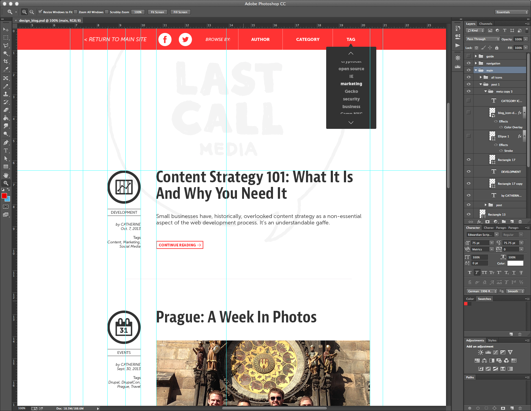
For huge nerds like me, one of the most exciting aspects is something you definitely can’t see. I built a responsive wireframe for the site before the actual design phase even started. You can view it here. (Make sure to resize your browser window while looking at it!) This is something we’ve also done during the wireframe phase for clients. It has its advantages and drawbacks.
As far as advantages go, it’s a great tool for showing clients who might not have a comprehensive grasp of responsive website functionality how their website will look across different browser window sizes and, subsequently, different devices. It’s also a much more direct and comprehensive way for a designer to deliver to-the-pixel CSS measurements to the development team, not to mention that creating such fleshed out wireframes takes a big chunk out of the design phase.
There is a significant downside to responsive wireframes however, and that’s the amount of time and effort it takes to make them. I created this one using Adobe Reflow, a program that creates responsive webpages. Reflow is a cumbersome program to use, possessing a level of fussiness I haven’t encountered since the earlier days of Flash.
This makes it almost impossible to design from scratch in Reflow: any responsive wireframes built with it are better designed in Photoshop first, then recreated in Reflow. Reflow is also extremely limited in its capabilities- you can’t even make a link with it, and any links on imported pages are stripped out. It’s certainly worth noting that the program is currently in preview, so I expect many of these kinks will be ironed out over time. Until then, it may be best to study the code Reflow uses to make its pages responsive and simply do them by hand. (Although I might try Froont first.)
(Also, as an aside, I had previously investigated Adobe Muse as a method of creating responsive wireframes. While it’s a much more solid program than Reflow, it doesn’t offer the same type of responsivity- it creates completely different layouts for phones, tablets, and desktops, rather than allowing you to set custom break points within a single layout as Reflow does. Reflow’s method of responsivity is superior, because it makes your website adaptable to any size screen, rather than relying on a quickly evolving, and perhaps rapidly disintegrating, system of classifying devices.)
The site is also Retina Display compatible, meaning it won’t look like pixelated garbage for those of you with fancy new Apple devices. Implementing this involved minimizing our use of raster images by creating a custom icon font with Fontello, and, in places where a raster image needed to be used, creating an alternate version at twice the size. Luckily, the process of creating Retina compatible raster images is now a snap thanks to Retinize It.
We employ web fonts on the site, which is not nearly as cutting edge as responsive wireframes or Retina compatibility, but no less awesome. We’re serving them on the site through Typekit, and I installed them on my computer for the purposes of utilizing them in designs through our Adobe Creative Cloud subscription. (A web search for “Adobe rules everything around me” somehow comes up dry.) We also made sure that bold and italic text on the site is being displayed as the bold and italic versions of the font itself and not being hamfistedly rendered by the browser.
As far as the creative side of the design goes I think the site pretty much speaks for itself, but I’ll talk about it briefly. It’s probably be pretty obvious to anyone that pays even a little attention to these things that we’re responding to a number of recent trends, trends of which I happen to be a big fan. Specifically, our new blog features flat, simple shapes, large, bold text, and wide open spaces to heighten legibility and create as immersive and frictionless a reading experience as possible for the user. I also tried to incorporate a couple of original ideas. The most obvious of these is, if you’re looking at it on a desktop, the large logo at the top of the page. On the front page of the blog it’s fixed to the background, allowing content to scroll over it, an effect I’m very happy with.
Speaking of big ideas, with our blog now firmly in place I’m free to move on to our main site. And wait until you see what we have in store there…