Branding Computational Cardiology.


How we did it
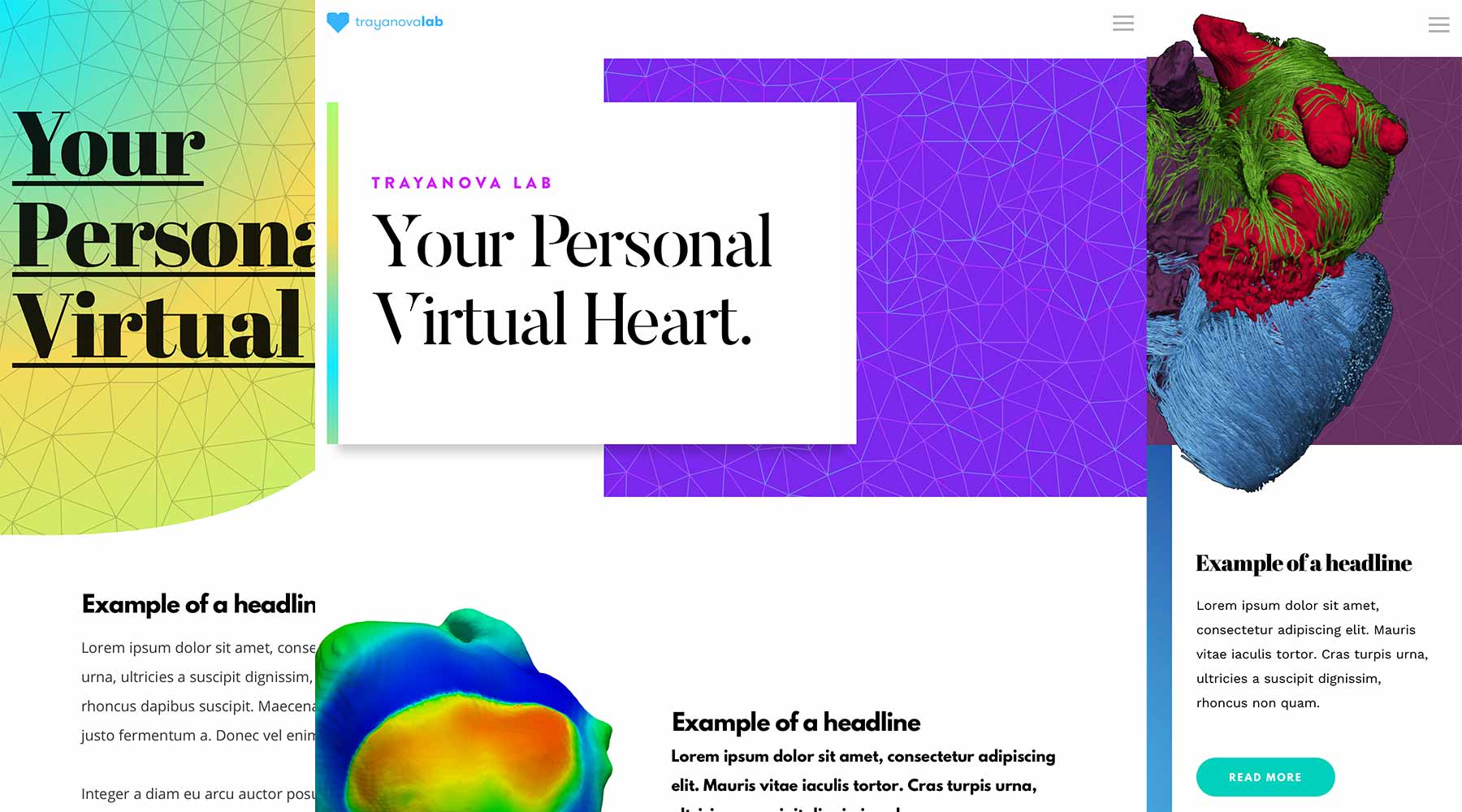
The Trayanova Lab of Computational Cardiology represented a rare intersection of art and science.
Discovery
During discovery, which consisted of an extensive on-site meeting, we learned a few important facts about Computational Cardiology that served as guiding lights for the design work we did with them. First, we learned about what they do. In a nutshell, Computational Cardiology creates virtual models of hearts that can be used for diagnosis or study. (Saving everyone the messy business of taking real hearts out of people’s bodies which can be, let’s say, not particularly healthy for the subject.) Here’s an Endgadget article about one of their recent studies.
Computational Cardiology uses design as a tool to set themselves apart from their peers and get attention drawn to their important work.
Our second big takeaway from discovery is that Computational Cardiology places a high value on design, a quality they told us can be rare in the scientific community. As such, Computational Cardiology uses design as a tool to set themselves apart from their peers and get attention drawn to their important work. And beyond just good design, they wanted a distinctive, exciting look. The leadership at Computational Cardiology has a keen eye for art and fashion, and they felt it was important that this sensibility be reflected in their identity. This was music to our ears!
Getting alignment
With all this in mind, we developed a few aesthetic directions that we could use to get creative alignment. These directions mostly represented Computational Cardiology’s identity using the bold, artistic direction they expressed to us, along with some more conservative elements to make sure a full range of choices was available for consideration. After quickly responding to some of the bolder directions, we selected the elements we thought worked especially well and went to work developing a unified direction based around them.
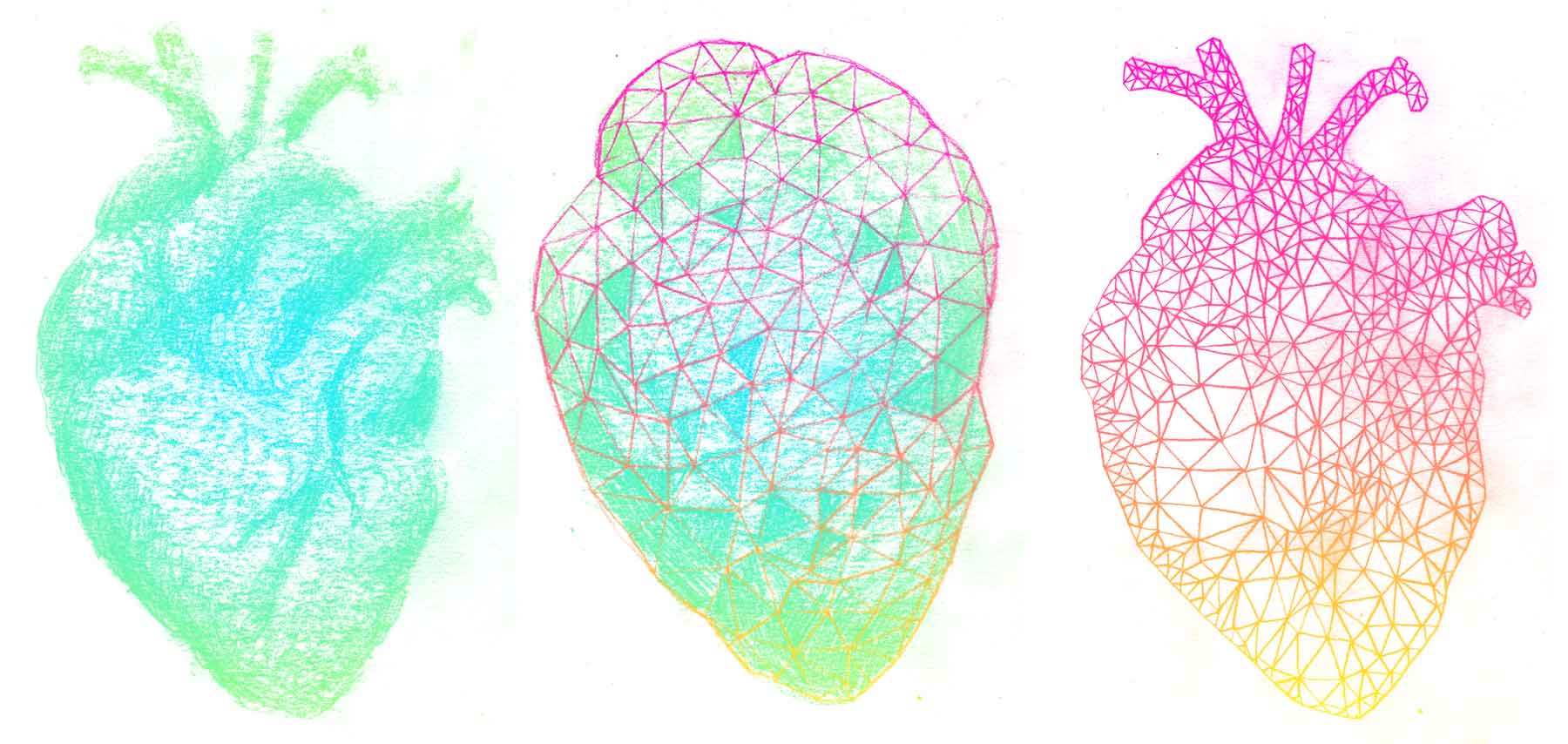
Our work has heart
One of those elements was a graphite illustration of Computational Cardiology’s computer models of hearts. That drawing would go through multiple iterations before taking the final form seen on the site, all of which can be seen below.
Designing a logo
Our Creative Director Nolan was able to quickly design a thematically dense logo in a very short amount of time. The heart icon, rendered with angles to reinforce the theme of technology, is surrounded by brackets, indicating that the heart is made of computer code. Those brackets also represent the two “C”s of Computational Cardiology and the negative space between them creates a cross, a symbol commonly used to indicate healthcare.
![]()
Building the site
Throughout the design process we remained aware that Computational Cardiology would be building the site themselves, and frequently checked in with their in-house developer to make sure we weren’t designing anything that would be problematic for them. After the designs were complete we provided them with the assets they’d need to build the site, which they did using the service Webflow. That the final, developed version of the site (which can be seen here) is so faithful to our designs is a testament to both their developer’s skill and the robust functionality of Webflow!