Improving the Drupal authoring experience.


- Continuous Delivery
-
Senior ProducerKelly Albrecht
-
Senior ArchitectColin Panetta
-
Art DirectorColin Panetta
In our engagement with Mass.gov, Drupal is essentially the product being developed and operated in.
So we had to ask ourselves, “In what ways can we make Drupal better for our customers, to give them a better experience, get better feedback from them, and build that relationship?”
The Commonwealth of Massachusetts embarked on a large-scale web replatform to modernize and make it easier to continuously improve the way the Commonwealth engages with and provides services to its constituents online. By improving the user experience for its constituents, and providing, as comprehensively as possible, a “single face of government”, Mass.gov® has become an essential platform in the Commonwealth’s ability to serve its constituents by delivering information and critical day-to-day social services to the Commonwealth’s 6.8 million people. With 15 million page views each month, the Mass.gov platform hosts over 400+ government agencies and content to support anyone who wants to move, visit, or do business in the state. All of which is fueled by the Commonwealth’s 600+ content authors, who have been able to use the platform to improve constituent satisfaction, making a noticeable positive difference on how the public sees their organization and the services they provide.
As early adopters of Drupal 8, Mass.gov and its ecosystem of web properties are the primary platforms for the delivery of government services and information in the Commonwealth of Massachusetts.
Wicked awesome content
The Commonwealth of Massachusetts was faced with a difficult to use web experience that stood in the way of a constituent base that wanted to interact with government services through the web. The goal was set to create new primary face of Massachusetts government that was constituent centric to enable fast, easy, and wicked awesome interactions with state services.
Prior to the migration to Drupal 8, the Commonwealth’s antiquated, proprietary content management system reflected its internal hierarchical structure instead of organizing content in a way that made sense to its visitors. That meant, for example, that a visitor looking to start a business in Massachusetts had to visit four or more separate department sites in order to get started. The Commonwealth sought to improve the user’s experience by focusing on guiding the visitor through the various services the Commonwealth provides over helping them navigate the complexities often found in a massive state organization.
Massachusetts Digital Service (MassGovDigital) had two core philosophies that drove their decision making: focus on the constituent experience and use data to support all decisions. They envisioned a unified user experience, where tasks like preparing to renew a driver’s license matched the ease of use of shopping on a major retail website. The MassGovDigital team was challenged to apply private-sector data analytics savvy, like defining and tracking constituent “conversions.” Gaining access to analytics at their fingertips was key for site authors to make fully-informed decisions to optimize their content for readers. A high-performing site search would ensure content findability.
Last Call Media and the MassGovDigital teams worked together to improve the Drupal authoring experience in order to deliver the next chapter of the state’s digital future. The end result represents a significant leap towards the goal of a new primary face of Massachusetts government that centers on constituents—enabling fast, easy, and wicked awesome interactions with state services.
Improving the Drupal authoring experience
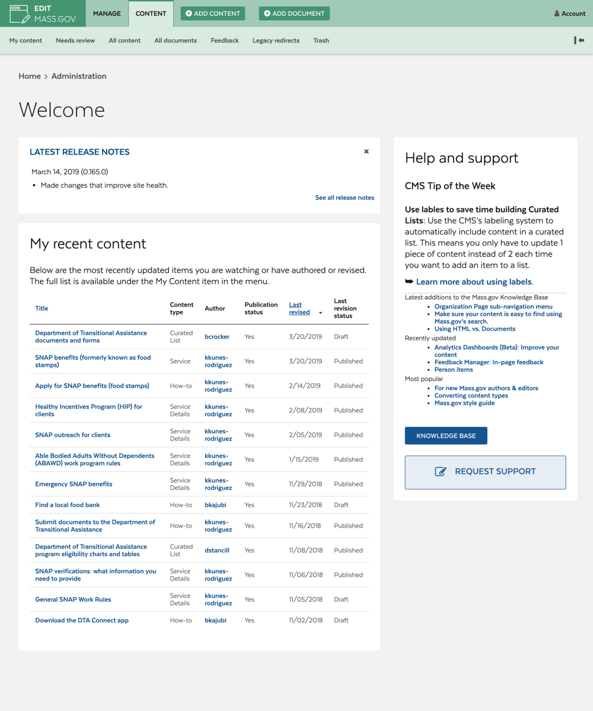
If you can improve the authors’ ability to create and improve content, then the constituents will be better enabled for fast, easy, and wicked awesome interactions with state services. For Last Call Media, improving the authoring experience meant a better interface for communicating data about each piece of content. This data was a mix of content scoring and direct feedback from constituents. For example, a site visitor submits the feedback form (available on any page) and says whether they found the page to be helpful or not (“Did you find what you were looking for on this webpage?”). The raw data goes into the calculation of their “grades.” The raw feedback comments also become visible in a tab in the editor interface, where the editor can focus in on what is or isn’t working well about the page. Surfacing this data, along with making the interfaces more intuitive and the content easier to add and manage, enabled authors to more rapidly improve their content in a more targeted way. According to ForeSee results, the release of the reimagined authoring experience directly correlated with a never before seen increase in Customer Satisfaction.
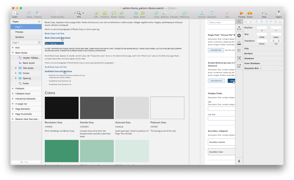
Retheming Drupal’s default admin site was a critical opportunity to improve usability for authors. With a pattern library, Last Call Media applied these improvements at a large scale without the prohibitively high effort of creating designs for every single page. Paying extra attention to vertical spacing intervals Last Call Media created a clearly defined page hierarchy. At the same time, flipping the brand color scheme provided a user experience that’s consistent with the main site, yet unique.

By using a shared design vocabulary, these ideas could be applied site wide—even the pages that weren’t yet designed—to start development and apply the broad strokes to the theme, while the design team focused on some areas of the site that required more attention for usability. Faced with the challenge to deliver complex content with forms assembled from a number of differently-styled modules, form elements became a focus area. In addition to a unified styling system to improve usability for all form elements, horizontal lines now mark the end of one form element and the beginning of the next. Vertical lines do the same for nested re-orderable elements.
A clear path to publish content
Last Call Media also created a new and improved version of the Admin Toolbar to streamline navigation for content editors and creators. In addition to the Admin Toolbar module, a separate custom toolbar module specific to the Admin Theme was created to handle customizations. Now, buttons provide easy access back to the login page, with a separate button to return to the main site. A custom tab directs content editors to their most important pages.

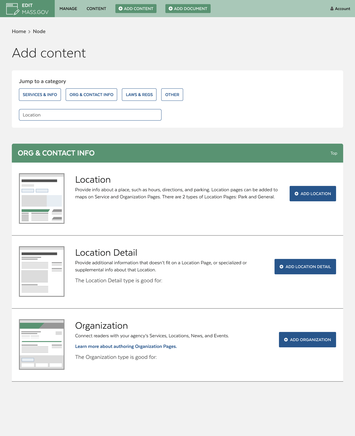
Before, there was no direct way for authors to quickly access their top two pages: the page to add content and the page to create new documents. To balance that functionality with a slim line top bar experience, buttons were added to those pages right to the tab menu. Last Call Media built a custom “Add Content” page with attentional experience in mind; Mass.gov, at the time of this project, had about 35 content types for an author to scroll through.

A faster and easier authoring experience has allowed authors to keep improving and adding to their content. This keeps constituents in the know and continues to grow Mass.gov as a single source of all the information they need to interact with government services. Read more about how Last Call Media did this here.
Outcomes
- Leading the Way Among State Government Websites: Mass.gov placed 3rd nationwide in a review of 400 state government websites by ITIF and was recognized for performance in page-load speed, mobile friendliness, security, and accessibility.
- Constituent-Centric UX: Produced 23 content types using structured content to ensure consistent and constituent-centric UX.
- Huge improvements in both the front and back end performance: We achieved a 50% overall improvement in the back end performance, and a 30% overall improvement in the front end performance all while maintaining content freshness.
- Empowering Content Authors With an Improved Drupal Admin UI: Updating, adding, and reviewing content moved from requiring technical expertise to being open and usable to non-technical subject matter experts. Now, hundreds of users login to Mass.gov each week to update, add, and review content performance to support the services their organization provides to the people of the Commonwealth.
- Streamlined on-boarding with guided tours: A series of guided tours support a refined publishing process, which accelerated on-boarding new content authors.
- Collecting Insights from User Feedback: Verbatim content feedback from constituents is now available to authors, and feedback helps create content performance scores in an improved Drupal admin interface.
Key features and functionality
Reimagined authoring experience
- Content Categories: Content types were organized into categories and jump-links to them can be found on the “Add Content” page.
- A Deeper Search: Custom search functionality sorts through both the content type names and the description text.
- Clear Visualization and Direction: A “thumbnail” example of each content type shows authors a sample preview. Cleaner and more strategically-positioned description texts give easy-to-follow direction.
- Extra Guidance: Links to Mass.gov’s document site provide additional information about each content type, including how it’s used, tips for creating new content, and links to live examples.
New welcome page experience for authors
Key Drupal Modules
Why these modules/theme/distribution were chosen
Flag: Used to notify editors about content updates.
Paragraphs: Used to guide authors in creating structured and reusable content.
Tour: Used to improve the authoring experience by introducing them to the functionality of their content types.
Tour UI: Used to assist Product Owners and Customer Success in tailoring Tours as needed, based on customer feedback, minimizing the interruption to the feature development work stream.
Pathologic
Redirect: Having migrated from a very large legacy site with a long history, Redirects were a critical consideration.
TFA
Password Policy
Metatag
Seven: Hooking in to Seven, a Drupal 8 theme, provided a base that is maintained and receives security updates from the Drupal community. One of the main challenges in building an admin theme for Drupal are the number of modules that require different user interfaces; some modules make minor tweaks to the UI to meet their needs, but some create their own from scratch. It’s very difficult for an admin theme to support all of these use cases without something breaking, let alone making the UX cohesive. By creating the theme from Seven, Last Call Media ensured that it wouldn’t unexpectedly break module UIs for modules that we hadn’t even anticipated needing yet, and it makes sure not to be breaking anything that’s already there.
Final Thoughts
Currently, Last Call Media is a leading digital agency working to transform Mass.gov’s digital platform and strengthen government-constituent interaction. This provided technical architecture leadership to develop and support the new digital platform, by working closely with the MassGovDigital internal team and several other vendors.
Over the past 12-months, by relying on constituent feedback and analytics and a commitment to collaboration and flexibility, the teams have been able to improve constituent satisfaction with Mass.gov month over month, according to data collected by Foresee.