A Hub for Emergency Preparedness.


- Agile/Scrum
San Francisco takes emergency preparedness seriously.
As the fourth largest city in California, the city also serves as a center for business, commerce and culture for the West Coast. To support the City of San Francisco’s commitment to emergency preparedness, the Department of Emergency Management designed and developed a campaign to drive citizens to better understand how to be prepared in the event of an emergency. And in the unfortunate event that disaster does strike, the platform transitions to a communication platform where citizens can find the most up to date information directly from the City.
DEM had invested significant effort into creating a very engaging website to communicate to the public about emergency preparedness. However, the site was developed in a way that did not facilitate quick and easy content changes - a critical need when up-to-the-minute accurate information is needed. The site also fell short on a number of accessibility metrics.
How we did it.
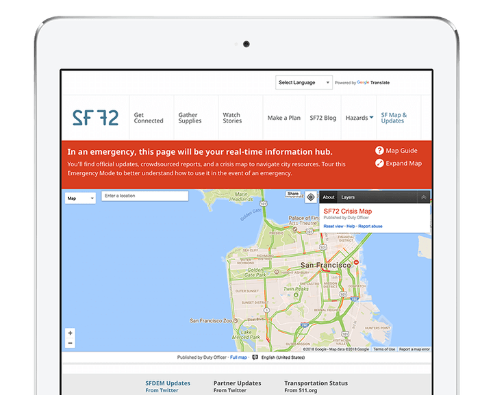
When it’s business as usual, the site serves as a platform to generate awareness for how someone can better prepare themselves and their family in the event of an emergency. Visitors can download checklists, and complete forms, in addition to reading about how to prepare for different kinds of disasters, like an earthquake or tsunami. However, in the event of an emergency, the City can quickly enable a separate emergency home page which presents visitors with vastly different dynamic content updated in real time specific to the emergency, including an embedded interactive Google Crisis Map that displays information aggregated from a variety of external sources managed by the City.
Last Call Media provided a direct replacement of the existing site in Drupal 8, leveraging the out-of-the box D8 accessibility features and the user-friendly D8 in-place content editing interface. We also reduced the maintenance burden by bringing the blog, which had been a separate site, into the main site.
Our accessibility audit revealed that the original color palette used for the site designed relied heavily on colors that did not meet WCAG 2.0 contrast requirements. We were able to identify a compliant color scheme that remained within the existing brand guidelines for the new site. The site also relied heavily on icon fonts which were not taking advantage of Unicode’s private use area, and the HTML elements displaying the icons did not use appropriate ARIA attributes. Rebuilding the icon font and HTML markup to take advantage of those tools helped to greatly improve the screen reader experience for the site.
Another area that needed improvement was general accessibility related to interactive elements. Sections like flyout menus and tabs were difficult to navigate via keyboard, and were missing ARIA attributes that make them easier to understand and use. During the rebuild we switched away from using mostly-homegrown CSS and JS, and leveraged the Foundation CSS/JS framework instead. This change provided a couple of benefits - many of the missing accessibility features are included in the components provided by Foundation out of the box, it helped keep the nuanced details of the styling more consistent across different areas of the site, and it expedited the development process as well.
The City of San Francisco now has a means of communicating its emergency preparedness message with a site that is engaging, nimble, and robust.