Hey, check out our Sketch pattern library! Part 3: Using Sketch

This is part three in our series of posts about our Sketch pattern library. If you missed them, it’s probably best to read part one and part two first. Here’s a direct link to the 17MB Sketch pattern library file we’re discussing.
We use Sketch to make websites. For our money, it’s the best way on the market to quickly and accurately mock up websites. It has a few features that we found especially helpful when making our pattern library in particular. But that isn’t to say Sketch doesn’t have its share of issues. What do you want first, good or bad? Okay, good first.
The good
The Text Styles feature in Sketch is basically a library of font styles you can apply to instances of text at a touch. It’s great for tracking font styling as defined in our pattern library, and making sure all instances of text conform to them. In fact, every piece of text in our pattern library is hooked up to a Text Style! We have Text Styles for big things like H1s and paragraph text, and also small things like button text and Billboard subtitle text. I actually just changed the font for all instances of our serif font, and because of Text Styles, was able to do it in about twenty minutes. Much faster than if I had to select the hundreds of layers it appears in individually. The Sketch documentation site is a great place to learn more about Text Styles in Sketch.
Symbols are a great feature in Sketch that allows a single component to not only be reused in multiple places, but if any changes are made to that component those changes will be reflected in all instances of it. We have Symbols for things like buttons and blog post summaries. You can learn more about Symbols in Sketch here.
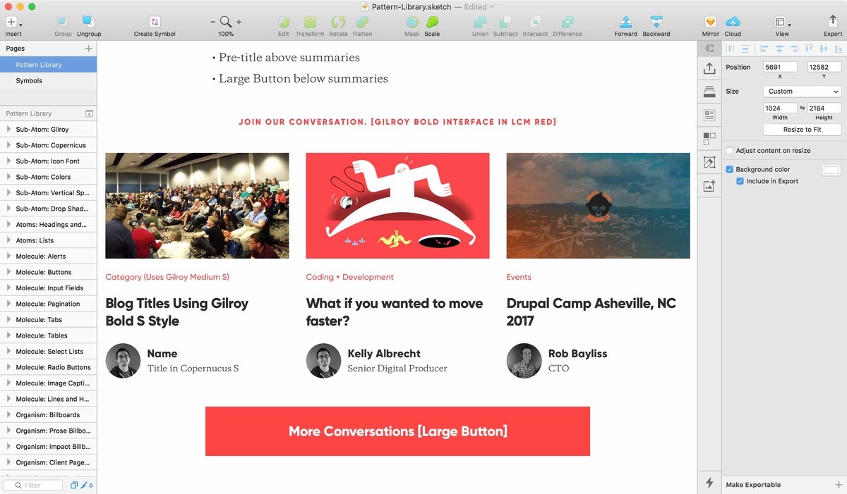
One great feature of Symbols it’s good to be aware of is overrides. Overrides in Sketch allow instances of Symbols to be populated with custom content. So if you’re using multiple instances of the same Symbol (like, say, a blog post summary) to show a listing of multiple pieces of content (like, say, a group of blog post summaries) each of those instances can have unique text and even image content. For example, the our Blog Post Summaries Area molecule (seen below) is just a single Symbol repeated, but with overrides to give each instance unique content.
One of the keys to making our pattern library sustainable going forward is the Craft Library for Sketch. Through Craft Library we can bring these Symbols into new designs instantly, and can apply Text Styles and colors at the press of a button, which makes new designs faster to produce and more effortlessly consistent.
There’s a definite convergence happening here, between the way Sketch functions and the way pattern libraries work online.
All of these Sketch features, the ability to store styling rules and components in a centralized location, synced between multiple instances and users for the purposes of speed and consistency, sound a lot like something else, don’t they? They sound like… a pattern library! There’s a definite convergence happening here, between the way Sketch functions and the way pattern libraries work online. The functionality of web design platforms like Adobe and Sketch have been moving in this direction maybe longer than pattern libraries have been a thing. I take this as another indication that the basic premise is rock solid. We’re trying to push this by making our design pattern library resemble our development pattern library as much as possible.
Another key feature for us is InVision Inspect, which takes all the styling info from our Sketch file and gives developers one-click access to it in a convenient web interface.
The bad
Unfortunately, all of the great Sketch features listed above have serious limitations.
Text Styles can only be set at the Layer level. This means you can’t have unique styling within a line or paragraph of text, like link styling in the middle of a sentence for example. You also can’t have exceptions. Like, say, if you want to center an instance of subtitle text. Obviously these are things that pop up in web design a lot, which makes Text Styles more or less unusable in a number of important scenarios.
Symbols are great, and really useful because overrides gives them the ability to have unique content. However, if that unique text content takes up a different number of lines than are planned for in the Symbol, it breaks the layout. Your only choice is to disconnect the instance from the Symbol, losing its ability to stay current with changes to the Symbol. This, again, is something that comes up pretty often in web design and is a significant ding to the usability of this feature!
The Craft Library… is wonky man, haha. Around a year ago we took a good look at it as a team and found it to be unusable. Someone would make a change to a synced component, push the changes, and no one else would get those changes. I looked at it again a couple months ago and it’s much better, but still far from airtight. For example, I lost the ability to update a Text Style so I tried to delete it and upload a new version, but I was blocked from doing to because it “already existed.” If you really use the Craft Library, this type of thing is not uncommon. This is one of the few things Adobe is still mopping the floor with Sketch on. The Adobe Library works flawlessly.
Layout rows don’t currently display in Inspect. This makes it so development doesn’t have access to our vertical grid, putting a major hurdle in the implementation of the vertical rhythm of our designs. I reached out to Sketch about this, and they’ve confirmed that it isn’t the intended functionality of Inspect, that it’s a widespread issue, and that they’ll let me know when it’s fixed.
Join me for the next post where I’ll attempt to wrap this all up by talking about what we learned by doing this and what our next steps are!