Hey, check out our Sketch pattern library! Part 2: What it’s made of

This is part two in our series of posts about our Sketch pattern library. If you missed it, it’s probably best to read part one first. Here’s a direct link to the 17MB Sketch pattern library file we’re discussing.
What informs the pattern library
Our brand guide, as something that informs everything that utilizes our branding (not just in the digital realm but in print collateral, signage, apparel, etc), holds a higher position of truth than our pattern library. If you have a brand guide, simply reformatting the info it contains will give you a great start on a pattern library.
If you have a brand guide, simply reformatting the info it contains will give you a great start on a pattern library.
We have company-wide design standards. I won’t go over them in their entirety, but here are some bullet points explaining some of how you’ll see them reflected in our pattern library. Eagle-eyed readers will see they’re broken in a few spots in the library. (Always for a reason!)
- Our horizontal grid is 12 columns.
- Our vertical grid is made up of 12 pixel high rows.
- Font sizes are in multiples of 6.
- We align the baseline of type to the bottom of grid rows. (I think this might be somewhat unusual, but it leaves a lot less up to judgement than centering type vertically within a row.)
- We use as few colors and fonts as possible.
- We have standardized layout widths. These designs were produced at our Wide layout size, 1024px.
Atomic design
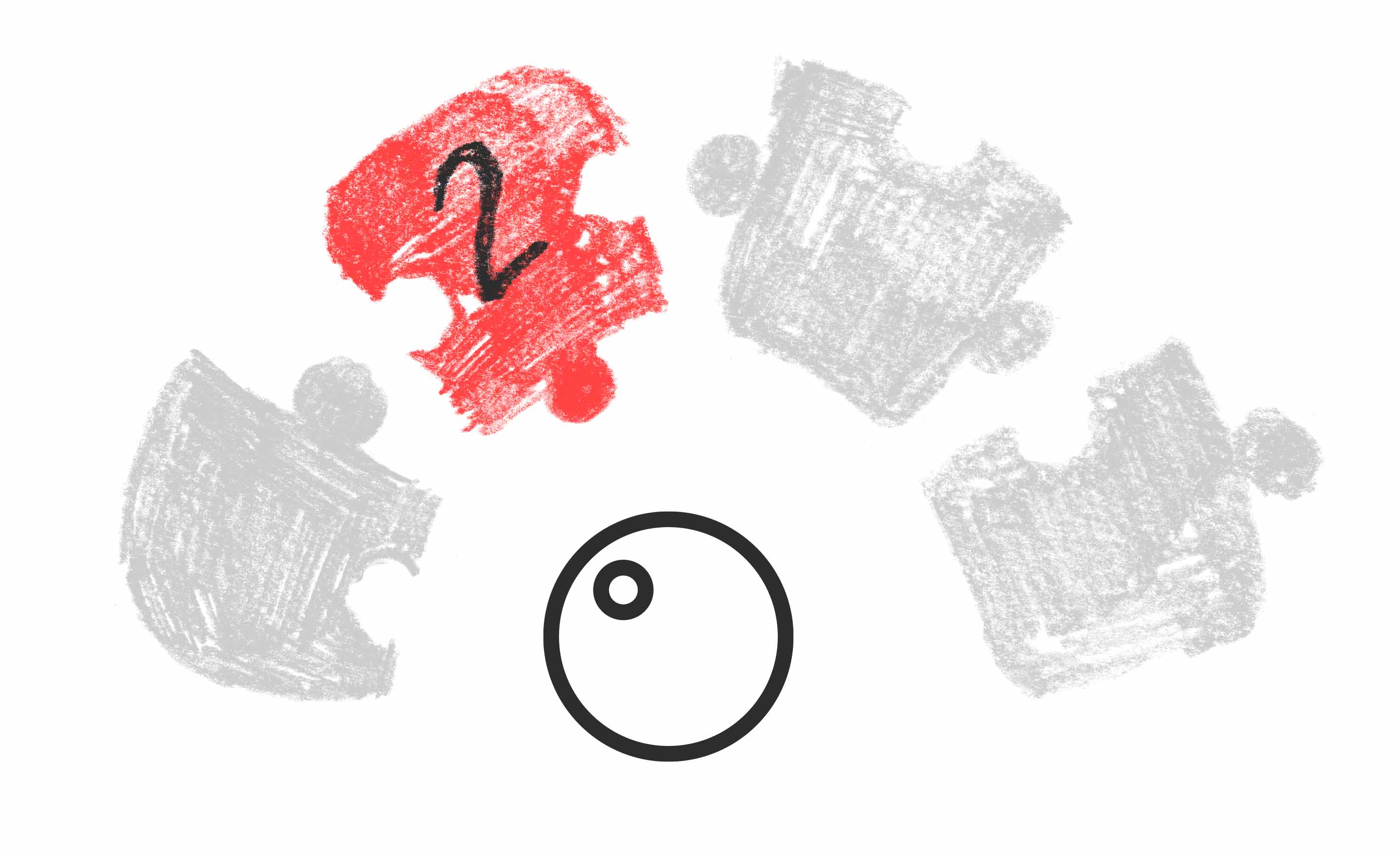
Another thing that informs our pattern library is atomic design. (I’m sure more than a few of you already noticed!) Atomic design is frequently used as the basis for the structure of pattern libraries. Some prefer defining their own vocabulary, and we are still considering doing that, but right now we are exploring the advantages of utilizing an industry-wide vocabulary.
However, that’s not to say we don’t put our own spin on it. Firstly, we use custom definitions for the terms. To us an “atom” is a single, styled element (which means mostly just text, like headings, paragraph, and lists), a “molecule” consists of two or more atoms, and an “organism” is larger than a single molecule. (We haven’t delved into “templates” or “pages” yet.)
Sub-atoms
We also invented our own pre-atom term, sub-atoms. Sub-atoms aren’t components that appear directly on the site, but they style all components. They’re things like fonts, colors, general spacing rules, and drop shadows. They’re the elements of the styling that everything on the site uses, and therefore anyone doing any theming work on the site would benefit from being familiar with them so they can make informed choices.
Something in our sub-atoms that merits special attention is the defined font styling. For Gilroy ExtraBold we have XL, L, M, and S. When using that font, designers should always try to use one of those stylings. Somewhat differently, for Gilroy Medium we only have M and S because our branding doesn’t use that font at large sizes. We also have a couple font styles defined to be used in specific ways: Gilroy Instructive and Gilroy Interface. We limit our use of styling for our fonts in order to maintain consistency, and we do it at a level higher than atoms so components don’t need to be the same thing in order to have the same font styling. An example of that would be how all of our UI (buttons, pagination, tabs, etc.) are set to use the Gilroy Interface sub-atom, which ensures all that text on things like buttons and tabs is all the same size instead of being just different enough to look wrong.
What else is in there?
Well, I’ll tell you what’s not in there. This isn’t a full design. Like I mentioned above, it doesn’t have template and page designs. We made the call that, having an already launched site that those things already exist on, those things didn’t make sense to go back and recreate.
Screenshots are in place for some elements, like the header and footer. Since those elements already exist on the live site, and we’re not planning on changing them any time soon, screenshots are the most accurate way to represent them. If we do ever need to change them, a designer could rebuild them and add them to our shared library, where everyone has access to it!
Speaking of our shared library, join me in the next post where I’ll talk about it and more of the nuts and bolts of how we built our pattern library, when I talk about Sketch!