Designing Focus

Sometimes a simple question in one of our internal Slack channels returns an unexpected and oh-so-fabulous result. About a month ago I posted this question about focus states in our accessibility channel:
Just curious, wondering if focus state is something that LCM ever includes in a design?
I had started my day with that dangerous activity of checking my social media accounts. This could become a slippery rabbit hole, but I have a special twitter account dedicated to following accounts that post frequently about accessibility and I have learned a tremendous amount from the people I follow. At some point that day I had read a post somewhere saying that web site designs should include styles for focus states. From there I somehow got to a discussion site for designers (OK, yes, I did go down the rabbit hole) where I saw this question:
Why do (many) designers avoid :focus and :active button states?
Wow….I thought. I wondered if Last Call Media had ever done a site design that included styling for focus states. And as it turned out, we had not - and by the end of the day our Creative Director, Colin Panetta, had created a ticket for designing focus styles for our site. I didn’t expect anything to happen soon, because I assumed that everyone had “more important” things to do. But to my delight, Susie Howard soon took up the challenge and got to work.
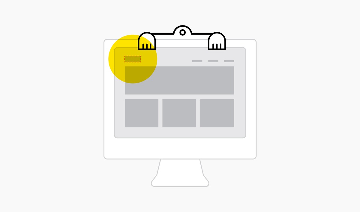
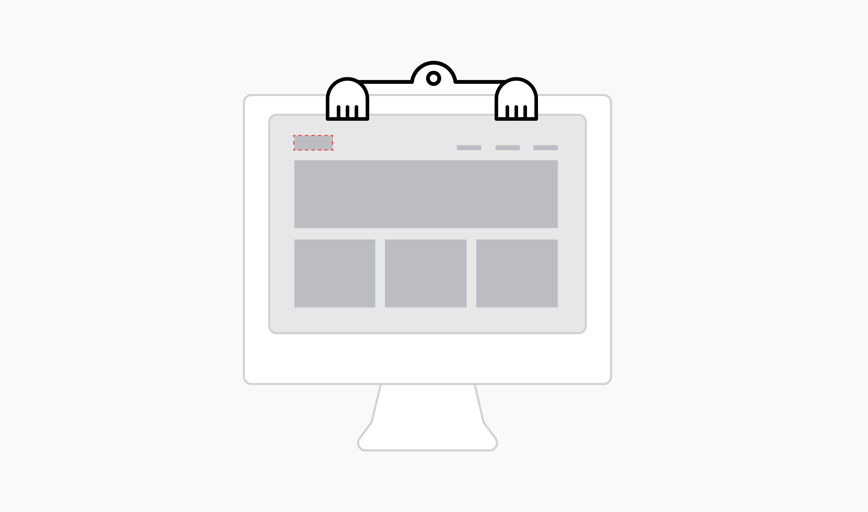
Since you are here on our site, you may have noticed that we have a pretty strong brand identity. User testing has shown that one of the things that people remember after visiting our site is the color scheme. Another impression that we see is that the site is perceived as fun or playful. Since we have made an effort to create this overall visual impression, I thought it would be nice to include folks who rely on (or choose to use) tab navigation in the party.
When I saw the new styles that Susie created, and the work that our developer, Dan Stafford, did to make them a reality, it totally knocked my socks off!! I’m not going to be shy about bragging on these two, and I have been running around showing these focus states to friends who have very little idea of what I do in my day job. So, now they really know what a nerd I am!
There were a few challenges along the way. Since we make a lot of use of red and black, there are a few places where it was tricky to get a style that was on brand but still quite visible. Dan, who has really jumped in with both feet on accessibility work, was able to make specific styles for certain pages. Susie provided great feedback for some revisions that took a few tries.
Now that the new styles have been made live, I almost can’t stop tabbing around just for the fun of it. Check out the footer links! Check out the menu! I hope everyone enjoys the new focus states as much as I do! More importantly, I hope people find them helpful - I realize that plenty has also been written about why you should not interfere with default focus states. Since we are only human, there may be some places where we missed the mark. If we did, please let us know and we’ll work up a fix as soon as we can.