Accessible Navigation in a Playful Menu Design

We recently made some enhancements to the menu navigation of our website. It was important to us that the updated menu should be tab navigable, and should make sense to screen reader users. It seems like this should be pretty simple, right? Well, menus can be tricky for accessibility, especially if you like to color outside the lines like we do here.
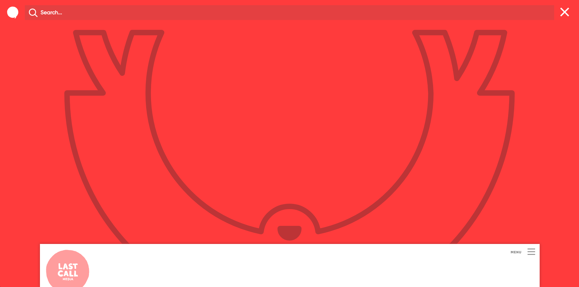
We really like the way our “underlay” menu expresses our personality. It’s a little bit interactive, and responds in a way that is slightly unexpected but fun (hopefully!) for a sighted user. When the burger icon is clicked, the main screen slides down to reveal the menu hiding beneath it. Once the menu is revealed, It has bold, colorful styling, a huge smiling yeti image, and a simple structure. However, once again, we made things a little bit different for a sighted user - in a reversal of the familiar right-to-left reading order, we have placed the primary items in the right column, and the secondary items are on the left. We make it clear that the right side items are the primary links through context and styling.
To help maintain orientation for sighted users, a small slice of the top of original page remains visible as an overlay in the lower portion of the screen. A sighted user with a mouse can close the menu and return to that page by either clicking anywhere in the section of the page overlay that is still visible, or by clicking the X in the upper right corner of the menu.
So, how does all of this translate to an accessible experience? We’re so glad you asked!
Focus order and keyboard navigation
The menu is not displayed as a visible element on the pages of our website, resulting in a clean, uncluttered presentation that is in alignment with our simple overall page structure and site structure. A bold burger icon is presented in the upper right corner. Using tab navigation, if you bypass the skip link when page loads you will experience these elements on your way to there:
- Banner
- Linked image - home (our linked logo image)
- Primary navigation button
If you choose not to activate the button and keep going, your next experience will be:
- End of Banner
- Main
You have now arrived at our main content area. But let’s say you do want to explore the navigation after all. Two quick keystrokes in reverse takes you back to the navigation.
When the cursor is on the burger icon, a screen reader announces that you can open the the primary navigation button. Activating that button takes you into the menu where you will have this experience:
- Open primary navigation button,
- Main menu group announcement
- Image link back to home
- Search box
- Who we are (link)
- How we work (link)
- What we do (link)
- Get in touch (link)
- Wanna work together? - (text)
- email link
- phone number
- social icons
- Close primary navigation button
We had a discussion about whether to present the elements as they appear visually on the page from left to right, or as they appear above. Our conclusion was that the information hierarchy is as outlined above and the styling of the page persuades the visitor’s eye to move to that the right side first, in opposition to their trained behavior of scanning the left side first. And, although I didn’t know it at the time, DOM order of the elements is as shown above - just the visual presentation has been re-arranged using CSS.
User friendly announcements
For each of the elements on the left side of the separator, we used the aria-label attribute to provide a user-friendly screen reader announcement for each of the links:
- Email Last Call Media at [email protected]
- Call Last Call Media at 888-788-7177
- Last Call Media on Facebook
- Last Call Media on Twitter
- Last Call Media on Drupal.org
While it’s generally advised to avoid excess verbosity, my current thinking leans in the direction of providing a more inviting announcement than the out-of-the-box experience typically provides for social links.
Avoiding a trap
One of the puzzles of working through this was that the order needed to be the same for tab users who are sighted and for screen reader users who are not. The puzzle came into play for one of the issues we needed to resolve: Once the reader arrives at the final link, what should happen next?
Before implementing a proactive fix, the experience was inconsistent from one environment to another, but generally non-ideal. After tabbing or arrowing to the final link, the user might find that any additional tabs or arrow keystrokes resulted in no further movement and the same link being read over and over again. Or, the cursor might jump from the menu to the footer - also not ideal and difficult to recover from.
There were a few options available for solving this puzzle. One option that was discussed was bringing the cursor directly from the menu to the main content area. For screen reader users, this would be similar to what happens on many sites, where the menu is visually presented in a horizontal bar above the main content area. The user arrows through the navigation menu items, and after the last item advances to the main content after announcements for the end of the navigation and banner. For sighted tab users, however, this implementation our site would mean pulling the page overlay back up over the menu when tabbing from the last icon in the menu. That could be an unexpected behavior, which is something we wanted to avoid.
The solution that made the most sense brought us back to another riddle we discussed early on about tab navigation prior to the main menu. In the section above I noted that the tab order after entering the menu area goes first to the linked logo image, then to the search box, and then to the right column, in this sequence:
- Image link back to home
- Search box
- Who we are
- etc …
We chose not to go all the way across the top of the menu area and move from the search box to the navigation button, which would have resulted in this sequence:
- Image link back to home
- Search box
- Primary navigation button
- Who we are
- etc …
This was another case where strictly following the left to right reading order didn’t make sense. The user just got to the navigation, and has not yet landed on any links, so providing a button to close the navigation seemed confusing. We decided to move directly from search to navigation with the rationale that the navigation button was more like sidebar content. On open pages it remains visible on the right edge of the content area, so that the menu is always available.
The solution we arrived at to get past our keyboard trap was to move from the last item to that navigation button that we bypassed earlier. Here is the tab sequence, starting from the social media links:
- Last Call Media on Facebook
- Last Call Media on Twitter
- Last Call Media on Drupal.org
- Close primary navigation button
The user initially took a proactive step of clicking a button to open the menu area, and now they are positioned to take a proactive step to close that menu by clicking the button - nothing happens unexpectedly. Our menu is pretty short and sweet, so many users will probably remember that initial button interaction so that it will make sense to arrive at a button at this point.
What do you think?
I think that most of what I have written above is not going to shake the earth beneath the feet of some folks who have a lot of experience with accessibility and coding. But I do think it makes an interesting case study for the role of empathy in designing and developing for accessibility. It involves thinking beyond the literal presentation of items on a page, and the literal translation of the WCAG criteria and the ARIA standards, and focusing instead on what users with different abilities are experiencing. I think it is also interesting for people who may not immediately think about the all of the factors involved in adding fun, original and creative elements to their sites. Keeping your site accessible can mean that it takes a little bit more time to figure out an inclusive approach, but it absolutely does not mean giving up on all of that fun.
I’m curious to know if you have other perspectives on the solutions we came up with for our interactive menu. And if any part of the menu is causing trouble for you with tab or screen reader navigation, of course we want to hear from you right away!