Seramount UX/UI Refresh: Big usability gains, no rebuild required
Overview
Seramount’s site—which we originally built in 2022—no longer reflected the breadth of the organization’s offerings in the wake of its acquisition by EAB. So Seramount called on us for help.
Our discovery process verified the company’s thinking—they still had a strong platform, but the structure, content hierarchy, and user experience had ceased to represent Seramount’s evolving mission. A full rebuild wasn’t required. Instead, we looked for targeted, high-impact changes that would better align the site with the organization’s focus and offerings.
In five months, we delivered:
- redesigned homepage
- new product page templates
- rebuilt navigation structure
- improved Research & Insights filter
- expanded WordPress component library
Everything was delivered within budget and without touching the underlying platform.
About the Client
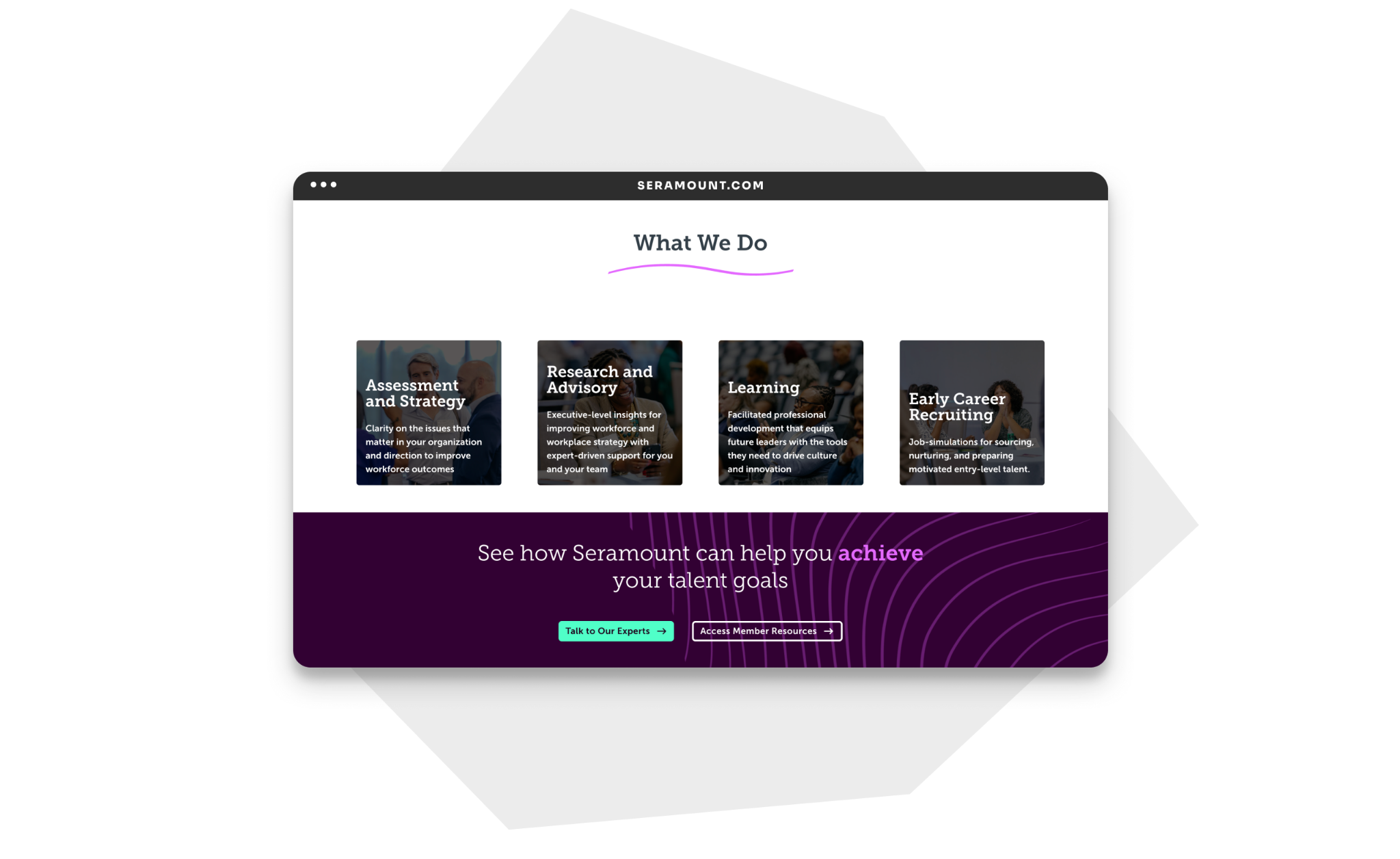
Seramount is a global workforce and talent solutions firm that helps leaders turn insight into action. The company serves HR leaders at more than 600 organizations worldwide to align workforce and corporate strategy. They provide research and advisory services, benchmarking, assessments, and job simulations.
Since Seramount was acquired by EAB, a global education advisory company, it has expanded beyond inclusion best practices to broader talent priorities including work redesign, skills, leadership, and early career.
Goals
Our objectives were clear:
- Align visual design and messaging with Seramount’s current brand positioning
- Redesign navigation to serve key audiences
- Make it easier for users to find content in the Research & Insights section
- Establish reusable WordPress patterns, enabling Seramount’s team to create and maintain pages consistently after launch
- Do all this on a constrained budget—and without disrupting an active, content-rich site
Challenges
A site that had outgrown itself
Seramount’s site no longer fully reflected the organization’s evolution. As the resource library expanded, staff were using manual processes to build new webpages, creating inconsistency across the experience.
Navigation built around internal logic, not user needs
A survey of 35 Seramount staff and a peer review of competitor sites revealed a clear issue: navigation labels reflected internal terminology rather than how users think and search. What’s more, the Seramount experience was sometimes dense and difficult to navigate. Users struggled to find what they needed—not because the content wasn’t there, but because the company had outgrown the legacy site navigation.
Authoring complexity after launch
Because Seramount manages its own content via WordPress, we wanted to make design changes easy to implement by non-developers. Without a solid component framework, site improvements would require vendor support for every update. Our job: create a framework to empower Seramount authors and editors.
Solutions
A structured discovery that centered users and stakeholders
Before a single design decision was made, we uncovered two pivotal themes that kept the project on-track and human-centered:
- Users needed a modernized visual language
- The site needed restructuring around tasks instead of internal categories
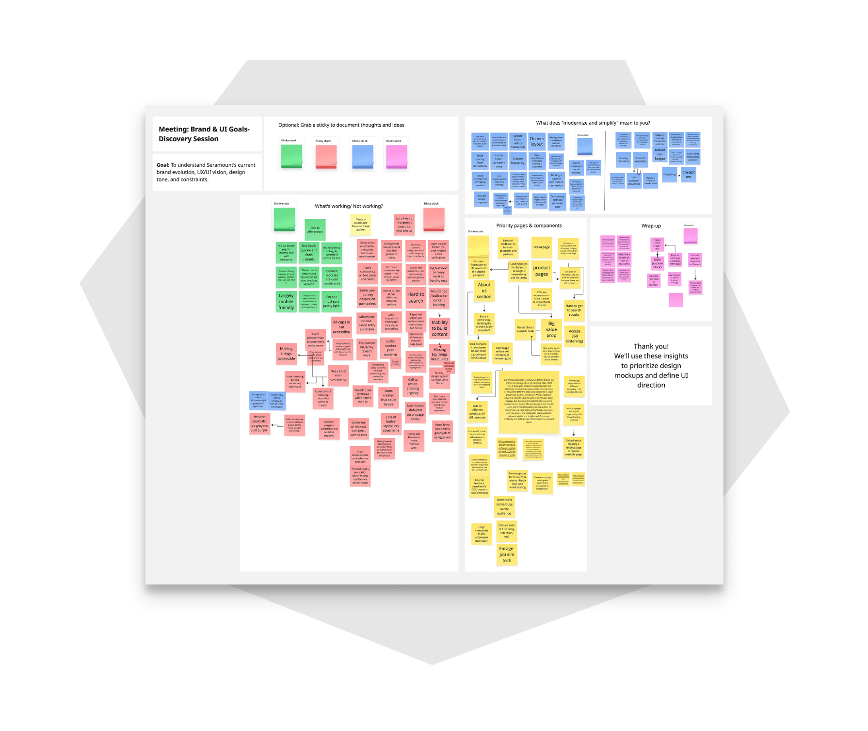
We drew these findings from a two-week collaborative discovery sprint, where we:
- Analyzed survey responses from 35 Seramount staff.
- Designed and facilitated a structured peer review exercise, where three Seramount reviewers each evaluated three to five competitor sites.
- Ran a 90-minute collaborative workshop, bringing together Seramount’s site authors, designer, marketing director, and director of digital strategy to share and rank their ideas and priorities.
With our findings confirmed, we built a backlog of high-impact improvements—a clear roadmap that focused every design decision on what users actually need.
Homepage redesign as a design laboratory
Rather than applying a new look across the site all at once, we used the homepage to test a refreshed UI. This approach meant quick improvements to Seramount’s digital front door, ensuring it accurately communicated the company’s updated offering. Starting small also helped us minimize disruption for users while validating changes. Our team validated the new typography, modernized the components, updated button and toggle styles, and added subtle animations before applying them more broadly. We also reduced the text density and visual noise to reduce overwhelm.
Navigation rebuilt around user tasks, not org charts
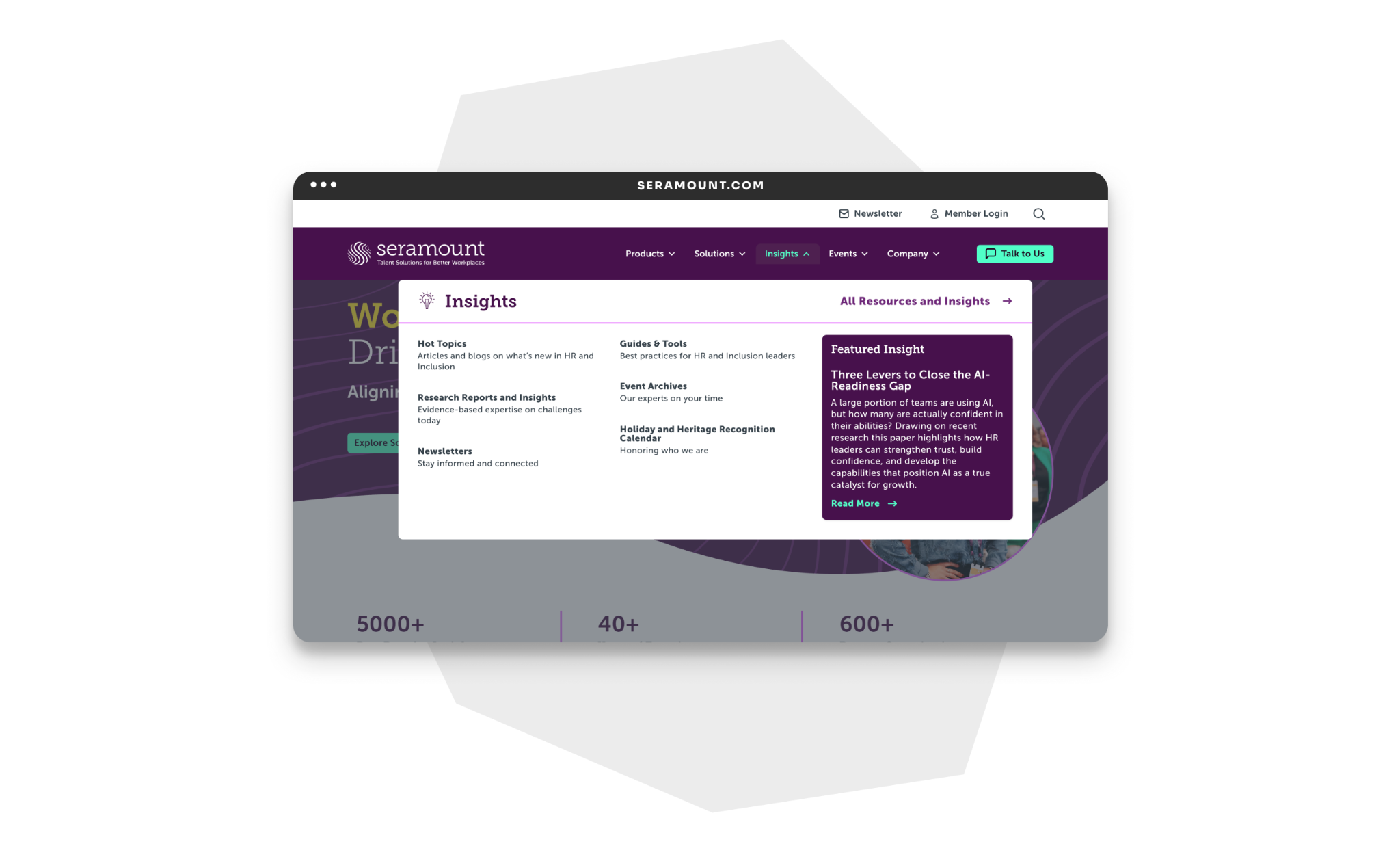
For information architecture, we focused on one principle: labels should reflect what users typically look for, not what Seramount calls things internally. We worked with the Seramount team to review site maps, discuss navigation gaps, and iterate site structures. We stripped internal jargon from navigation labels and redesigned the menu as a compact mega-menu. The result was a navigation system that meets users where they are, rather than asking them to translate jargon.
Research & Insights filter redesigned for clarity
The Research & Insights section houses much of Seramount’s content library and is one of the most-used parts of the site. We made it easier for users to find the content they need by:
- Replacing the filter with a cleaner dropdown-style menu, which allows users to narrow their search by topic, type, and relevance.
- Rebuilding the taxonomy with a topic-first approach, meaning content is organized by user interests rather than historical categories.
Product page templates built for consistency and flexibility
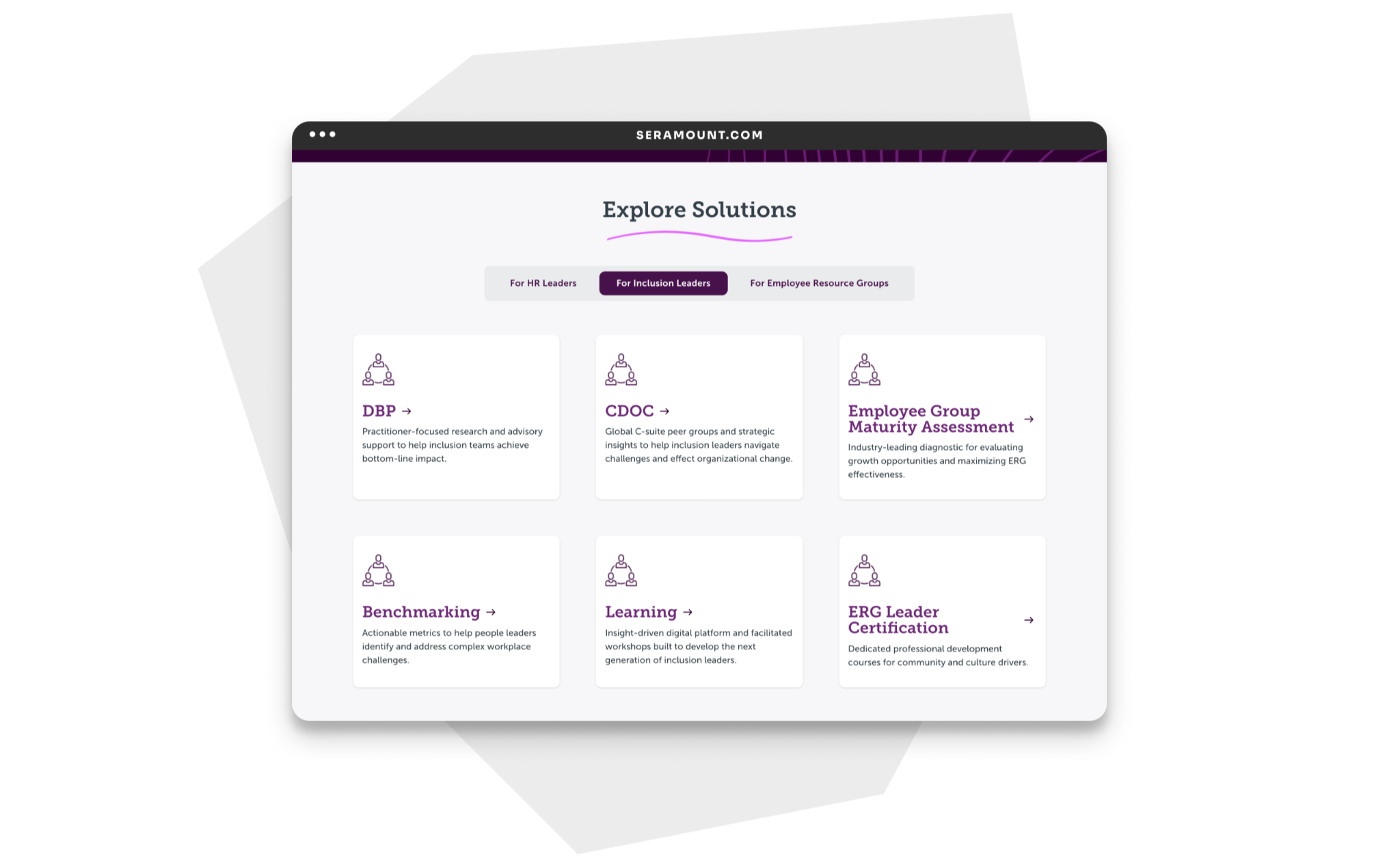
We designed flexible templates to showcase Seramount’s varied products. Our team identified the staff’s needs by analyzing existing product pages for structure and content patterns. The new templates reduce text density while maintaining clear visual hierarchy. Component-driven layouts make each offering clear and action-oriented. The result is cleaner, focused product pages that are easier to scan.
Improving accessibility throughout the visual system
As part of the refresh, we identified opportunities to improve color contrast and proactively adopt WCAG 2.2 Level AA standards. We refined the visual system to support stronger contrast and accessibility while maintaining Seramount’s established brand identity.
An expanded component library that empowers the Seramount team
We made every design decision with future content editors in mind, giving Seramount’s internal team greater flexibility to create and maintain pages independently. We expanded their WordPress component library with reusable full-page and half-page patterns for the most common page types—each pattern documented for development handoff using Figma Annotate. We also created component-based WordPress patterns for the Seramount team to drag, drop, and configure independently—including a 50/50 image-with-text component, a testimonial component with color options, and a stats component.
Results
Seramount reported increased site traffic following the refresh, a direct signal that the navigation and content discovery improvements were working.
We delivered the following to Seramount:
- A redesigned homepage establishing the refreshed visual language
- Two new product page templates providing consistency across Seramount’s product suite
- A rebuilt mini mega-menu navigation aligned to user tasks and audience needs
- A redesigned Research & Insights filter with improved taxonomy and dropdown UX
- An expanded WordPress component library with new reusable patterns and components
- Additional improvements including a footer redesign, content page updates, and WordPress patterns enabling Seramount authors to build and maintain pages independently
We completed the project within budget—a testament to the success of our asynchronous review process. This flexible approach kept work moving without requiring continual stakeholder availability.
Learnings
This project reinforced several things LCM’s team already believed and made the case for them more clearly.
Small IA changes produce outsized usability gains. Stripping internal jargon from navigation labels and aligning them to user tasks was a high-impact change. It required no new technology and no new pages, just user research and our human-oriented design process. Human-centered design opens up clear paths to success through communication, not technology.
Maintainability is a design requirement, not an afterthought. The most durable outcome of this project may be the WordPress component library and the patterns we built for Seramount. By giving Seramount editors and writers a maintainable framework for content creation, we ensured the site can evolve without requiring vendor involvement for every update.
A full rebuild is sometimes not the right answer. The right-sized solution delivers more lasting value than rebuilding for its own sake. When the underlying platform is sound, human-centered design can deliver meaningful improvements without requiring technical changes. Knowing how to identify the best solution is what made our impact for Seramount real and lasting.