
Iteration 2 of our Drupal 8 site from 2013
In 2013, Drupal 8 was still very incomplete and unstable. We were very excited about where it was heading and were involved in its development as much as possible. As it was nearly time for a site refresh for our company site, we thought doing it in Drupal 8 would be a good way to put the software through some real world usage, and fix the bugs along the way. We did it. While our then-new 2013 Drupal 8 site had information about us and our work, it was primarily proof of we could do with the early Alpha versions of the CMS at that time.
Drupal 8 was officially released in 2015 and by 2016 we had completed several complex Drupal 8 projects. It was getting to be about that time. Our website was still performing, serving what we had set out for it to do back in 2013. However, a shining example of Drupal 8 from 3 years ago was not all we needed to be communicating in the coming year. We had evolved, grown, and done a lot of cool projects with a lot of cool people. Technologies and best practices had changed and evolved too, and we had been right there with them. There was so much more we were aware of and ideas were forming in everyone’s minds about how we needed our website to better represent us and communicate for us.
We wanted to improve how we tell our story so our site visitors could have a better sense of who we are. We wanted to increase engagement to help our visitors learn about our work and what we can do for them. We wanted to give our visitors an authentic transparent view into all that LCM is, so they can take that awareness and make the best possible decision for themselves.
Authenticity, Card Sorting, Personas, Site Map
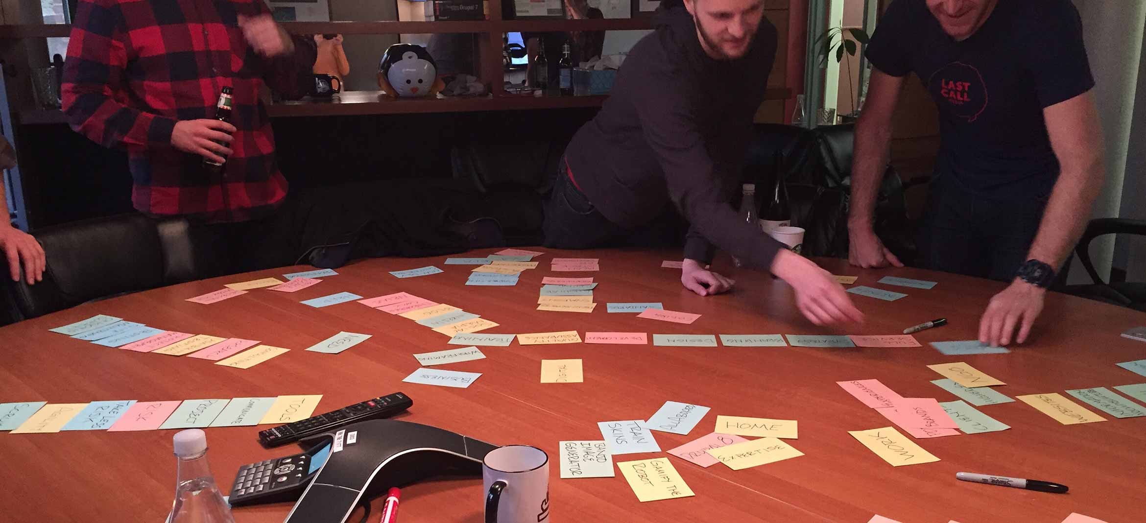
We wanted this new site to represent us and communicate who we are. This takes learning each other and finding the alignment and attunement needed to agree even on first steps, like a site map. Over the years, we’ve developed a pretty successful Card Sorting workshop as an excellent attunement exercise for this exact need. Additionally, I thought it would be fun. We sent around a Google poll asking the team what they think LCM does and what they thought we should do more of. From these answers, we formed the base card set for use in the exercise. We took this set, with blanks for any new cards needing to be created, and did the company wide exercise of sorting, discussing, creating, and grouping cards. We even discarded some.
Some of the things from the Card Sorting exercise stood out and informed major changes to our site. Our About section was a priority and had a lot of cards ordered within it. We really wanted people to know who we were. Blogs were deprioritized out of the main navigation and made more contextual. Our services were agreed to be a priority to communicate. Finally, a focus on our work with the client as a focal point emerged as a strong theme.
A lot of the cards that fell into an About section had to do with our commitment to Agility, its values, and its focus on collaboration and communication. While considering who we understood our site user personas to be and brainstorming what new content would be needed for this direction, a final draft site map came together with new top level items. “What we do” was to be a “Work/Portfolio” section to show our work by first focusing on each client, with our Services explained contextually. “How we work” was to be a “Process” section to talk a little about how we achieve such work for our clients. This covered many of the cards from the exercise’s About section. “Who we are” covered the rest of that section’s cards and was to be our more traditional “About us” section. And, then of course, “Contact us.”
General strategy, content, and content modeling for each aspect proceeded, informed by this initial discovery work.
Content and Functionality
For the “What we do” section, we wanted to put our Clients first to represent their importance to us. So, the homepage was to be the “What we do” section, answering that question for people immediately. A visitor could read more on each featured client and see different work examples we had done for them. From there they could view more clients or contact us.
Underneath the hood, we built ourselves a business tool with every project, large or small we had ever done, catalogued and referenced with each project’s services and responsible team leads. These projects could be filtered and featured on their own dynamic Service/Industry Landing page, or on custom Targeted/Personalized Landing Pages, as well as on their relevant Client Pages.
Due to the content model, all of this content flowed into other related clients and projects to browse, with the option to contact us always available. If visitors were looking for more info, they could go to the menu and read about How we work, or go even further to read about Who we are.
However, as the designs, content, and the site itself was coming together and we were using it, something felt off. It didn’t flow.
Usability Testing & Agile Design
For Usability Testing, we came up with some tasks that we wanted to test. The project broke for Thanksgiving and I got a head start by asking my ten year old daughter if she wanted to user test Dad’s new website. She agreed. Two of the Usability Testing tasks revealed the site’s flow problem within minutes.
1. Find out what Last Call does, when you have a sense of it, send them a message.
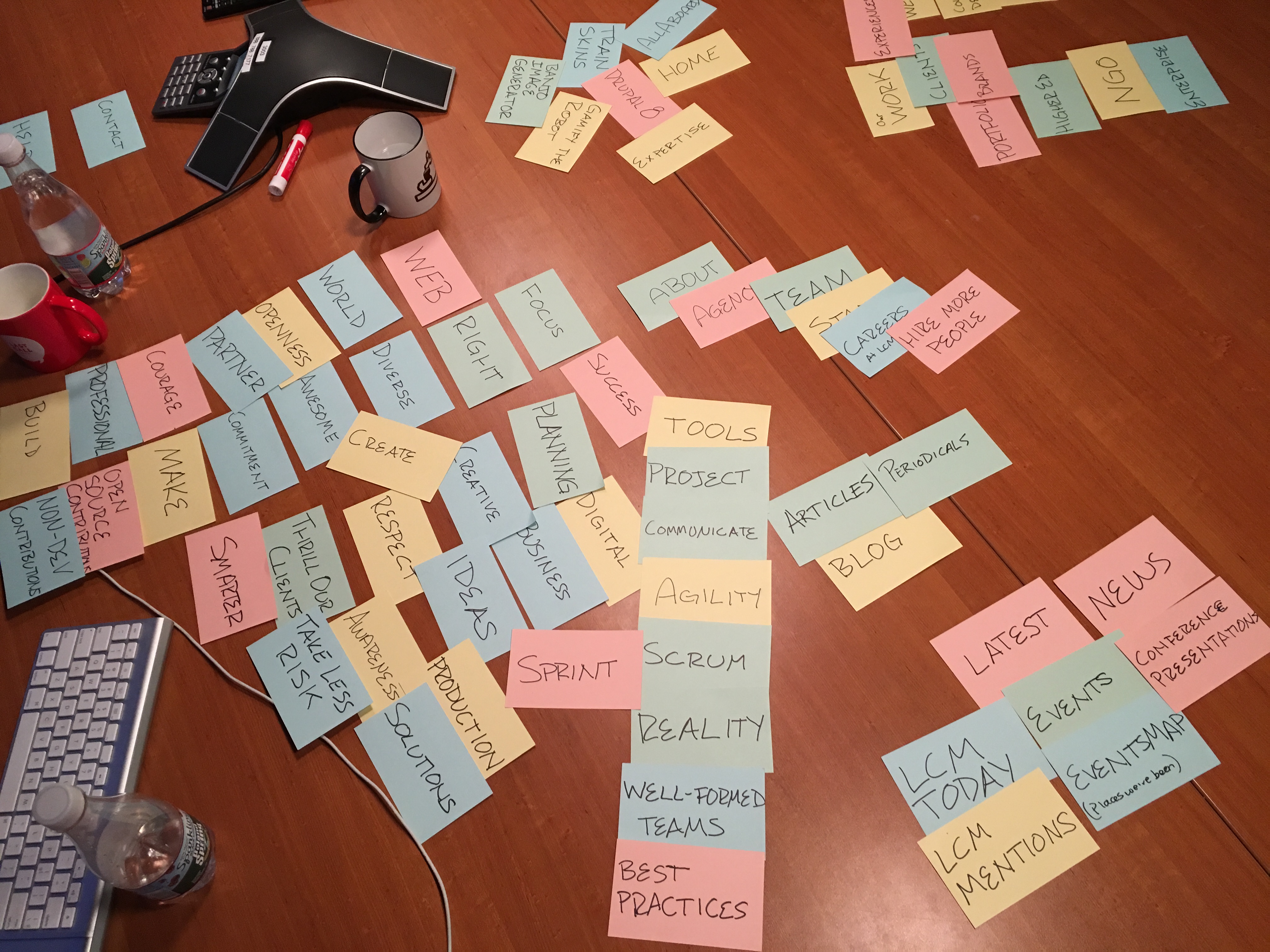
Our Client focused presentation on the site didn’t help my ten year old with this question. It was just a nice variety of different things, with no obvious relation between them. She managed to find her way to a “What we do” link, and ah-ha! the answer must be in here! Not quite, this went to a page of client logos. Despite the page saying, “What we do, as seen through those we do it with,” it was really just a bunch of logos. My ten year old dug into a few clients for a while before I called an end to that task. I thought to myself: well it could be better, but she might be a little too young to get it and our target audience could figure it out, probably.
2. Find out if Last Call does Design work, when you have a sense if they do, send them a message.
By this time, my daughter was aware of the “What we do” menu item. Understandably, the answer to this one should be in there. Not so fast, it was the logos again. She helplessly started browsing through the clients and the problem dawned on me. We shouldn’t expect our visitors to hunt and peck through all of our clients to learn about what we do.
Thinking this through, I decided we needed to make what we do more obvious. I also wanted to go further by giving visitors an earlier option to learn about us, rather than burying it in the menu only. This was more true to an aspect of the sitemap that came out of the card sorting exercise initially. It was:
About | Work | Services
We had then revised it to:
What we do (Clients/Contextual Services) | How we work (About/Process) | Who we are (About us)
After user testing, I proposed:
Who we are (and why us?) | How we work | What we do (Services, Clients)
This made the information into more of a story:
- This is our website and we are authentic, our mission and commitments are true to who we are and that’s why we are all here, including the site visitor.
- Because of who we are, there’s a certain philosophy to how we work.
- Hopefully that resonates and the great things coming out of it can be seen in what we do.
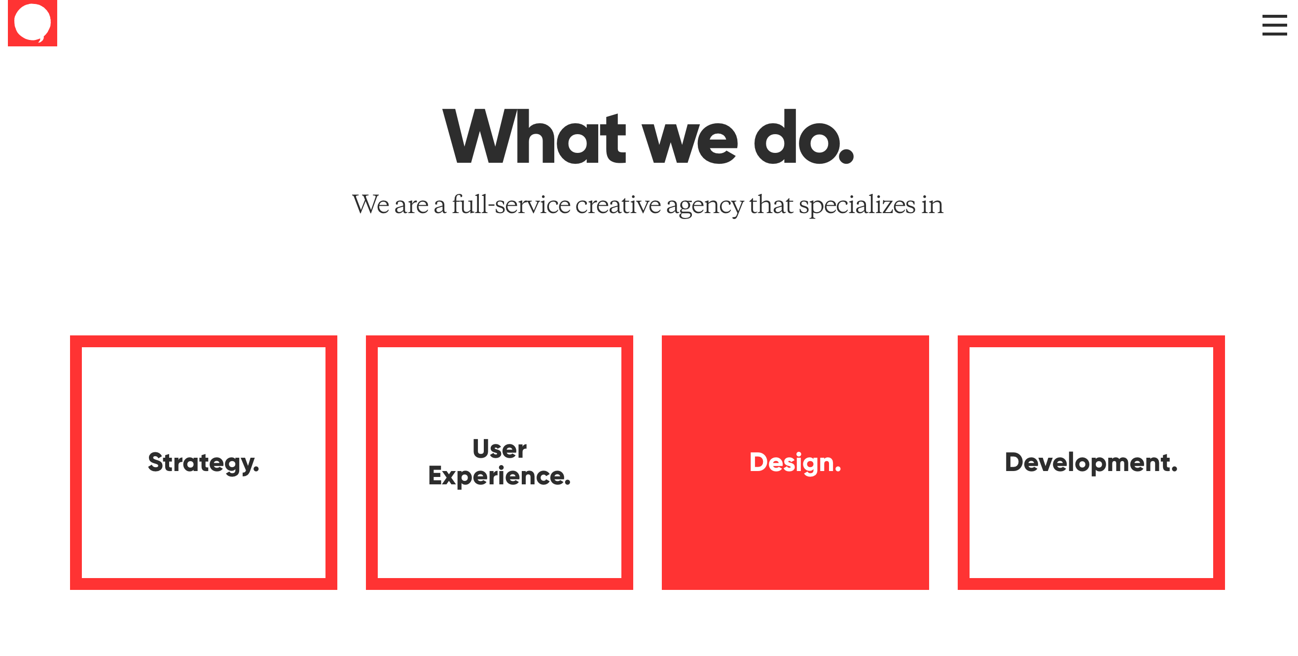
We had to rearrange the content a bit to accomplish this, including putting our Services at the top of our What we do page.
This was the kind of last minute scope change that would have driven our past selves nuts. If it was even able to break into whatever project phase we were in. But the current reality was that this was a major new awareness for UX, Design, and Development all working together on the same project at the same time and the right thing to do was to make the adjustments quickly. Because of our adherence to agile methodologies, atomic design, and functional scaffolding, we were able to produce design adjustments and rework the content and functionality and still launch ahead of the holidays.
What’s next
We are currently refining backlog items for a follow up iteration for 2017Q1. One of the items iterates on the Targeted/Personalized Landing Pages for setting a visitor’s homepage to a targeted specific homepage based on who the visitor is, possibly further filtering the whole site experience to that visitor’s industry. Another backlog item will bring a personal brand platform to the site for our staff to use to build their own professional equity in themselves.
More soon!