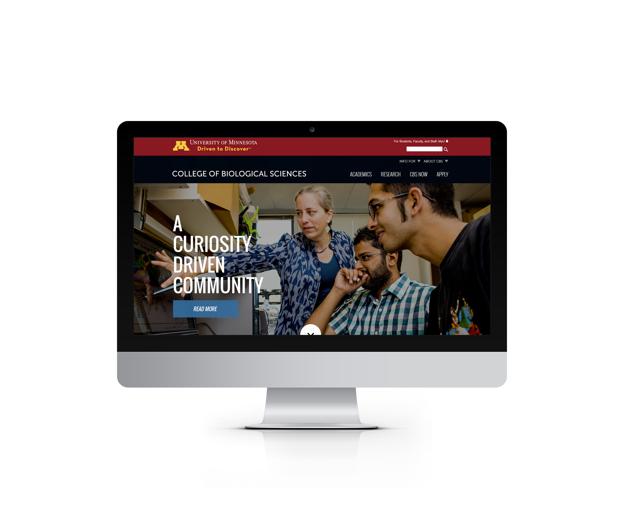
We are brimming with pride at the launch of University of Minnesota’s College of Biological Sciences’ redesigned website. I’m newer to the Last Call Media team, and this is the first project I’ve seen from the initial kickoff to over the the goal line launch. I’m thrilled to present an inside look at how we transformed a Higher Ed redesign into a powerful tool for recruitment.
CBS came to us looking for a redesign overhaul with a hosting platform migration to increase site engagement. They wanted a “modern, clean design” that reflected and communicated their college’s mission “to prepare today’s students to create the biology of tomorrow.” Many of the challenges and stress points we faced are common to the Higher Ed community. Colleges and universities have a plethora of content they want and need to be accessible to their site visitors. Visitors range drastically in intent to a college site. They range from prospective students and their parents; current students and their parents; students that are undergraduates or in their graduate studies or alumni; and, of course, faculty and staff. All of these visitor tracks have and require slightly different content. The symptom of this issue is visible in a site’s navigation and menu, and manifests itself in multi-tiered dropdowns and an overload of links.
How do we keep the necessary information without causing cognitive overload while streamlining the path it takes to get there for all parties? That is the big question for Higher Ed sites, and that’s the problem we solved. We knew engaging prospective and current students through streamlined and tailored content was key to the CBS team and redesign success.
Our solution was one in which design and development worked in concert, beginning by keying in on CBS’s information architecture from wireframes into development, partnering with the CBS team every step of the way. CBS brought a stunning collection of imagery we knew we needed to to highlight on the home page. We utilized the Drupal Panels module to set distinct regions on the home page for CBS imagery that they can swap out on a regular basis to keep the site looking fresh. We brought everything together with a robust full window vertical slideshow and mega menu.
If you haven’t seen the page, I encourage you to experience it in its live form. The mega menu is featured at the head of the page, and remains accessible when scrolling, slightly decreasing in size to allow the visual content to take center stage. We have a fantastic team here at Last Call Media that loves to push the limits on both design and development. It works because they know each other’s tools inside and out. Tom, our lead developer on this project (not to be confused with the different but also wonderful Tom of the CBS team) is proud of “how we were able to bring together an understanding of the tools the developers were going to use with design, and carry that all the way through the process. That went so smoothly, it was unbelievable.” These Drupal Panels not only look fantastic, but are powerfully functional in that they allow the CBS team to change the featured pictures, headings and links on their own without worrying that they’ll change the layout of the page, break the site, or have to have a lengthy call with their IT team (that we happened to love working with).
The launching of the CBS site necessitated integrating with the University of Minnesota’s tailored Acquia Cloud platform. We’re proud to have an Acquia-certified Drupal Grand Master leading our team, CTO Rob Bayliss. Under his watchful eye and our friends at Acquia, along with the talents of the whole project team at Last Call Media, the integration went off without a hitch. And just this week, Jeff Landfried became a Drupal certified Grand Master as well!
Our final product launched in time for the eyes of the incoming prospective student pool, and has been met with positive feedback from the CBS staff and students alike for its design and functionality. We’re proud of having such a beautiful and functional product that’s been deemed “Hot Stuff!” by our client. I can’t think of a better way to express this project, than perhaps in a haiku. If you want to have a little more haiku in your life and mindfulness in your projects I’m giving a session about it at NERDSummit in September. Hope to see you there! 


