
Introduction
A few months ago, whispers about a cool new tool caught my ear. I heard that it would simplify front-end development and drastically change how we develop sites in the future. I thought, “I wonder how big of a deal this could be compared to other existing frameworks?” It was around that time I was introduced to the concept of pattern libraries. When I learned that we were creating our own pattern library, I immediately recognized that we could make an impression on current and prospective clients, and it gave us an opportunity to flex some of our design muscles here on the Creative Team. Thereafter, Rob, our CTO, and I sat down and discussed a starting point. That was the beginning of an amazing learning experience. I will outline the thought processes and decisions were, and where we’re at today.
Mannequin primarily appeals to those who need to build a more flexible, versatile, and efficient front-end. Most of the magic happens in the back-end and, as a result, the interface was viewed somewhat as a frame for what was really happening under the hood. With that said, we set out to create a frame that was beautiful yet minimalist.
Discovery
The Product
Pattern libraries are an emerging trend that developers are jumping quickly, which is unsurprising, these tools make their lives lot simpler when it comes to building out large and complex websites. Pattern libraries achieve this by providing devs the ability to utilize component theming vs. your traditional page based theming; the former offers unparalleled versatility and control of the theming process. Mannequin’s provided framework allows one to work on components in isolated environments. This environment allows a developer to add logic to how components may be used, reused, or displayed in varying contexts. It’s loads of fun and almost makes you think, “Why weren’t we building like this before!?”
Similar Products
As previously mentioned, pattern libraries aren’t new. Some common pattern libraries are Styleguidist for React, Pattern Labs, and Fractal. While they all take advantage of the concept of component theming, there are small differences between them and their use-cases. However, we felt these products were lacking and that we could take the concept even further. For example, Pattern Lab has a great “extra info” display, but group listing often becomes clunky. Because Styleguidist is React-specific, it limits a developer’s options. Some pattern libraries have an awkward way of displaying html snippets of components on their UI vs the actual templates that would be used on live sites. These are just a few aches and pains we experienced that motivated us to take our own shot at it.
Users
Since this is a theming tool, the primary users will almost exclusively be front-end developers. As such, we have a dev-friendly command line interface and a straightforward UI..
Design
Getting Mannequin’s UX right
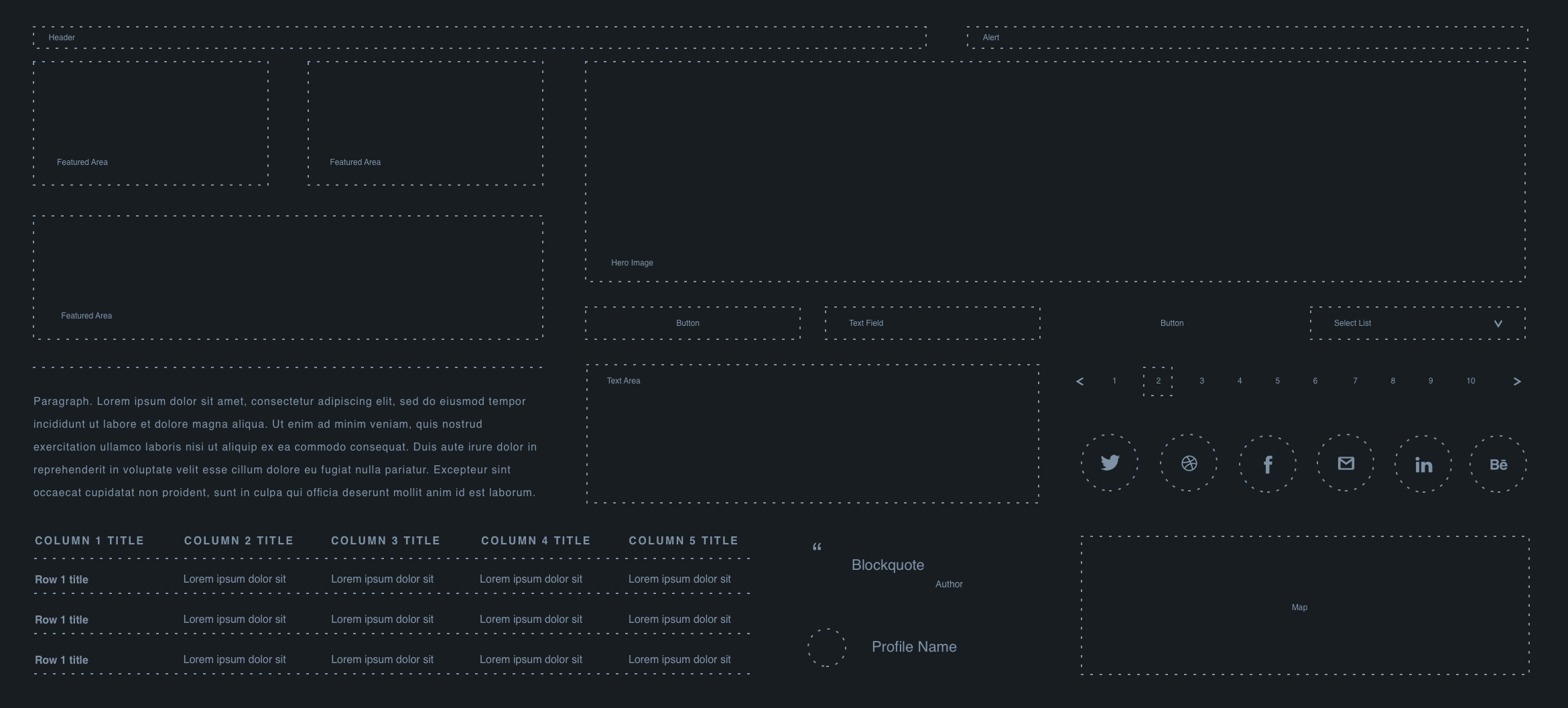
Our priority during this phase was to focus on individual components. We aim to display the most optimal version and give users an accurate depiction of how the component fits on the page. We decided to hone in on 3 main objectives by asking 3 questions: How do we best display a single component; How do we conveniently switch between component samples; and What’s the cleanest way to organize these components based on groups and subgroups then provide a simple way navigate and traverse them?
Navigation
After a few attempts, we decided that pattern libraries, like Pattern Labs, had done a good job and that having the component groups in the header was a reasonable solution to the navigation issue.
Or so we thought.
After careful consideration, we made 2 very important calls at the same time:
-
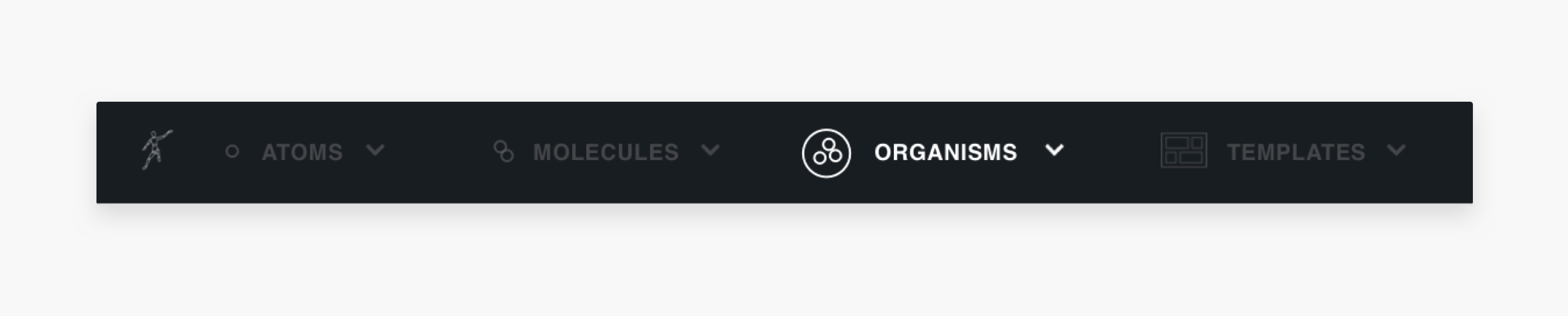
We want to step away from atomic naming practices and allow users to label and define their own groups and subgroups.
-
We don’t want to set a limit to how many top level categories there were.
In light of the above, we decided to replace navigation in the header with a drawer that houses a list of all the components and their groupings.. This decision was in line with our goal of giving users the flexibility to handle their components however they want.
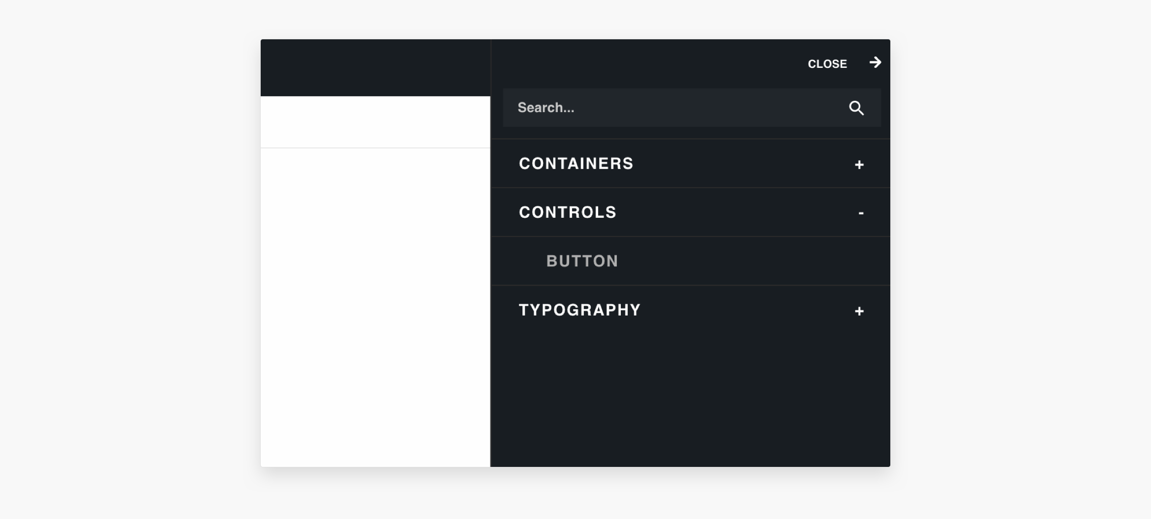
Component Samples
This involved simply creating a drop down that allowed users to stay on a specific component page and swap between the different variations of components.
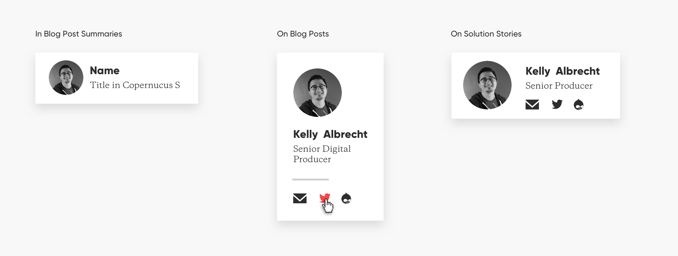
Single Component
As of now, most pattern libraries present the component previews either using html snippets or awkwardly positioning templates on a page. We believe that rarely captures the essence of the component, and does a poor job of providing a useful environment for working on the component itself. Although they usually come with an option for you to open the component in its own browser page, we wanted to make that a last resort. Our direction was to have components take up as much real estate as possible to give the user a sense for how the component would look on an actual web page and to display the actual component template.
QA Process and incremental improvement based on feedback
Lessons we learned so far
A minimal layout works and UI elements should be as unobtrusive as possible. We’re still trying to find ways to improve on what we currently have. In addition, flexible branding and labeling is important, and navigation needs to be both efficient and scalable.
Upcoming UI/UX Features
-
Landing Page Navigation: Currently on the landing page, you have to click the navigation icon in the header to gain access to your component list. We want to replace that with navigation that remains open on that page. This would reduce the number of steps and make life easier.
-
Interface Instructions/Help Tips: We’ve gotten feedback that sometimes people need a little introduction to how things work so we’re exploring possibly adding help text, a mini tour, or user-instructing interfaces on the Mannequin UI that users would be able to toggle on and off.
-
Subtler Header: If we can find a better way to put more focus on the component, we’ll implement it. We want to simplify the header into a single bar and offer an option to hide/show if the user is interested in taking a peek at the component without having to leave the page.
-
Flexible Branding: As part of our commitment to making Mannequin as flexible as possible, we’re working on giving developers the freedom to add their own branding and messaging to their pattern libraries.
Want to connect about Pattern or Component Library Design?Reach out here